GIMP tutorial: Adding floating logo to jazz up your Graphics!
Floating logo tutorial: A useful skill to jazz up your graphics
Creating a floating logo (one that appears like it’s floating about a background) is an easy task once you learn it step by step. In this tutorial, we intended to explain the creating of a floating log in a step-by-step manner so that you will be able to create your own logos.
The GIMP (GNU Image Manipulation Program) open-source graphics editor is available for Linux, Microsoft Windows, and macOS.
In this tutorial, you will learn the creation of a layer mask to conceal some parts of a layer and create the impression of a subsequent layer floating over the previous one.
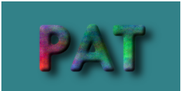
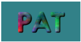
You will also learn to create a drop shadow effect to give the viewers the impression of floating above the background like in the illustration below:
Example of GIMP floating logo
You will use the concept of floating logo, text or image repeatedly because of its great utility.
Step 1: Let us begin by creating a new image of the chosen size:
Go to: File → New…
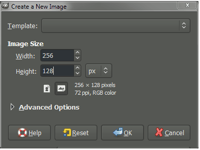
The Create a New Image dialog box presents the options you can choose.
You can choose the dimensions that you want for the image. It all depends on what you need. It will be a good idea to play around with different dimensions until you get one that suits your
requirement.I am choosing 256 px width and 128 px height. Also, I am leaving other option untouched.
Hit 'OK’ to create the image.
The image you see here is a white space (or other color depending on the GIMP default setting) filling the canvas.
Step 2: Fill the new image with black
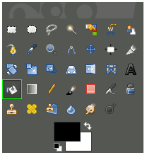
Check that the Foreground Color is set to black.
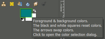
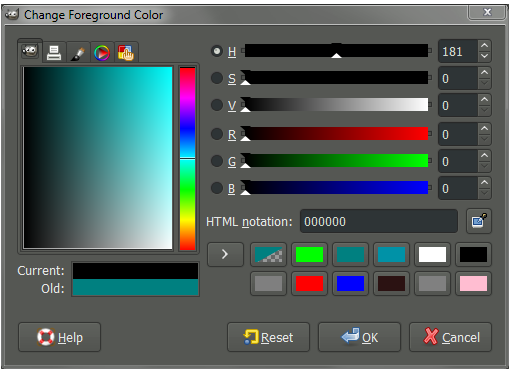
Click on the foreground color in the Color area to bring up the 'Change Foreground Color’ dialog:
Click the foreground color to change to black.
Choose black (RGB 0, 0, 0) in the dialog box.
Once the foreground color is set, use the Bucket Fill Tool to fill in the image:
Got to: Tools → Paint Tools → Bucket Fill
- After the Bucket Fill tool gets activated, click on the image to fill black.
Step 3: Adding some text
- We will now place the text on the image. But the image is black and so long as the foreground color is black, the text will also be black.
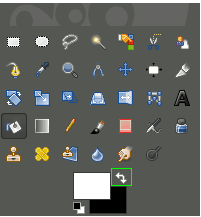
- As black text on black background will be invisible, we need to change the foreground again to a lighter color.
- For this, you will repeat the procedures to choose a different foreground color.
- In case the background is already white, using the arrow we can swap it for the black foreground.
GIMP allows you to quickly swap the foreground and background colors by using the keyboard shortcut "X’”.
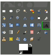
Now that the foreground color is white, you can use the Text Tool to add some text:
Go to: Tools → Text
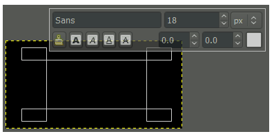
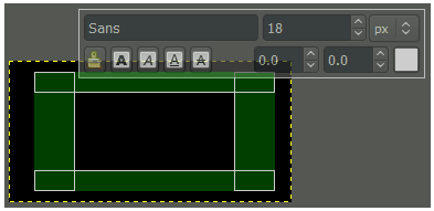
- Click on the point in the canvas where you want the top left-hand corner of the text box. Drag the cursor down to the bottom right.
- As you can resize this box any time you want, you need to worry about the exact size of placement of the box.
- Redefining the text box is easy. You can do that by clicking on the text box and dragging any of the green areas.
The text you type will g into the black area surrounded by the green handle.
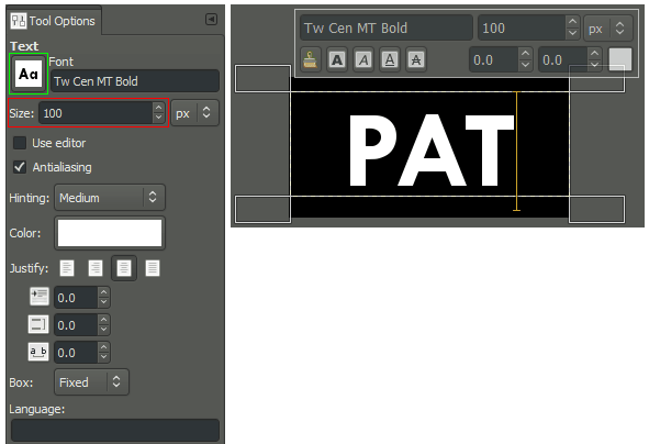
Now you can type the text you want in the logo.
- If the text tool you enter looks too small, go to the Text Tool Options palette and change the font size and font type.
Step 4: Creating a new layer
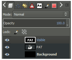
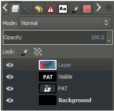
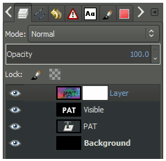
Once the text is created the way you want it to look, you create a new layer from all the visible layers. This is done by right-clicking on the text layer on the Layers Tab and choosing New Visible.
- There is the alternative of creating a new layer from visible using the menu: Layer → New from Visible
Step 5: Blurring the New Layer
Ensure that on the Layer’s palette that the new layer is chosen (with the white border around the layer name)
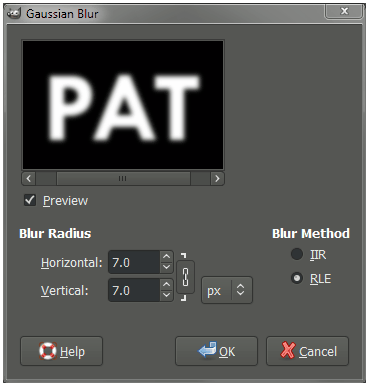
This is achieved by applying the Gaussian blur on the new layer.
For this go to: Filters → Blur → Gaussian Blur
In the dialog box choose the percentage of blur needed.
Step 6: Adding Color
Now that your text is done, choose to color the text. For this you need to add a new layer first:
Got to Layer → New Layer…
The fill is not really important here. So, you can leave it at it and hit OK.
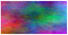
Now you can use the Plasma plugin to add color to this layer. Go to: Filters → Render → Clouds → Plasma…
The default values may work perfectly fine or you can change them to what you want.
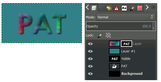
- Now the canvas looks like below with the plasma layer on top and visible:
Step 7: Bump Mapping
- Bump Mapping gives the impression of a fake 3D effect for the text created earlier.
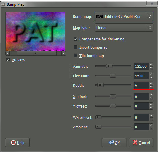
- For this, open the Bump Map dialog in the menu: Go to: Filters → Map → Bump Map…
- The preview available with the Bump Map dialog is useful in checking out the effect.
- It’s important to point to the source for bump mapping to work.
- So click on the spinner for the Bump Map and point to the 'Visible’ layer we chose.
- You can set the depth to increase the illusion of depth. Click OK.
Step 8: Applying Layer Mask
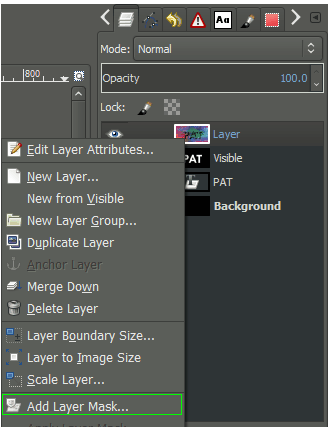
- The Layer Mask will isolate the bump mapped text.
- For this add a Layer Map to the Plasma layer: Go to: Layer → Mask
→ Add Layer Mask…
- On getting Add a Mask to the Layer dialog, set Initialize Layer Mask choosing White (full opacity).
Step 9: Copying Visible layer
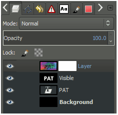
- You should now copy the “Visible” layer, and paste on the layer mask for the Plasma layer.
- For this, Left-Click on 'Visible’ layer on the layers palette, thus activating it:
Ensure the layer we want to copy is active. Go to: Edit → Copy
Then make the plasma layer mask active. Paste the 'Visible’ layer back into the image: Go to: Edit → Paste
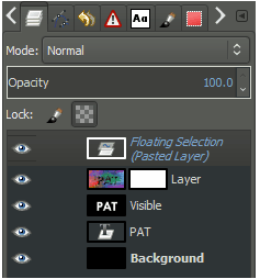
This inserts a Floating Selection (Pasted Layer) into the image:
Step 10: Anchoring the Floating Selection into mask
Go to : Layer → Anchor Layer
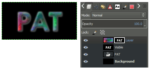
This anchors the selection onto the mask.
Now you will add a different color background to fine-tune the results. Add a new layer and place it beneath Plasma layer. Pick a color to fill this new layer.
Step 11: Adjusting the levels
You can adjust the mask to clarify the text edges.
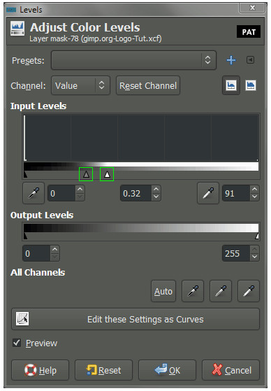
Choose the layer we want to be sharpened. Then open the Adjust Color Levels dialog through the menu. Go to: Colors → Levels…
With the Adjust Color Levels dialog, sharpen the edges of the mask:
- This is achieved by adjusting the Gamma and White point sliders. You can drag the White point slider down to increase the Plasma layer prominence. Then push the Gamma up to stress it more.
- This increases the definition of the text edges, without causing a jagged (aliased) effect.
Step 12: Creating a Drop Shadow
- A drop shadow sexes up the image by making it appear floating above the background.
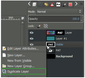
- For this, first, copy the 'visible’ layer with the original blurred text. Activate the layer and go to: Layer → Duplicate Layer
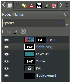
This creates a new “Visible copy” layer. Move this layer above your background color layer to just beneath your plasma layer as shown (you can Left-Click and drag the layer in the palette):
Drag the “Visible copy” to beneath the plasma layer. This becomes the shadow. You will need to invert the colors to make the text black using :Colors → Invert
Change the layer so that all of the white areas are transparent. For this go to: Layer → Transparency → Color to Alpha…
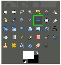
The layer now has black text over a transparent background. You can shift this slightly to simulate height by offsetting it down and to the right. To do this we can use the Move Tool: Tools → Transform Tools → Move
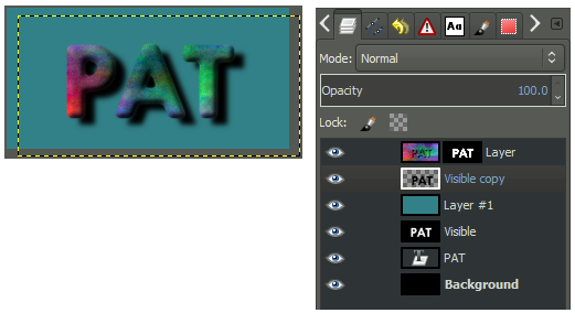
- Hold down Shift and click on the canvas to restrict the Move Tool to modify only the active layer (the shadow layer). Drag the layer to the right and down to simulate the shadow.
- This shows that the shadow layer has moved to the right and down.
- Adding a Gaussian Blur to the shadow will give the impression of spreading it out.
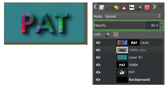
- Modify the layer Opacity, adjusting it to allow the background through.
The Simple Floating logo is a useful trick to have to jazz up your images. Hope you liked the tutorial !! Thanks.
Posted on Utopian.io - Rewarding Open Source Contributors
Thank you for the contribution. It has been approved.
PS @osblog , although I don't really like the look-n-feel of your design, you did explain it properly.
But please, could you try to also do some OK-looking stuff next time?
Cheers, @scipio
You can contact us on Discord.
[utopian-moderator]
Hey @osblog I am @utopian-io. I have just upvoted you!
Achievements
Suggestions
Get Noticed!
Community-Driven Witness!
I am the first and only Steem Community-Driven Witness. Participate on Discord. Lets GROW TOGETHER!
Up-vote this comment to grow my power and help Open Source contributions like this one. Want to chat? Join me on Discord https://discord.gg/Pc8HG9x