My Logo for Piano Keyboard
Repository
Issue and pull request
Details
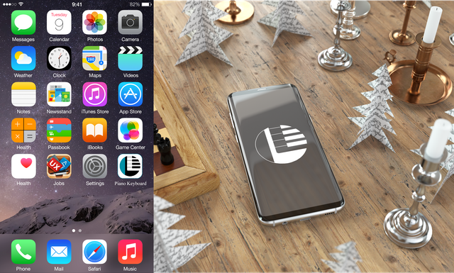
Let me give you a brief overview of this design. Piano Keyboard it´s an OpenSource project that let you play a piano using CSS and JavaScript, you can play using a touch device, but you can also use your keyboard or mouse to play.
So I decided to give my contribution designing this logo for this project, a project owned by Felipe Fialho
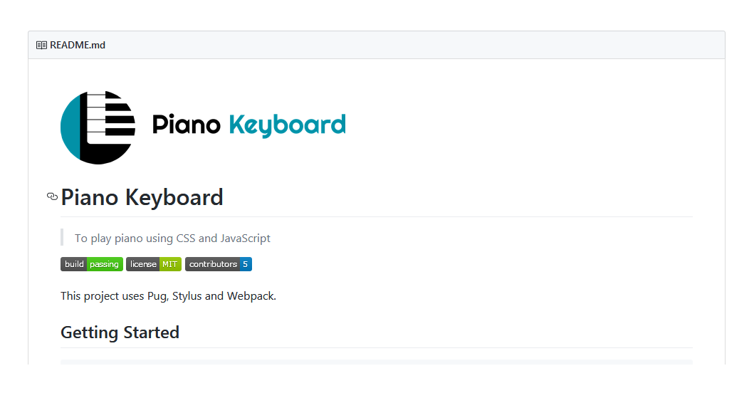
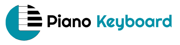
For this project I propose a logo for the owner and he accepted and added it to the README file of the project. The owner just ask to change the color.
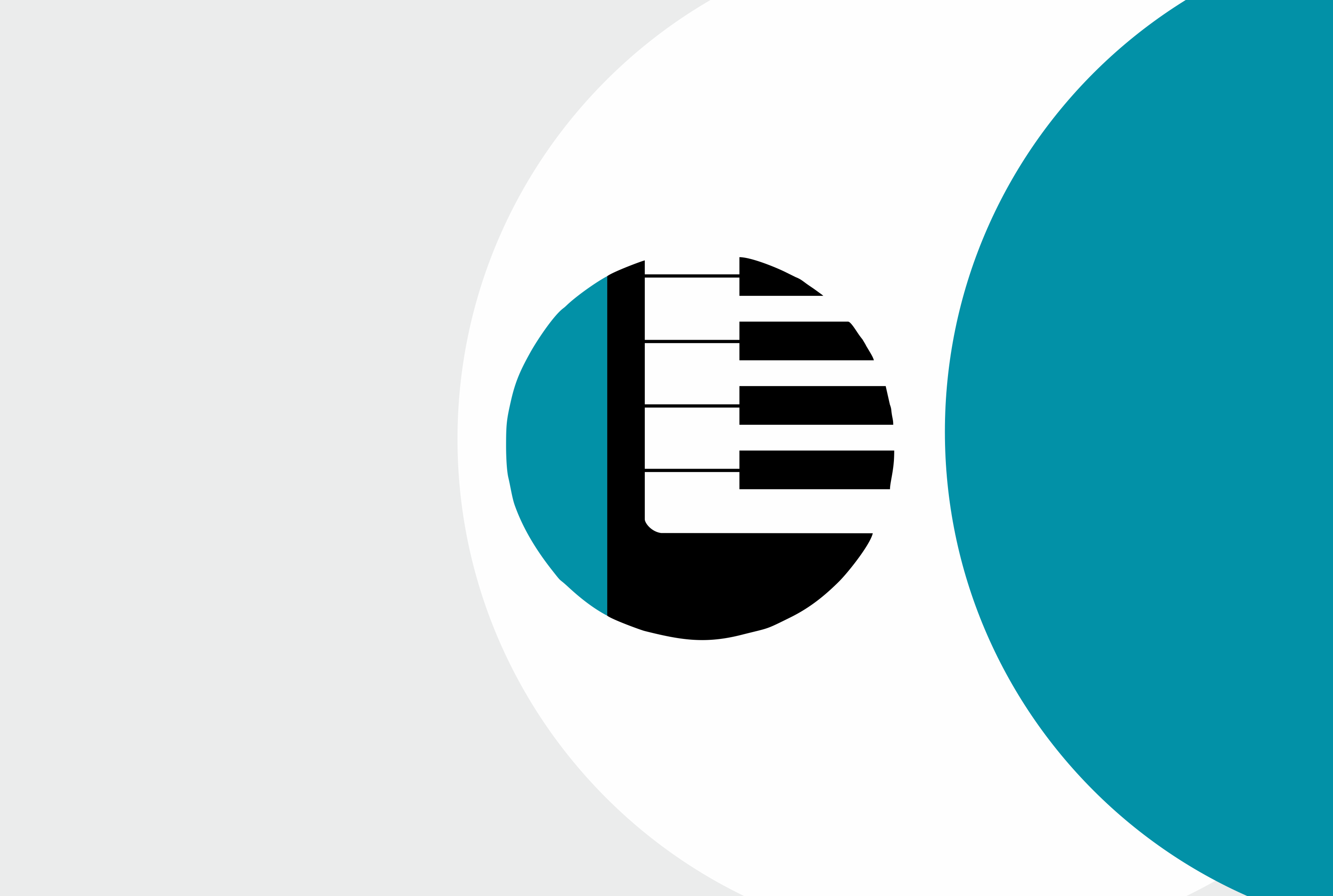
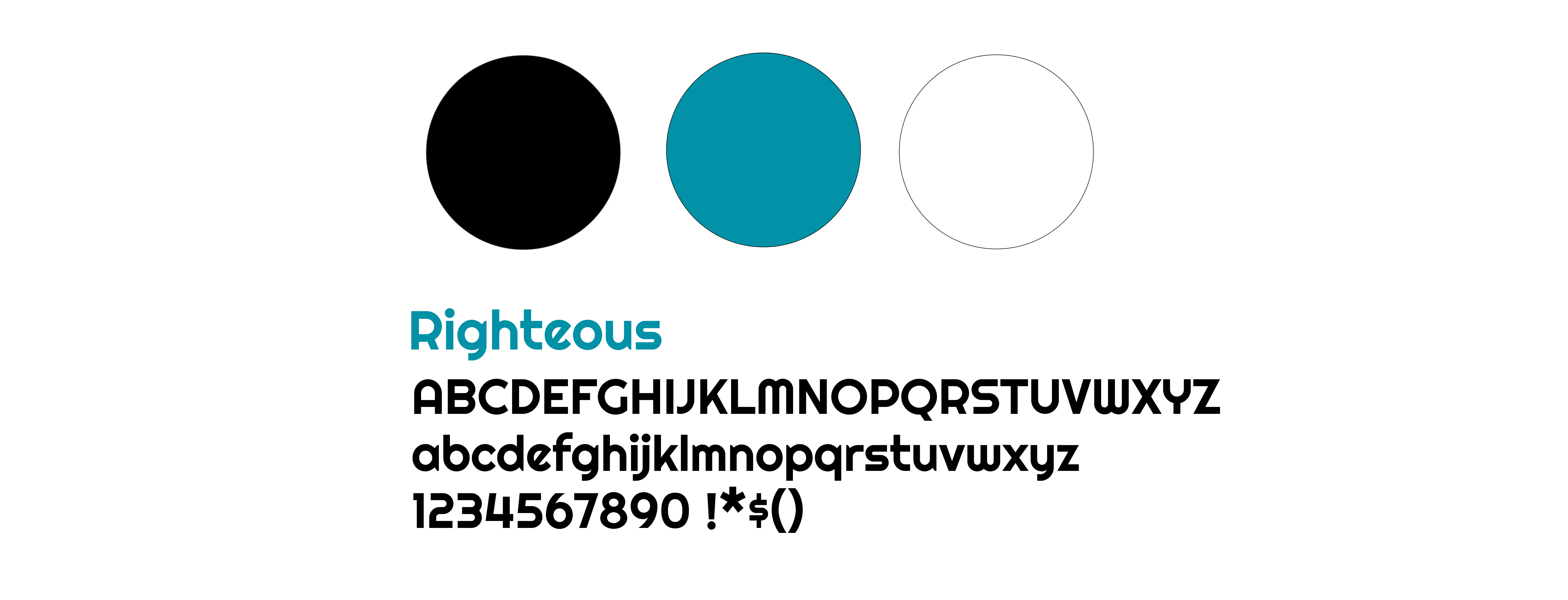
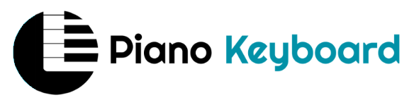
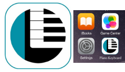
For the graphic concept I use a piano keyboard, and add two solid shapes one in black and other in blue, to give to the logo some modern look, all the elements are inside a circle that can be used as app icon.
Finally for the colors the owner requested to use blue in the color solid shape, and keep the proposed black.
I chose Righteous as a font because it fits well with the logo.
Concept and Result
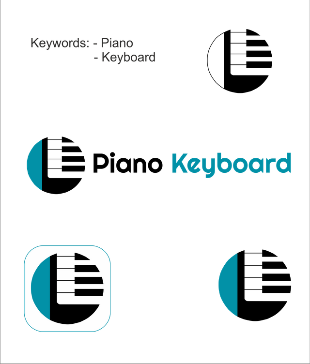
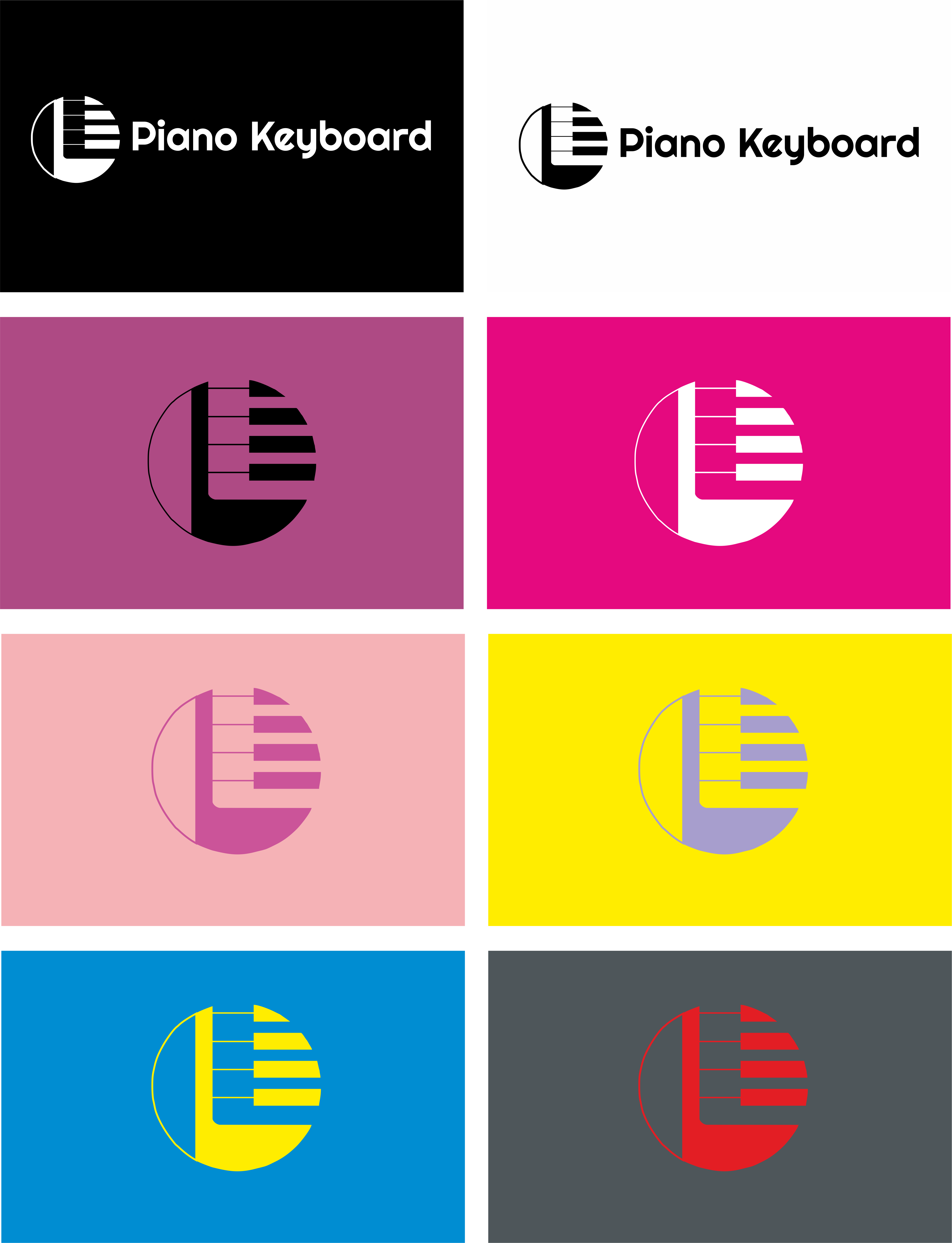
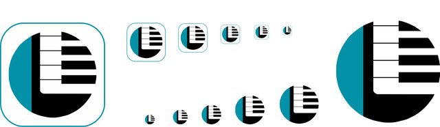
Logo variations / Background / Black and White / Colors / Size
Logo Size variations
Colors / Font
Benefits / Improvements
• Piano Keyboard did not have logo before, so my logo bring new identity to this project;
• It´s modern, original and easy to remember;
• Understandable in small sizes and with great monochromatic versions.
Tools
- Computer (windows PC)
- Coreldraw X8
- Autocad 2012
- Photoshop (to use the mockups)
Proof of authorship
Click here
Original Files
Font: source
Proof of Work Done

This work is licensed under a Creative Commons Attribution 4.0 International License.
Think about people with dark theme in your presentation.
Your contribution has been evaluated according to Utopian rules and guidelines, as well as a predefined set of questions pertaining to the category.
To view those questions and the relevant answers related to your post,Click here
Need help? Write a ticket on https://support.utopian.io/.
Chat with us on Discord.
[utopian-moderator]
Thanks for your review, I will think in what you said.
Greetings.
Cool logo! I love pianos!:D
There are just a few things I don't understand in your concept.
1.
why this blue space? Don't you think is better to omit it?
Black and blue are very nice color choice!! and I like the font you used too :D
oh, and 2. .. I don't understand this either:

Your icon is strong, and stands alone, I think you don't need that square with round corners; if for the icon for mobile it is an obligation to be square with round corners it would be nice to have an adaptation:
What do you think?;D
I hope my comments doesn't bother you, and congrats on getting it merged!!!
I am not utopian moderator, take my advice if you want. I am a graphic designer graduated in 2009; founder of @wearecodex team.
Hello, thank you very much for your comments, because it is with this type of interaction that makes me grow for a better graphic designer.
"Why this blue space? Do not you think it's better to omit it?"
I found that without the blue space the logo was very simple, in my opinion :)
I love the adaptation of the square icon! I will do that in my next projects, thank you for your ideas and comments.
you're welcome =) I am glad to help :D
Hey @nunojesus
Thanks for contributing on Utopian.
We’re already looking forward to your next contribution!
Contributing on Utopian
Learn how to contribute on our website or by watching this tutorial on Youtube.
Want to chat? Join us on Discord https://discord.gg/h52nFrV.
Vote for Utopian Witness!
@resteemator is a new bot casting votes for its followers. Follow @resteemator and vote this comment to increase your chance to be voted in the future!