Logo Proposal for Jcameras

Repository
Issue and pull request
Details
Jcameras is an opensource software that records and play the computer mouse behavior, created and owned by zswang, so I decided to give my contribution designing this logo for this project.
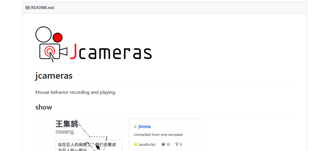
The owner added the prososed logo to the README file of the project.
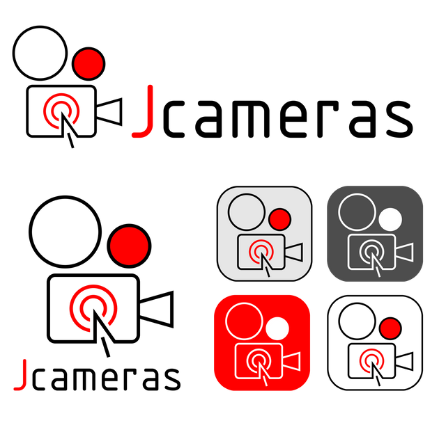
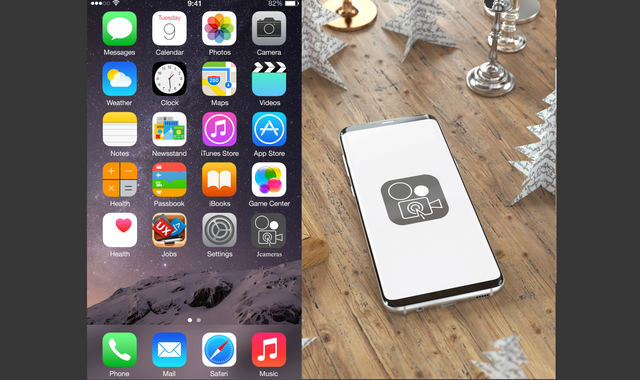
For the graphic concept the owner of the project presented me with two images for inspiration, the first image was a film camera and the second image was a computer screen with a mouse arrow.
So I created a mixture of the two images, making the body of the camera the screen of the computer, where I put the arrow of the mouse, I added a few lines in red to simulate the mouse click on the screen. As we know this software allows us to record the movements of the mouse on the screen, so I filled one of the coils in red, to represent the recording red light.
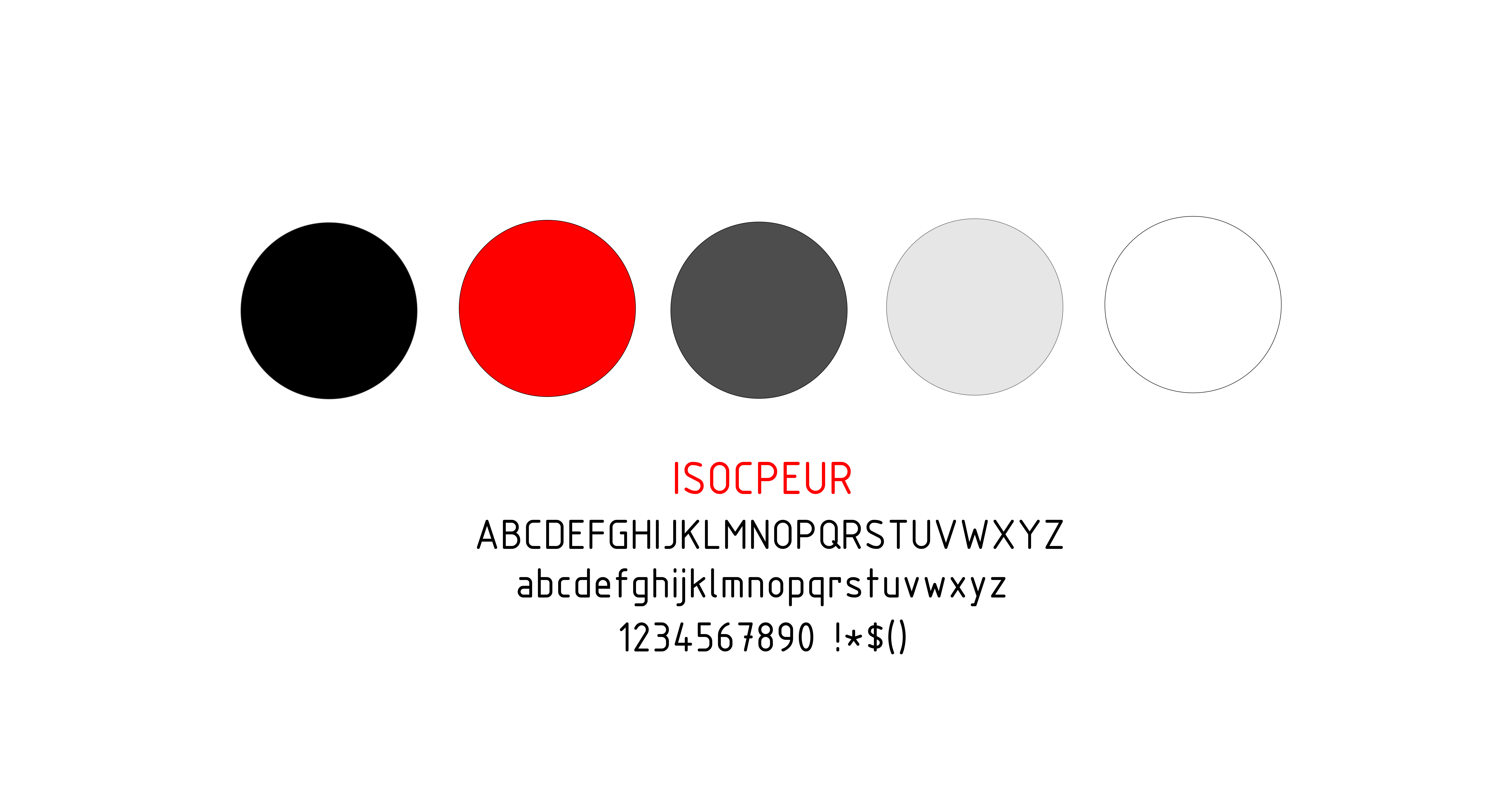
For the choice of colors the owner did not make any request, so I used the color black and the red color which gives a nice contrast to this logo.
I chose ISOCPEUR as a font because it fits well with minimal look of the logo.
Concept and Result
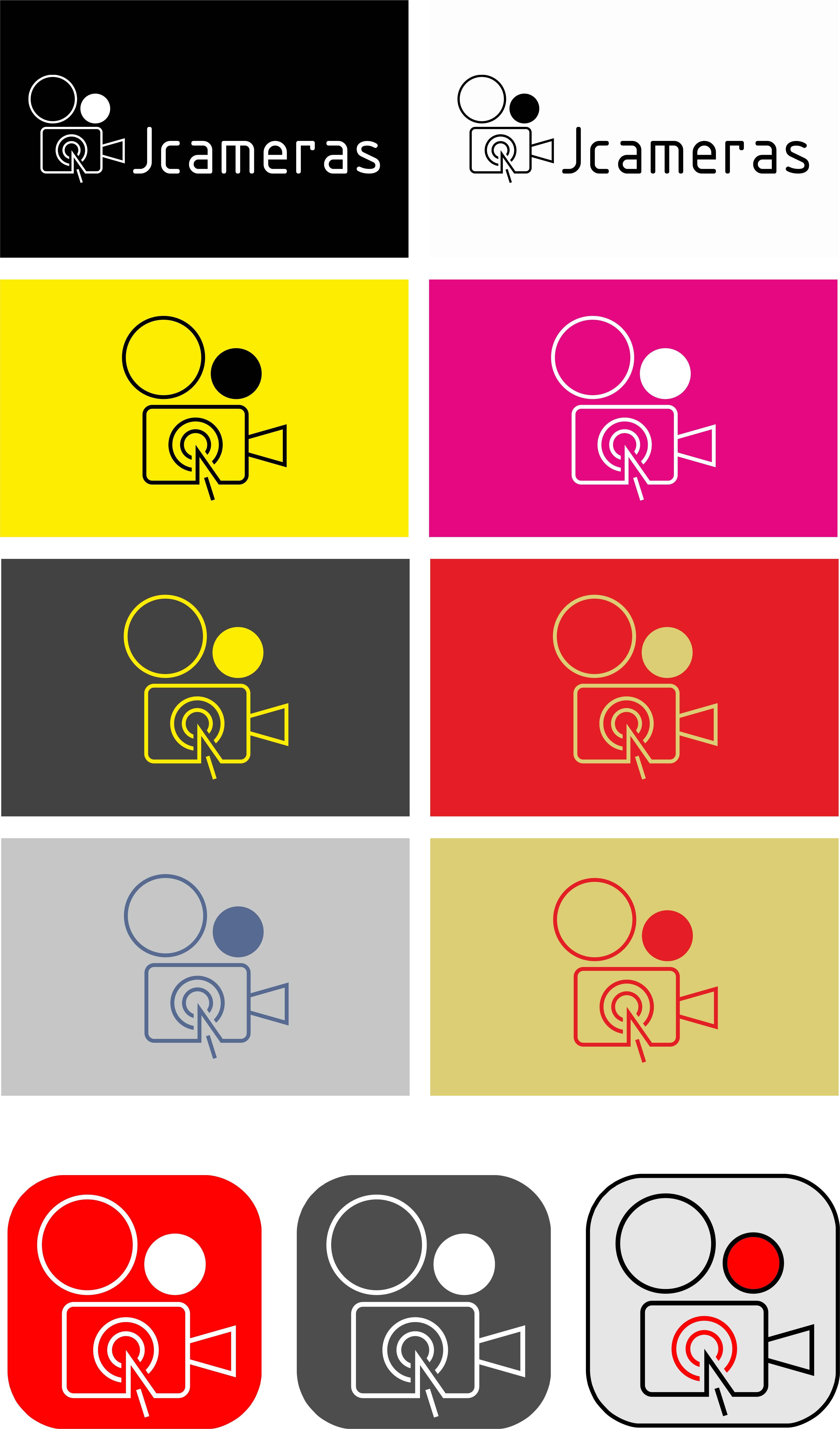
Logo variations / Background / Black and White / Colors / Size
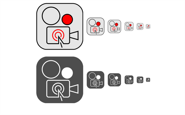
Logo Size variations
Colors / Font
Benefits / Improvements
• Jcameras did not have logo before, the brand new logo bring new identity to this project;
• It´s modern, clean, minimal and easy to remember;
• Understandable in small sizes and with great monochromatic versions;
• The owner was very pleased with the design and it is already merged in the master code of the repository and in the readme file.
Tools
- Computer (windows PC)
- Coreldraw X8
- Autocad 2012
- Photoshop (to use the mockups)
Proof of authorship
Click here
Original Files
Font: source
Proof of Work Done

This work is licensed under a Creative Commons Attribution 4.0 International License.
I love this one:

cheers!!!:D
I love that one too and also the gold one with red background. Thanks!
Hey @nunojesus ,
Thank you for the contribution. It is nice to see you worked with PO and you have achieved the best result. I am only not sure about application appearance. The lines may look a bit ineffective because those are too thin. However, well done!
Your contribution has been evaluated according to Utopian rules and guidelines, as well as a predefined set of questions pertaining to the category.
To view those questions and the relevant answers related to your post,Click here
Need help? Write a ticket on https://support.utopian.io/.
Chat with us on Discord.
[utopian-moderator]
Thank you very much for your review @baranpirincal, it´s allways good to work with the PO, but lots of them they dont have time :)
Greetings!
Hey @nunojesus
Thanks for contributing on Utopian.
We’re already looking forward to your next contribution!
Contributing on Utopian
Learn how to contribute on our website or by watching this tutorial on Youtube.
Want to chat? Join us on Discord https://discord.gg/h52nFrV.
Vote for Utopian Witness!