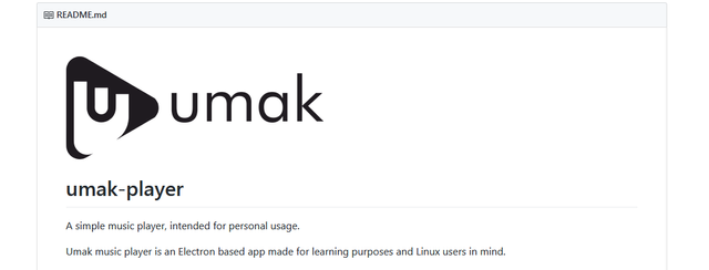
Logo for Umak
Repository
Issue and pull request
Details
Umak is an simple music player, intended for personal usage, an opensource project that is also an Electron based app made for learning purposes and Linux users in mind, created and owned by Reinards, so I decided to give my contribution designing this logo for this project.
The owner added the prososed logo to the README file of the project.
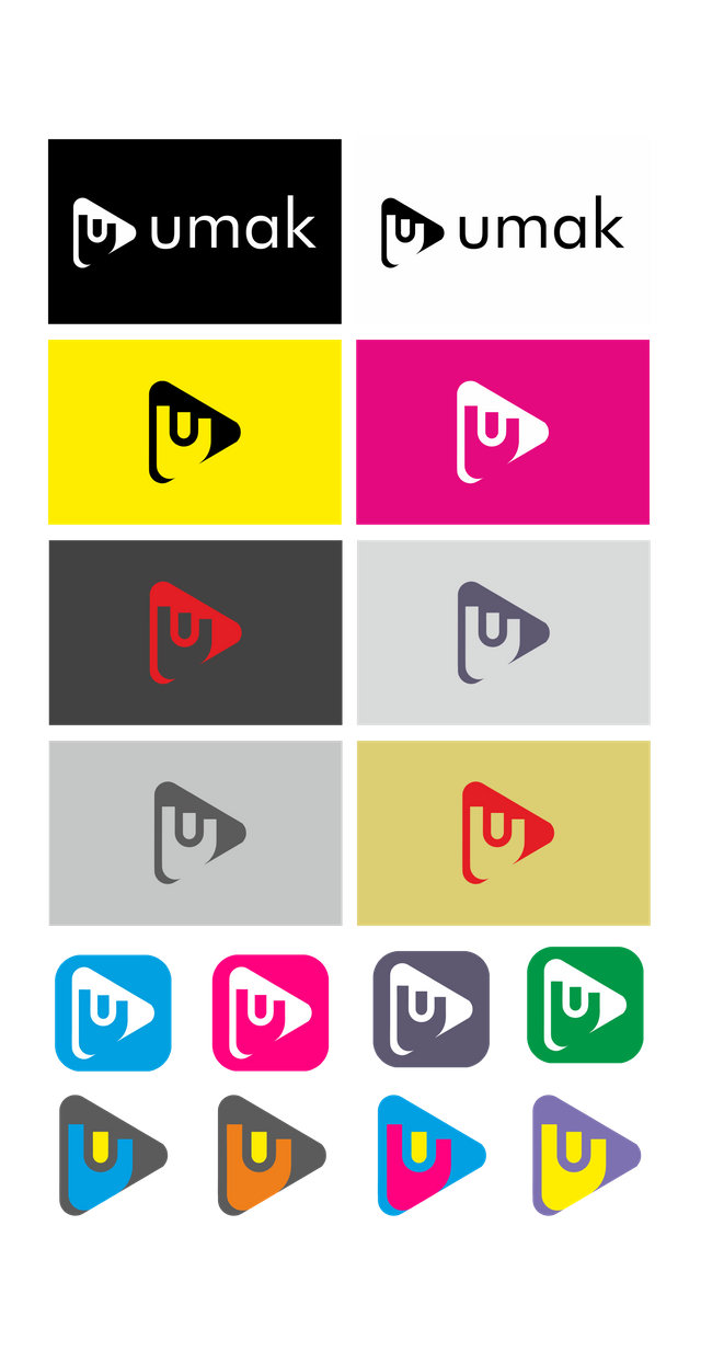
For the graphic concept I decide to use the letter U of umark and player button
So I created a mixture of the two keywords, making the player button the body of the logo, them I add two shapes to create the letter U.
For the choice of colors the owner ask for dark grey an orange, but in the end he love the black and white logo, that is already in use.
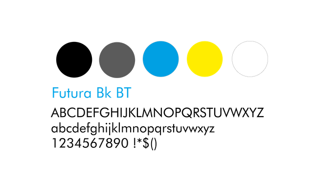
I chose Futura Bk BT as a font because it fits well with minimal look of the logo.
Concept and Result

Logo variations / Background / Black and White / Colors / Size
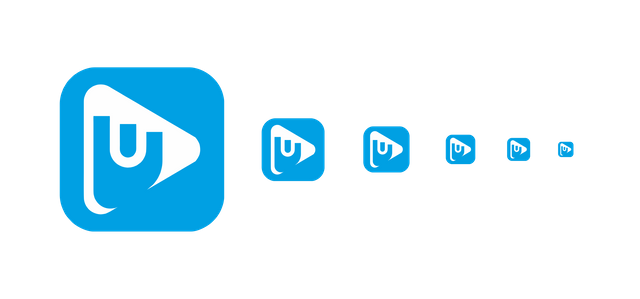
Logo Size variations
Colors / Font
Benefits / Improvements
• Umak did not have logo before, the brand new logo bring new identity to this project;
• It´s modern, clean, minimal and easy to remember;
• Understandable in small sizes and with great monochromatic versions;
• The owner was very pleased with the design and it is already merged in the master code of the repository and in the readme file.
Tools
- Computer (windows PC)
- Coreldraw X8
- Autocad 2012
- Photoshop (to use the mockups)
Proof of authorship
Click here
Original Files
Font: source
Proof of Work Done

This work is licensed under a [Creative Commons Attribution 4.0 International License.](creativecommons.org/licenses/by/4.0/
it is nice that project owner has merged your design to his project, however i still found a lot of room for improvement in your design.
First of all, there are too many inconsistency in your design, the gaps are not concitent, and there is some part that not curved smoothly.
The letter U and blue part in the play button is a little bit odd, make it simple and memorable but also try to make it as legible as possible.
I think it would be better if the bottom part of the letter U not following the shape of the play button, even tho i still find too much space in the bottom part of the play button.
Your contribution has been evaluated according to Utopian policies and guidelines, as well as a predefined set of questions pertaining to the category.
To view those questions and the relevant answers related to your post, click here.
Need help? Write a ticket on https://support.utopian.io/.
Chat with us on Discord.
[utopian-moderator]
Hey @nunojesus
Thanks for contributing on Utopian.
We’re already looking forward to your next contribution!
Contributing on Utopian
Learn how to contribute on our website or by watching this tutorial on Youtube.
Want to chat? Join us on Discord https://discord.gg/h52nFrV.
Vote for Utopian Witness!
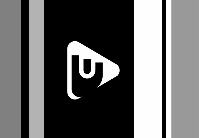
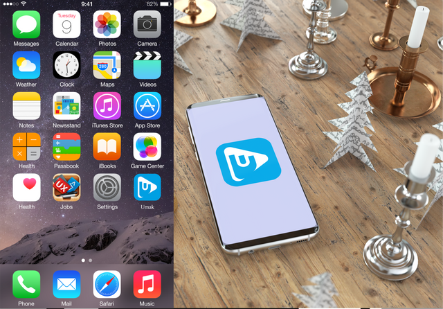
And i don't know why you did this phone mockup, since umak is not a mobile app