Suggestion for user interface
Components
Sicmu is a new music player that enables users to play songs easily on their android devices, it has a lot of good features like shuffle, shake to switch songs, fast-forward and rewind.
Proposal
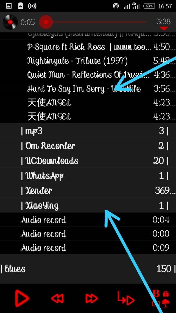
Going through the Sicmu music player, i'm not really enjoying using the player because of how the interface is. It doesn't make the player attractive and the folders are not well arranged making it a bit stressful for users especially those who are not really app friendly.
Mockups / Examples
Instead of the interface showing this way with everything being scattered around...

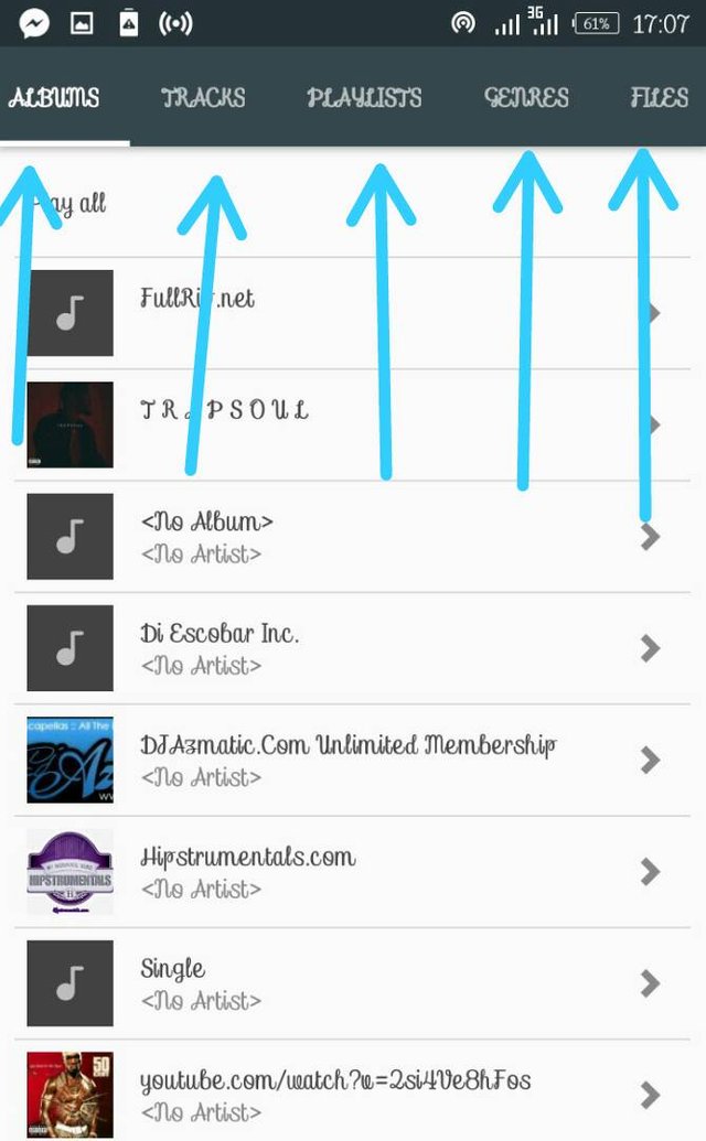
I suggest that the developers should make the interface look this way for everything to be well arranged..

With this every file will be at his right folder, making it well arranged and decent to the eye..
Benefits
This will make the app look more modernize and smart. it will make it less stressful for users to locate which folder they are looking for in the app. It will also attract more users as it will have a new look and unique interface.
Posted on Utopian.io - Rewarding Open Source Contributors
Hello @noraliza, your contribution can not be approved because we already received similar contribution ( https://utopian.io/u/33493459)
You can contact us on Discord.
[utopian-moderator]
Hey @ckole, I just gave you a tip for your hard work on moderation. Upvote this comment to support the utopian moderators and increase your future rewards!
please with all due respect..i dont see this contributions being the same. he is talking about directories of when you want to play a song, while i'm talking about the user interface..it's not the same thing please.look into it again please.