RE: Logo Design for Nuage [Contribution] [Graphics]
Hi @arkhamknight, thank you for your contribution.
This is a really good simple design, the concept itself is good by combining a folder and cloud and yet the logo still looks simple and recognizeable even in small size. In your source files (.svg) the logo is a little bit different though with the one that you show in your presentation. As you can see bellow, the logomark and logotype in your source files has different widht.

(In your gdrive)

(in your presentation)
Also i can only find .svg files as your editable files, it would be better to add another file wih different extension such as .eps or .pdf.
Talking about your presentation, explaining the benefits in bullet poin is a plus, i really like it. One think you might want to nate is your mockup.
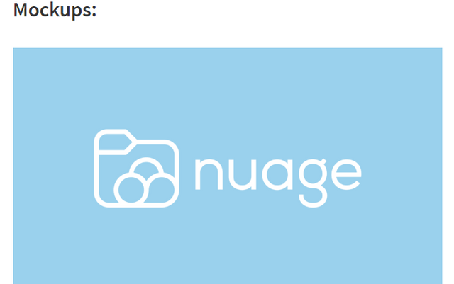
Mockup is a model that people use to show how their designs looks in real life, i see you did show some mockups to project owner in the github issue, you should show some here in your presentation, think it like this is your portofolio, you want your presentation to look as good as possible.
Your contribution has been evaluated according to Utopian policies and guidelines, as well as a predefined set of questions pertaining to the category.
To view those questions and the relevant answers related to your post, click here.
Need help? Write a ticket on https://support.utopian.io/.
Chat with us on Discord.
[utopian-moderator]
Yeah the width issue on the wordmark happens when you view it on vector applications other than Inkscape I guess. I think its due to the fact that I used strokes on the font to make the width match the iconic mark. Idk why the stroke won't appear on other vector applications. I ran into all sorts of issues while making the logo, weird and random errors appeared all over the place. Anyways I am going to use illustrator and try and fix all the problems :) Also about the mockup thing, yeah that was a stupid thing to do. I will try and improve the presentation. Thanks for the constructive criticism, I appreciate it!
hhmm i see, if thats the issue you can try to outline the stroke, i never used inkspace but i am sure this is possible as you can do it in another vector programs.
and next time don't forget to export to multiple editable extension such as .eps or .pdf
I might stop using Inkscape altogether it has all sorts of weird glitches.
Ofc I will.
In Inkscape doing so will remove the fill and only the stroke shall remain as a path.
Thank you for your review, @nilfanif!
So far this week you've reviewed 5 contributions. Keep up the good work!