Logo Design For Steemia With Adaptive and Responsive Icons

Details
Steemia is a social media running over the Steem Blockchain. For more detail about Steemia you can check here
Process
Since Steemia is a social media app, my main goal is to make a solid and dynamic logo. I started by doing some research and collecting some social media logos for moodboard and inspiration.

From the moodboard I realized that all of those logos share same characteristics, those logo are simple and versatile, those logos can work in every single kind of display and any kind of size yet still recognizeable.
From there i try to make a simple and versatile logo that can represent Steemia, here is the result:

As I said before, i want to make a versatile logo and since Steemia is and app for Android and iOS, the most important thing is the icon, I made the icon in several adaptive form.

I made the icon to be responsive, so it can be work as a small notification icon. In responsive logo some detail can be remove and still the logo must be recognizeable. This is the example of responsive icon
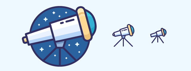
And here is proof of my logo is a resposive logo. you can see the shadow part was removed so it will be clean and still recognizeable when the logo scaled down to notification icon.

Here are another previews of the logo.


Tools
The logo was made with vector based software: Adobe Illustrator and exported in several kind of vector files.
Proof of Work


Original files
Editable Vector FIles and .png files: GDrive
Font: Futura
Posted on Utopian.io - Rewarding Open Source Contributors
Well, I lost another competition..
Steemia name sounded me feminine, so those curves fits well imo. I would use shadow on both sides, not only in bottom. Another thing to consider, rather than using it on a hexagon or another shape you could use the icon as it is. So it would be seen better on notification are.
Great work, gratz.
You are still in the competition, the project owner said he like your logo 😄
Hmm shadow on both part could work, i think i can tweak it if the project owner chose it as the winning design.
For the notification icon, your idea sounds great. I'll try to export it and apply it the screenshot to see how it will appear.
Well, you didnt :D
gg well played.
well done!! i like it ..
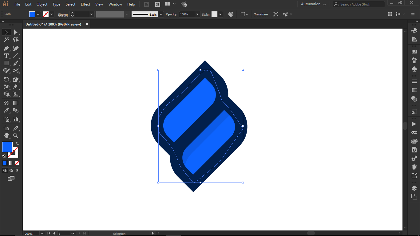
I do not understand why do you fill the blue with the pen?
Then what do you do to divide parts and extract the fill of the silhouette?
The blue fill was made later, the first concept was without fill, so i make the fill with pen tool and sent it to back (ctrl+open bracket key]
There is a tool to devide it, i dont remember its name something like (builder or shape builder), because i always use keyboard shortcut which is shift+m for that tool
ammm ok!! i use for that (K) interactive paint , and after expand .. :)
blessings
Thank you for the contribution. It has been approved.
You can contact us on Discord.
[utopian-moderator]
Neat!
Thanks
Hey @nilfanif I am @utopian-io. I have just upvoted you!
Achievements
Community-Driven Witness!
I am the first and only Steem Community-Driven Witness. Participate on Discord. Lets GROW TOGETHER!
Up-vote this comment to grow my power and help Open Source contributions like this one. Want to chat? Join me on Discord https://discord.gg/Pc8HG9x