Bootstrap One-Page Web Design #Part9 [Tutorial]
Bootstrap
Build responsive, mobile-first projects on the web with the world's most popular front-end component library. Bootstrap is an open source toolkit for developing with HTML, CSS, and JS. Quickly prototype your ideas or build your entire app with our Sass variables and mixins, responsive grid system, extensive prebuilt components, and powerful plugins built on jQuery.

Image Source
| What Will I Learn? |
|---|
| - We will be informed about font awesome. |
| - We will code our services section appropriately to our design. |
| Requirements |
|---|
| - Brackets (Website) |
| - Intermediate code knowledge |
| - Basic HTML and CSS knowledge |
| Difficulty |
|---|
| - Intermediate |
Curriculum
Part 1: Bootstrap One-Page Web Design #Part1 [Turkish Tutorial]
Part 2: Bootstrap One-Page Web Design #Part2 [Turkish Tutorial]
Part 3: Bootstrap One-Page Web Design #Part3 [Turkish Tutorial]
Part 4: Bootstrap One-Page Web Design #Part4 [Turkish Tutorial]
Part 5: Bootstrap One-Page Web Design #Part5 [Turkish Tutorial]
Part 6: Bootstrap One-Page Web Design #Part6 [Turkish Tutorial]
Part 7: Bootstrap One-Page Web Design #Part7 [Turkish Tutorial]
Part 8: Bootstrap One-Page Web Design #Part8 [Tutorial]
Part 9: You are now here.
Tutorial Contents
In our previous lesson, we added a slide section to our design. While adding the slide section, we used Bootstrap's Documentation page effectively.
What Have We Learned?
- We learned to add a simple slide that consists of image transitions.
- By adding an indicator to our slide, we learned to switch between images manually.
- We learned to add captions to each image on the slide.
- We created our slide and put it in a container and changed the background color to black.
Now let's start coding our services section of our design.
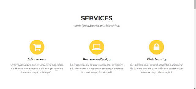
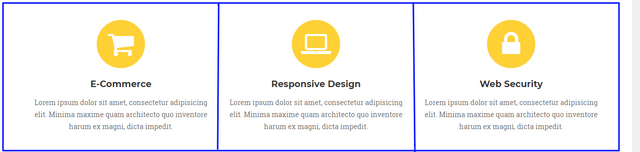
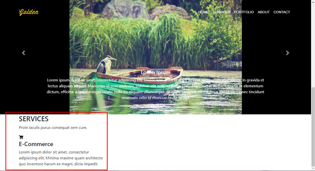
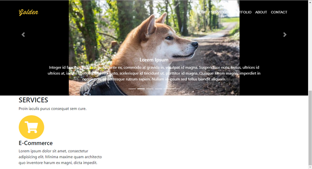
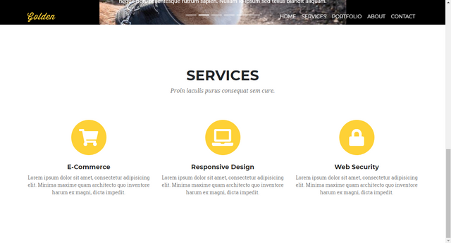
Our services section looks like this:
Let's start by coding our index.html page.
Create a section tag containing our Services section.
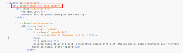
<section id="services">
</section>
Here we have defined the section id. As we mentioned in our previous lesson, with this id, we will link the Services section to the navigation menu.
Let's keep coding. Now we have to create a container inside the section tag.
<section id="services">
      <div class="container">
      </div>
</section>
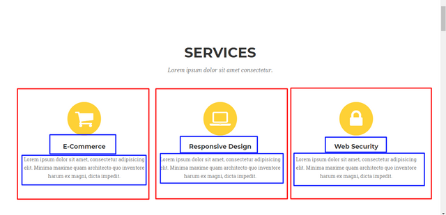
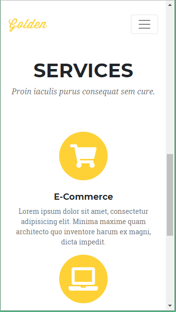
When we look at our design, our Services section is made up of two parts. In the first part we have our Services headline and subtitle. In the second part, we see a structure consisting of three columns.
How can we code these two parts?
Method 1: We create two rows in the container. We can divide the second row into three columns.
Method 2: We can code the first part and the second part in separate div classes.
In this lesson we will apply the second method.
Let's write the following code inside the container class:
<section id="services">
      <div class="container">
          <div class="services-top">
                <h3>SERVICES</h3>
                <p>Proin iaculis purus consequat sem cure.</p>
            </div>
      </div>
</section>
Here we have created the first part. We have added a header and a paragraph into the services-top class.
Let's save our codes and check our page.
If you want, we can delete the services-top class and look at the view of our page.
Change the codes like this.
<section id="services">
      <div class="container">
                <h3>SERVICES</h3>
                <p>Proin iaculis purus consequat sem cure.</p>
            </div>
</section>
Let's save our codes and check our page.
There was no change as you see it. Why did we define our header and our paragraph in the services-top class? The answer is simple.
When you look at our design you can see the headings and paragraphs at many different points. Even in the Services section, where we are now coding, you can see headings and paragraphs in the marked parts of the photo.
When coding our design, we first define the div class, so we will assign different properties to different headings and paragraphs. For example, in Services section, we want the paragraph under the heading to be italic, while we do not want it in the paragraphs below. To provide this, we will define it in a different div class. Let's make our old code and save it.
Let's coding the second part of our Services section.
We will start by creating a div class called services-content and define a row class inside it.
As you can see in the photo, we will split a row into three equal columns and fill each column with similar content.
<section id="services">
      <div class="container">
          <div class="services-top">
                <h3>SERVICES</h3>
                <p>Proin iaculis purus consequat sem cure.</p>
           </div>
          <div class="services-content">
                <div class="row">
                </div>
           </div>
      </div>
</section>
We have created our row class. Using the information we learned in our previous lessons, we will divide a row into three columns. As you will remember, a row in Bootstrap consists of twelve columns. We will use the col-md-4 class for the three columns we want. (12/3 = 4)
Let's add our codes.
<section id="services">
      <div class="container">
          <div class="services-top">
                <h3>SERVICES</h3>
                <p>Proin iaculis purus consequat sem cure.</p>
           </div>
          <div class="services-content">
                <div class="row">
                   <div class="col-md-4">
                   </div>
                   <div class="col-md-4">
                   </div>
                   <div class="col-md-4">
                   </div>
                </div>
           </div>
      </div>
</section>
Our general code structure was formed. Now let's get our content. Note that each section has one icon, one title and one paragraph. We'll get the icons from Font Awesome. We will coding the circle which they are in.
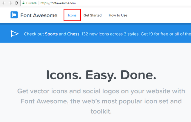
Let's start by getting our icons and placing them. We click the Font Awesome web page.
Font Awesome Free is free, open source, and GPL friendly. You can use it for commercial projects, open source projects, or really almost whatever you want. Source
In the page that opens, we click on the Icons link.
This is our first icon:
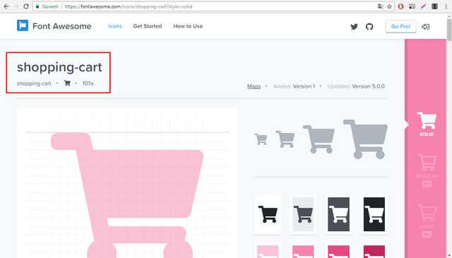
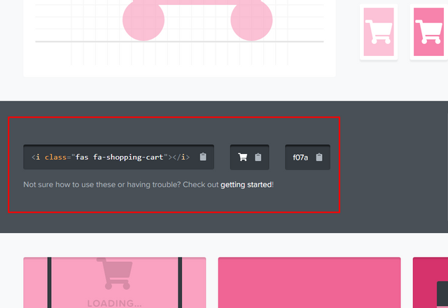
You will see the code we need to add if you scroll on the page.
Let's start coding our first column.
<div class="item-circle">
</div>
We added our first div tag. Let's paste the code of our icon in the picture above.
<div class="item-circle">
    <i class="fas fa-shopping-cart"></i>
</div>
Then let's code our heading and paragraph. Place these codes right under our icon codes.
<h4>E-Commerce</h4>
<p>Lorem ipsum dolor sit amet, consectetur adipisicing elit. Minima maxime quam architecto quo inventore harum ex magni, dicta impedit.</p>
The final version of our codes should be as follows:
<section id="services">
          <div class="container">
            <div class="services-top">
                <h3>SERVICES</h3>
                <p>Proin iaculis purus consequat sem cure.</p>
            </div>

            <div class="services-content">
                <div class="row">
                    <div class="col-md-4">
                        <div class="item-circle">
                            <i class="fas fa-shopping-cart"></i>
                        </div>
                        <h4>E-Commerce</h4>
                        <p>Lorem ipsum dolor sit amet, consectetur adipisicing elit. Minima maxime quam architecto quo inventore harum ex magni, dicta impedit.</p>
                    </div>

                    <div class="col-md-4">

                    </div>

                    <div class="col-md-4">

                    </div>
                </div>
            </div>
          </div>
      </section>
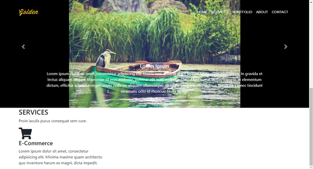
Let's save our codes and check our page.
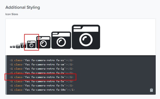
Yes, our icon is attached, but it's a bit small. We want our icon in the size seen in the picture.
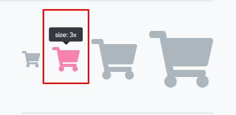
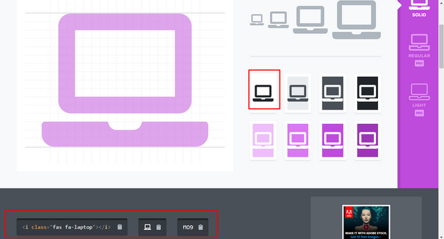
We add the fa-3x class to our icon as shown in the picture. <i class="fas fa-shopping-cart fa-3x"></i>
Let's save our codes and check our page.
It has gained quite a nice view. Now let's shape our icon. Open main.css file. And start editing.
We can write our css codes in the form of i.fas {} because our icon gets the class fas in the i tag. Let's write our codes first and then explain each one.
i.fas {
    color: white;
    background: #fed136;
    width: 100px;
    height: 100px;
    border-radius: 50%;
    text-align: center;
    line-height: 100px;
    vertical-align: middle;
}
What did we do here?
First we defined our icons in white color. We also organized the icon's background color as the main color of our web page (#fed136).
Secondly we got our icon in a circle. And we positioned it in the middle of the circle.
Let's save our codes and check our page.
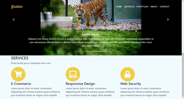
That seems nice. Now let's go to our main.html file and copy all the code in the first column and paste into the other two columns. Edit the headings and paragraphs.Find the icons as below and add their codes.
The final version of our codes should be as follows:
<div class="services-content">
<div class="row">
<div class="col-md-4">
<div class="item-circle">
<i class="fas fa-shopping-cart fa-3x"></i>
</div>
<h4>E-Commerce</h4>
<p>Lorem ipsum dolor sit amet, consectetur adipisicing elit. Minima maxime quam architecto quo inventore harum ex magni, dicta impedit.</p>
</div>
<div class="col-md-4">
<div class="item-circle">
<i class="fas fa-laptop fa-3x"></i>
</div>
<h4>Responsive Design</h4>
<p>Lorem ipsum dolor sit amet, consectetur adipisicing elit. Minima maxime quam architecto quo inventore harum ex magni, dicta impedit.</p>
</div>
<div class="col-md-4">
<div class="item-circle">
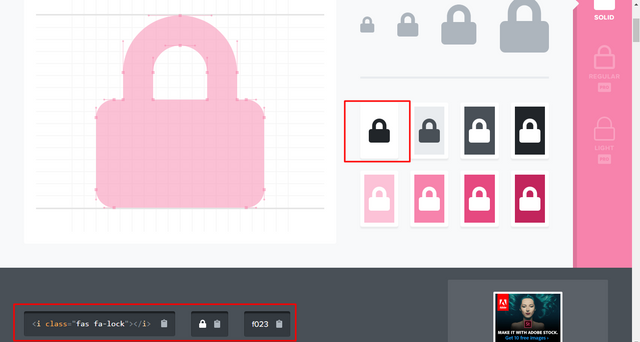
<i class="fas fa-lock fa-3x"></i>
</div>
<h4>Web Security</h4>
<p>Lorem ipsum dolor sit amet, consectetur adipisicing elit. Minima maxime quam architecto quo inventore harum ex magni, dicta impedit.</p>
</div>
</div>
</div>
Let's save our codes and check our page.
Now open main.css file. We will write our codes first and then explain each one.
#services {
    padding: 120px 0;
}
We defined the value of padding as 120 pixel from top and 0 pixel from bottom.
.services-top h3 {
    font-family: 'Montserrat', sans-serif;
    font-size: 40px;
    font-weight: 700;
}
We set the font of the header h3 class in the services-top class as Montserrat. We set the font size to 40 pixel and set the font to bold.
.services-top p {
    font-family: 'Droid Serif', serif;
    font-size: 16px;
    font-style: italic;
    color: #777;
    margin-bottom: 70px;
}
We set the font of the paragraph p class in the services-top class as Droid Serif. We set the font size to 16 pixel and set the font color to #777. Margin-bottom has set to 70 pixel. And also font style is italic.
.services-content h4 {
    font-family: 'Montserrat', sans-serif;
    font-size: 18px;
    font-weight: 700;
    color: #222;
    margin-top: 24px;
}
We set the font of the header h4 class in the services-content class as Montserrat. We set the font size to 18 pixel, set the font to bold and set the font color to #222. Margin-top has set to 24 pixel.
.services-content p {
    font-family: 'Roboto Slab', serif;
    font-size: 14px;
    color: #777;
}
We set the font of the paragraph p class in the services-content class as Roboto Slab. We set the font size to 14 pixel and set the font color to #777.
We have linked our fonts to our index.html file in our previous lessons.
<link href="https://fonts.googleapis.com/css?family=Droid+Serif:400,400i" rel="stylesheet">
<link href="https://fonts.googleapis.com/css?family=Montserrat:400,700" rel="stylesheet">
<link href="https://fonts.googleapis.com/css?family=Roboto+Slab" rel="stylesheet">
Finally, in our index.html file, we will add the text-center class to containerclass in services section and center all content.
Let's save our codes and check our page.
It looks pretty good. Let's look at the Responsive feature. Reduce the screen size.
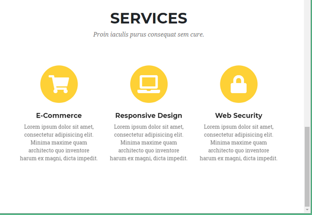
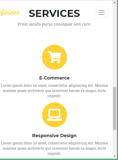
We will arrange our responsive features in the future, but even now it looks good.
We came to the end of this part of our education. Thank you for your interest.
Posted on Utopian.io - Rewarding Open Source Contributors
Thank you for the contribution. It has been approved.
You can contact us on Discord.
[utopian-moderator]
Hey @neokuduk I am @utopian-io. I have just upvoted you!
Achievements
Suggestions
Get Noticed!
Community-Driven Witness!
I am the first and only Steem Community-Driven Witness. Participate on Discord. Lets GROW TOGETHER!
Up-vote this comment to grow my power and help Open Source contributions like this one. Want to chat? Join me on Discord https://discord.gg/Pc8HG9x
Congratulations! This post has been upvoted from the communal account, @minnowsupport, by neokuduk from the Minnow Support Project. It's a witness project run by aggroed, ausbitbank, teamsteem, theprophet0, someguy123, neoxian, followbtcnews, and netuoso. The goal is to help Steemit grow by supporting Minnows. Please find us at the Peace, Abundance, and Liberty Network (PALnet) Discord Channel. It's a completely public and open space to all members of the Steemit community who voluntarily choose to be there.
If you would like to delegate to the Minnow Support Project you can do so by clicking on the following links: 50SP, 100SP, 250SP, 500SP, 1000SP, 5000SP.
Be sure to leave at least 50SP undelegated on your account.
The second step is to decide which style https://astra-motion.com/about-us/ suits your brand. You can use either complex art direction or simple, minimalist visuals to make a lasting impression. Keep in mind that the style of the video will depend on the audience you are targeting. The best video production and animation partners will collaborate with you to come up with the best solution.