Logo For Coogger

Detail
Response to coogger Need web design advice and logo. Task request from @hakancelik
Coogger is an Open Source information sharing network that works with multiple applications and rewards these information shares.
Benefits / Improvements
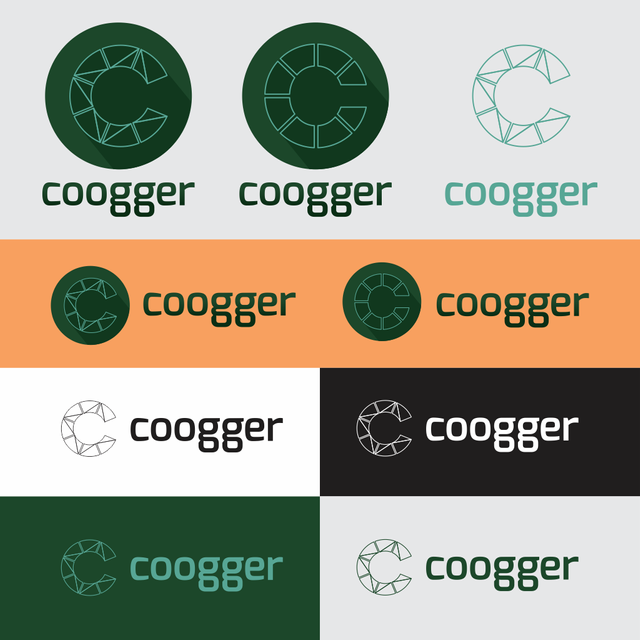
According to the task requests from the project owner, I create 2 different logos. I created a logo with a circle to form it into letter c according to the name of the coogger website.
Variation
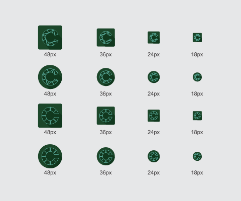
Size

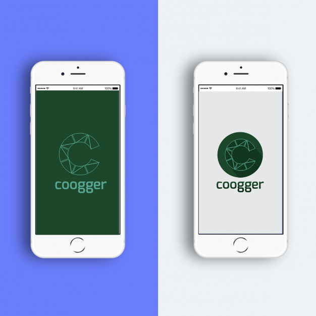
Mockup
Proof of work
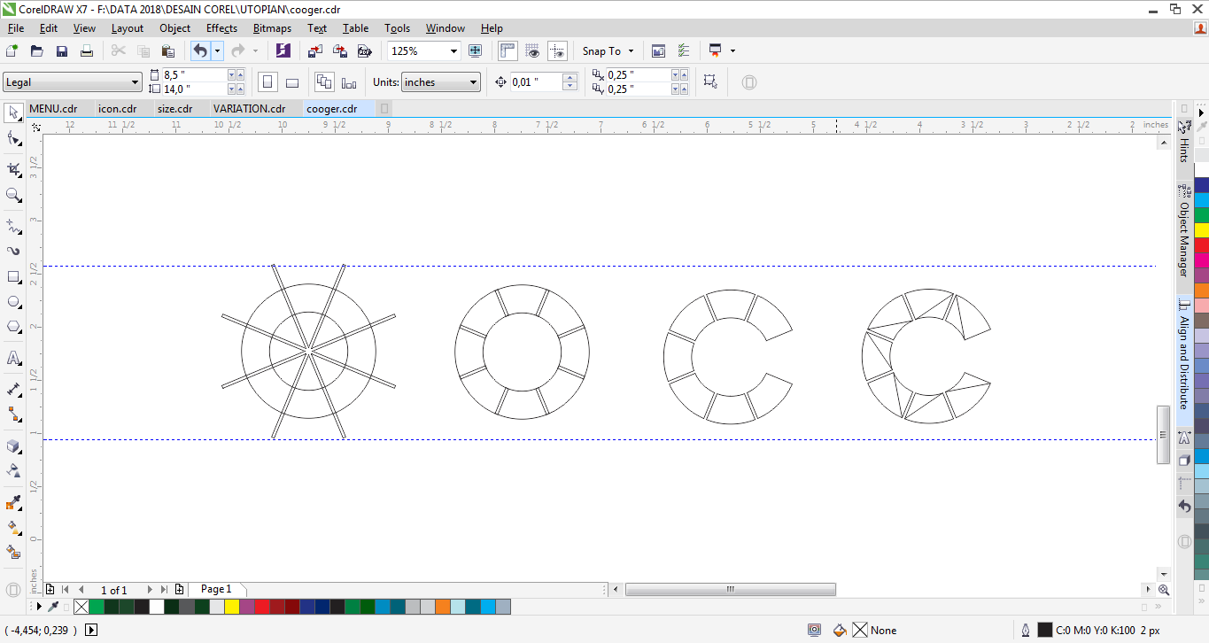
Tools
To design it i used CorelDRAW X7.
Original files

This work is licensed under a Creative Commons Attribution 4.0 International License.
Posted on Utopian.io - Rewarding Open Source Contributors
Thank you. Your contribution has been chosen by the project owner and approved.
Need help? Write a ticket on https://support.utopian.io.
Chat with us on Discord.
[utopian-moderator]
Hey @baranpirincal, I just gave you a tip for your hard work on moderation. Upvote this comment to support the utopian moderators and increase your future rewards!
Super Boost Your Post To Sky
Cheap resteem service you will ever get.
Exclusive Get Free Upvote for 30 days (limited time offer)
ORDER NOW CLICK HERE
Akhirnya. Selamat selamat.
Terimakasih bro @podanrj. Tp ya ada aja rintangan. Masak di bilang saya plagiat. Mungkin sama fontnya. Tapi bentuknya kan beda. Ahh sudahlah kita angkat jaroe manyang2 manteng u ateh. :D
Hey @midun! Thank you for the great work you've done!
We're already looking forward to your next contribution!
Fully Decentralized Rewards
We hope you will take the time to share your expertise and knowledge by rating contributions made by others on Utopian.io to help us reward the best contributions together.
Utopian Witness!
Vote for Utopian Witness! We are made of developers, system administrators, entrepreneurs, artists, content creators, thinkers. We embrace every nationality, mindset and belief.
Want to chat? Join us on Discord https://discord.me/utopian-io
Great work man!
The C with the greatest amount of edges looks so cool. The only problem is that in small sizes the strokes looks a bit broken, perhaps you could make the strokes a bit wider to avoid it.