New Logo for OkSocket
Repository
https://github.com/xuuhaoo/OkSocket
Details
this is an opensource project. This project runs on the Android operating system. this is a lightweight project. This project works for Client blocking sockets for Android applications.
this project does not have a logo, and I offer to make an interesting logo for this project and the project owner agrees. After that I sent a pull request. And the project owner has agreed to that. See our conversation about the link below.
Benefits / Improvements
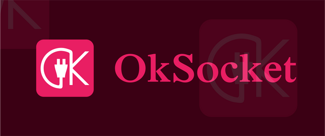
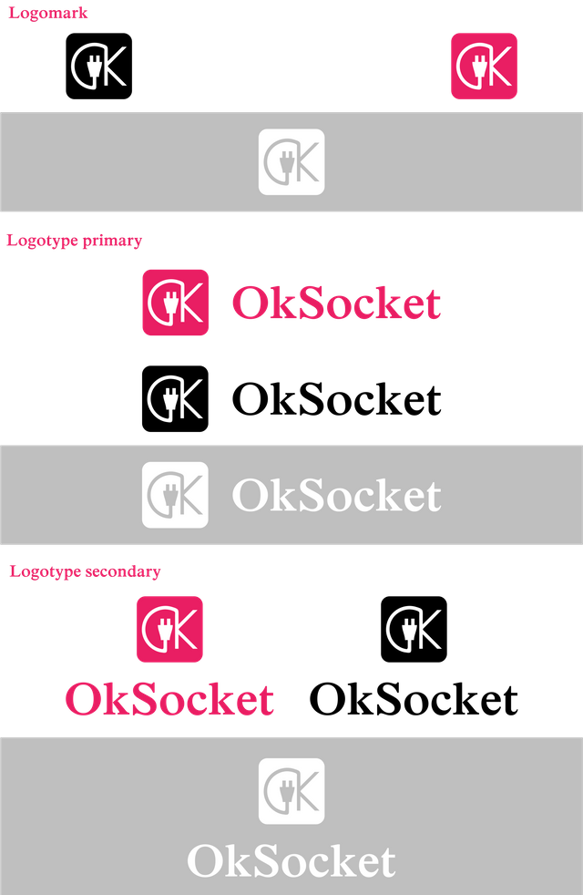
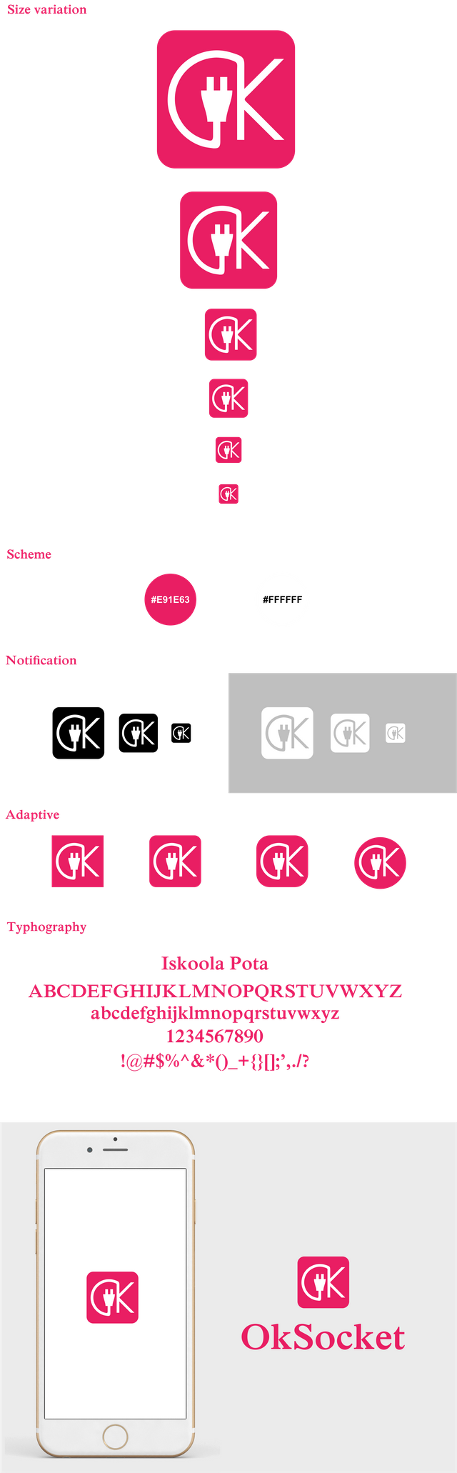
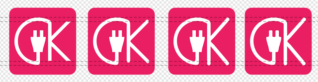
After I review this project. This project does not have a logo. so I offer to create a new logo for the project owner. This new logo looks unique and interesting. the logo design is inspired by the O and K letter socket icon. I combine the three so that it becomes interesting like that. It designs like that so that this icon matches the project name. and I wonder why in the logo project owner is not visible. even though the project owner has received this logo (merged) In this design I use the material color and Iskoola pota font.
Proof of authorship
Tools
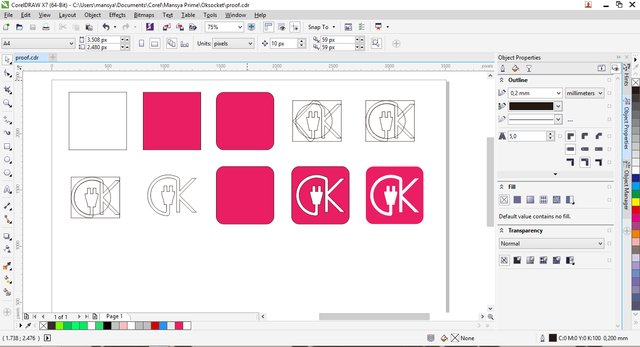
I use CorelDraw Graphics suite X7.
Original files
Drive link
Mockup link
Font link
Proof of Work Done
https://github.com/mansya/OkSocket

This work is licensed under a Creative Commons Attribution 4.0 International License.
Everytime you are telling you are going to "fix it next time" but clearly you are just ignoring every feedback and suggestions, you keep editing the same presentation.
You put filename instead of url,
<img src="Logotype primary.png" width="60%" height="60%" />that's why logo is not visible on the readme file. And I don't know how project owner overlooked it and merged it into the project.
https://github.com/xuuhaoo/OkSocket/pull/93/commits/1b267ed79f2d088672a88a0cf68742b0990a8a0f
I like the idea but I can see it could be executed better. For example bigger portion of the logo is circular/rounded but when it comes to letter K it ends with all straight lines. Instead of this I would go for the below changes.
Displaying same thing over and over again makes it less interesting, if you show black and white version once there is no need to show it in every size and everywhere in many times. When I scroll through your post I'm seeing the same thing several times, it would be better to see some progress instead. Maybe a sketch phase, a more detailed idea phase.
You're telling it's an android application but you are using an iOS device to present the icon, why?
You mentioned "it's an open source application and it doesn't have a logo currently" twice, instead of this you may explain why did you use sans-serif like "K" letter on your logo mark but you choose to use serif typeface in your logotype.
https://basicdas.com/serif-and-sans-serif/
Your contribution has been evaluated according to Utopian policies and guidelines, as well as a predefined set of questions pertaining to the category.
To view those questions and the relevant answers related to your post, click here.
Need help? Write a ticket on https://support.utopian.io/.
Chat with us on Discord.
[utopian-moderator]
Thank you for your review, @oups!
So far this week you've reviewed 4 contributions. Keep up the good work!
Sorry, Sir. it's my old design. so only a few days this has been merged pull requests. sorry about that. I'm really sorry sir
Hey @mansyaprime
Thanks for contributing on Utopian.
We’re already looking forward to your next contribution!
Want to chat? Join us on Discord https://discord.gg/h52nFrV.
Vote for Utopian Witness!