New Logo Design For ''cyclestreets.net''
Details
Hello to everyone,
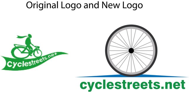
cyclestreets.net is an open source cross-platform offline maps application and with it's source-code available on GitHub. I decided to design a new logo for this project. The new logo looks much more useful and beautiful than the original. I hope you will like it.
Benefits / Improvements
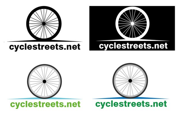
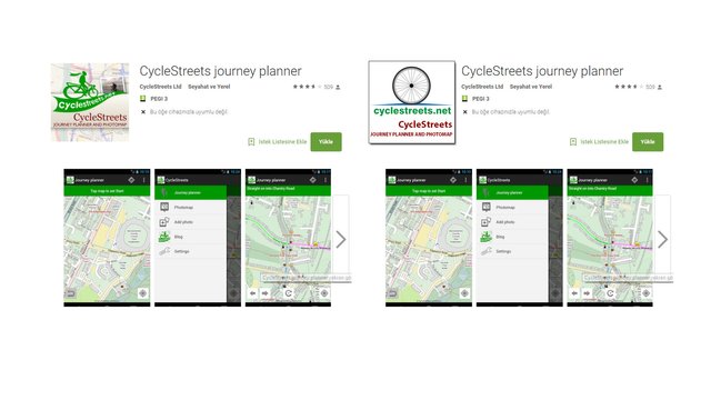
The original logo of cyclestreets.net is a logo that does not appeal to a lot of people. my newly drawn logo reveals the professionalism of the application. I made 3 alternative colors for the new logo. I added a blue line that represents the new logoda bike path. And I used the original logo color.
Mock up's
Tools
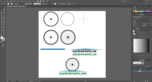
I used Adobe Illustrator CC to draw the new logo. And Proof of my works;
Original files
Click here to access all editable (vector, psd, pdf, svg) files and fonts.
Thanks for be interested.
Posted on Utopian.io - Rewarding Open Source Contributors



It's very nice study.
Thank you.
Wow. It is much more beautiful than the old one. Congratulations.
Thank you for your nice comment.
It looks good. Achievements.
Thank you my friend.
It was a beautiful narrative in detail. I hope the new logo is useful. :)
Thank you.
Your contribution cannot be approved because it does not follow the Utopian Rules.
You can contact us on Discord.
[utopian-moderator]