Logo/icon design for Linux Deploy
Details
In this post I will give a logo proposal on linux deploy application.
Linux deploy is an application that can make smartphone and tablet android can run pc desktop operating system (OS).
for more details you can directly to his website here
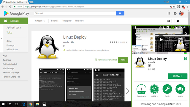
Google play
Github
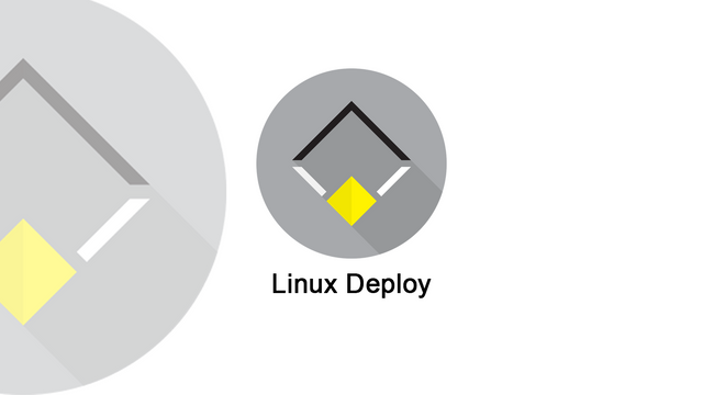
Original logo/icon
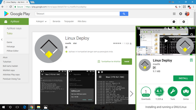
Proposal logo/icon
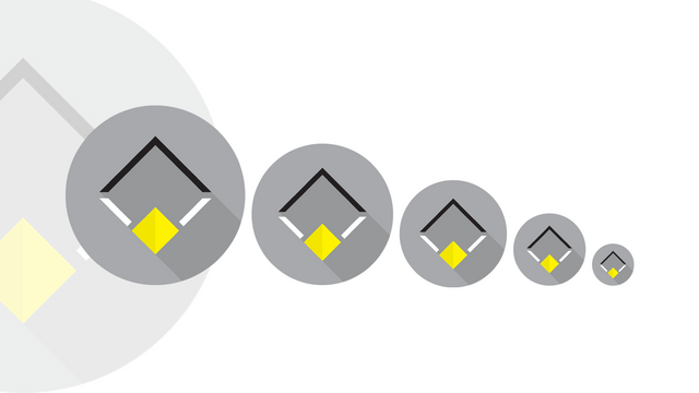
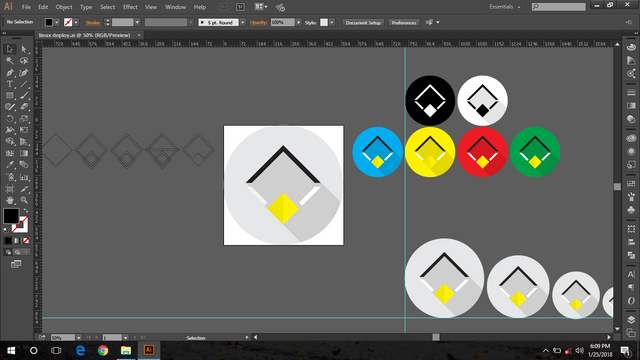
Color variations
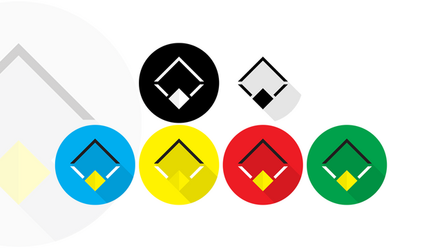
Size Variations
Benefits / Improvements
I have some reasons in proposing the logo / icon in this app. I see from the current logo, the logo is like a doll and I think like penguin game logo. So I have an idea to replace a more simple and elegant logo by using a very attractive and modern flat design style but still wearing penguins, I just use the head. When viewed from the overall logo I do not miss the original logo. hope you like it.
Tools
Adobe illustrator cc 2015 (Design)
Adobe Photoshop cc 2015 (Presentation)
Process
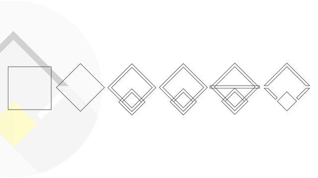
proof of work
Thanks
Original files
Google Drive : All file
Font : Arial
Posted on Utopian.io - Rewarding Open Source Contributors
Mantap design bg 👍
Bek npgh ile meunan. Preh ji aprv ile. Kaleuh itulak sige sbb. Haha
Saba tengku, iklas, trok bak postingan ka geu ato, rezeki ka jelas, tetap semangat, penteng usaha aju bek kendo :)
Yg pntng Usaha ile. Hehe
sige itulak , di aprove 100 ge hahaha
Hehe
Hello @lowlevel can you explain a bit how you came to this solution and about your process? and why have you selected the Font Arial?
Have you tried other solutions that this one?
I use arial fonts just as a presentation only. if i use another font also can. it's just that I like to use font like that. if any suggestion from you. i can try it with another font .
Ah, ok. Well i would never use Arial but that is personal taste.
Have you tried different approaches to your final result? I mean the icon.
this is the second time I tried it brother. if there is my mistake, please give advice. I will accept it. thanks .
most of the time there are no mistakes in design, just good or less good choices.
for my opinion the white lines of your penguin head do not have enough contrast to the light grey background.
I'm not sure if this "shadow" helps the whole concept of your icon. and to be honest, i'm also not sure if this rectangle penguin design is clear enough.
i had to stare at it for quite a while to even recognize that it should be a penguins head.
I'm totaly not your foe! ;-) i just want to help you to develop your design skills. as it is my everyday job anyway.
Thank you for the advice. next time I will be more careful in designing. thanks
Bang @lowlevel, lon izin cok sample warna nibak logo dron beh.
Ok
Your contribution cannot be approved because it does not follow the Utopian Rules.
You can contact us on Discord.
[utopian-moderator]