You are viewing a single comment's thread from:
RE: Timber Music Player Logo Proposal
@baranpirincal,
lol..... as predicted.
Between one moderator and other have a different rules. waakakakakakakaa.... which one should be following by contributors ??? hahahahahaha
@baranpirincal, you are funny guys...
Try to make this image in all different perspective bro
[] )
)
You will got the image which I built.
You did not found ?? learn more about the design graphic.
I will report this to utopian.io officially
@loenrizqael
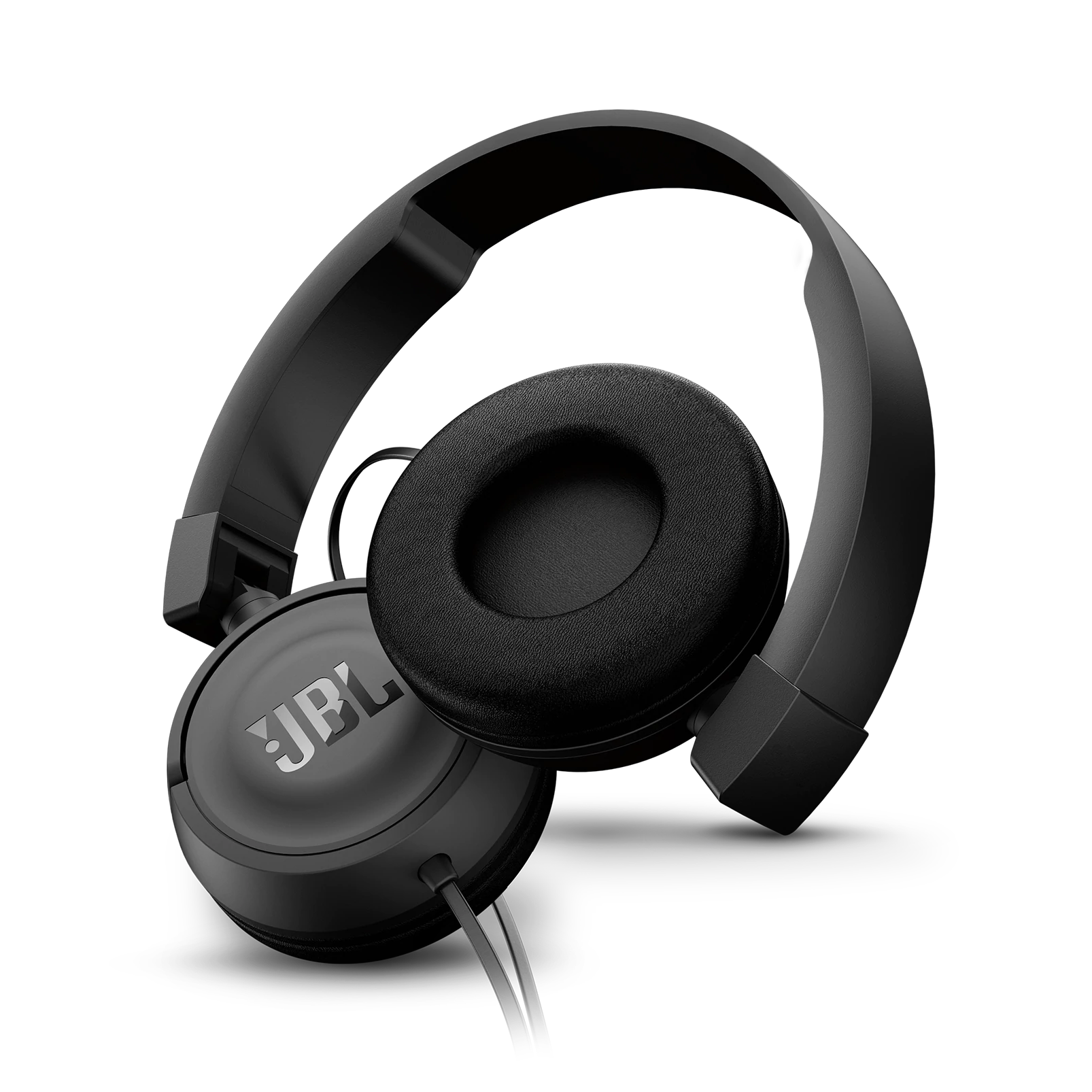
Of course, you can do whatever you want, you can complain me too but you can not talk about my design knowledge. I said my own opinion. The symbol looks more like an eyes, half-face or binoculars than a headphone. If you are designed a headphone, existing logo design is already has a headphone and it is obvious that it is a headphone. For this reason, your logo design has no benefit over their existing logo design. Also, the thin lines which is in your logo design, it disappears in small sizes, so your logo becomes even more meaningless.
@baranpirincal
Course reported officially already done and as information, the evaluation will be conducting ASAP. Good luck..