That is what I call uniq and make this logo memorable sir for being different with other VF logo. If project owner want letter VF look obviously it will be generic logo. Try google VF logo sir if you don't believe me
You are right, in fact this two letters don't allow you experiment a lot with their forms since they are very very simple, I have already searched on google and I've seen common stuff because of that (the structure of these two letters) and it becomes a hard challenge to conceive something singular. Wish you the best, your work is the cleanest and most professional I've seen so far!
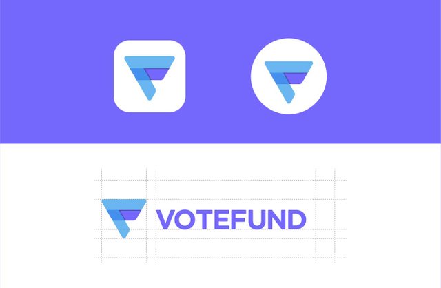
Nice work fellow! though the letter V is still kind of hard to understand despite I perceive that you associate it with an inverted triangle.
That is what I call uniq and make this logo memorable sir for being different with other VF logo. If project owner want letter VF look obviously it will be generic logo. Try google VF logo sir if you don't believe me
You are right, in fact this two letters don't allow you experiment a lot with their forms since they are very very simple, I have already searched on google and I've seen common stuff because of that (the structure of these two letters) and it becomes a hard challenge to conceive something singular. Wish you the best, your work is the cleanest and most professional I've seen so far!