Usabilty improvements for eSteem Surfer app editor

Repository
https://github.com/esteemapp/esteem-surfer
Components
The suggestions are particularly for the post scheduler functionality in the 'editor'.
Problem statement
New eSteem update 2.0.4 brings date & time picker for the post scheduler. It was much needed update since the previous selection wasn't user friendly.
I have certain usability enhancement on the 'schedule' feature.
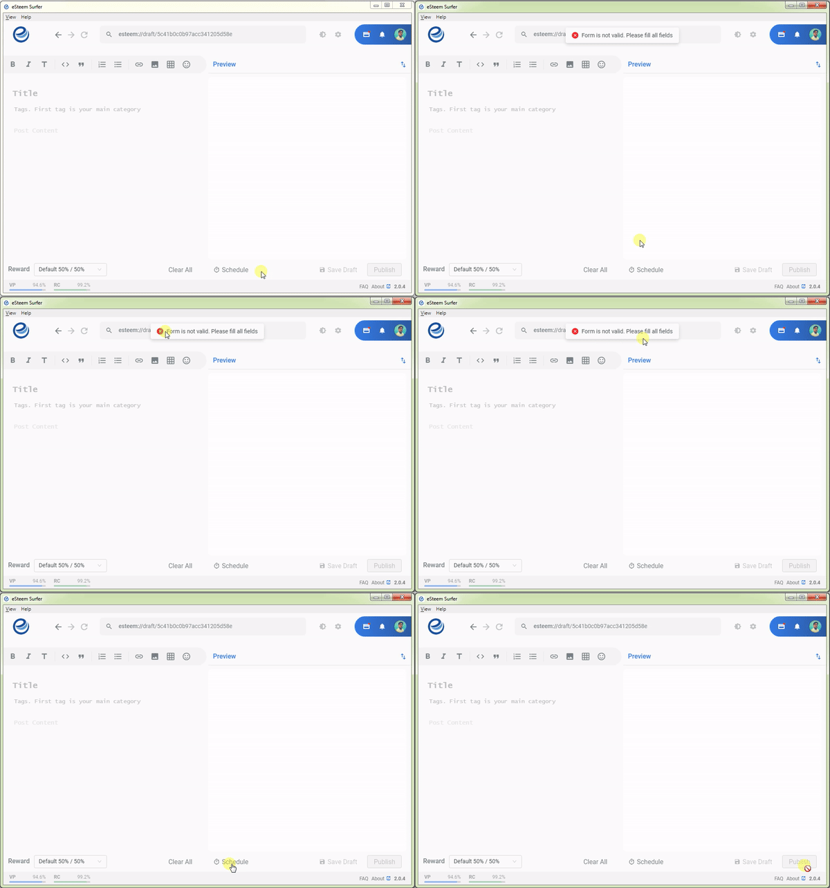
- When we try to schedule a post without title or tags, it shows an error 'Form is not valid'. The error is not clear to the user(and sounds too technical).
- The date time picker doesn't say whether you are selecting based on your local time or UTC time. This is confusing for the first time user.
- When the user schedule a post and then click on 'Publish' button, the post gets published immediately but you can also see that under 'Schedules'. Again a confusing behavior for the first time users.
Proposal Description
Let us now discuss some of the possible solutions for tackling some of the usability issues mentioned above.
.1. When we try to schedule a post without title or tags, it shows an error 'Form is not valid...'. The error is not clear to the user(and sounds too technical).
When the user try to 'save draft' or 'publish' a post without entering title or tag then the user action is stopped by disabling the 'Save Draft' and 'Publish' buttons, so that it is mandatory for the user to add title/tag/content to save it to the draft or publish. Similarly, the app must disable the 'Schedule' button when the user try to schedule a post without a title or tag.
Instead of allowing the user to select schedule and then display an error message which reads 'Form is not valid. Please fill all the fields', it is better to disable it altogether. Also, the error messages should not be technical in nature(like form is invalid etc), they must be in simple plain English.
.2. The date time picker doesn't say whether you are selecting based on your local time or UTC time. This is confusing for the first time user.
When I wanted to use the schedule functionality, I couldn't find any info about the timezone whether this will pick my local time or UTC time or some other server time. Tried to google it out but unsuccessful to find anything relevant.
It would be nice if we have a simple line(may be greyed out) which will inform users that they are selecting time based on their time zone. The info can also be shown on hover of date/time or an icon but the implementation detail is upto the team to decide.
.3. When the user schedule a post and then click on 'Publish' button, the post gets published immediately but you can also see that under 'Schedules'. Again a confusing behavior for the first time users.
This is again based on my personal experience with the eSteem surfer, I'm sure many others would have also experienced it atleast for the first time. After composing the post, I schedule it by selecting a date and time, then I was still in the editor so thought I have to click on 'Publish' so that the post gets published on the selected date and time but * BAM! * the post is already live!
IMHO, this is a serious usability issue. First time users will be caught unaware of how things work. They would have to be educated, trained or learn from their first experience but all of these are bad UX for a product. We can tackle this issue in multiple ways, some of the proposals/alternatives are as follows:
- When a post is 'Scheduled', exit the editor with a message that the post is scheduled. eSteem Surfer app already shows a message, so we are good with the message part.
- When a post is 'Scheduled', change the publish button text to 'Publish Later', so that when the user click on it just exit the editor, which will give an impression that the post will be published on selected date time.
- When a post is 'Scheduled', display an additional button(or text link) which will say 'Publish Later' and also change the exisiting publish button to 'Publish Now', so that the user can take informed decision. When they select 'publish later', the editor should exit and the 'Publish Now' will behave in same way how 'Publish' does it now.
From the functionality perspective it is not much of heavy lifting to be done but tweaking the text and interactions will improve usability of the editor in eSteem Surfer app.
Mockups / Examples
Current behavior of the scheduler when the title/tag is empty:

Alternatives for 'Publish' button:
Publish Later and Publish Now as buttons

'Publish Later' as link

Change 'Publish' button to 'Publish Now' if the post is scheduled.

Benefits
The above changes increase the usability score of the app. Any product should be intituive and user friendly. At any cost it should avoid confusion and ambiguity.
- It avoids confusion to the first time users, with clear and easy-to-understand text
- User interaction with schedule and publish is intituive.
Hello, @lifecruiser. Thank you for supporting Esteem surfer with some valuable UX ideas. Honestly, I appreciate how well thought out these ideas is. I believe that it will for sure improve the app user experience to a reasonable level. It is so kind of you to have provided useful mockup to better describe your ideas.
I have noticed that you have not submitted this as an issue on the project repository. Please do consider doing that as soon as possible to enable the project owner or maintainer keep track of this idea.
Thank you for using Utopian and I do hope to see more awesome idea contributions from you.
Your contribution has been evaluated according to Utopian policies and guidelines, as well as a predefined set of questions pertaining to the category.
To view those questions and the relevant answers related to your post, click here.
Need help? Chat with us on Discord.
[utopian-moderator]
Thank you for your review, @knowledges! Keep up the good work!
Congratulations @lifecruiser! You have completed the following achievement on the Steem blockchain and have been rewarded with new badge(s) :
Click here to view your Board
If you no longer want to receive notifications, reply to this comment with the word
STOPTo support your work, I also upvoted your post!
Hi @lifecruiser!
Your post was upvoted by @steem-ua, new Steem dApp, using UserAuthority for algorithmic post curation!
Your post is eligible for our upvote, thanks to our collaboration with @utopian-io!
Feel free to join our @steem-ua Discord server
Hey, @lifecruiser!
Thanks for contributing on Utopian.
We’re already looking forward to your next contribution!
Get higher incentives and support Utopian.io!
Simply set @utopian.pay as a 5% (or higher) payout beneficiary on your contribution post (via SteemPlus or Steeditor).
Want to chat? Join us on Discord https://discord.gg/h52nFrV.
Vote for Utopian Witness!