A Small Design Change to Make the Esteem App More User-friendly
Components
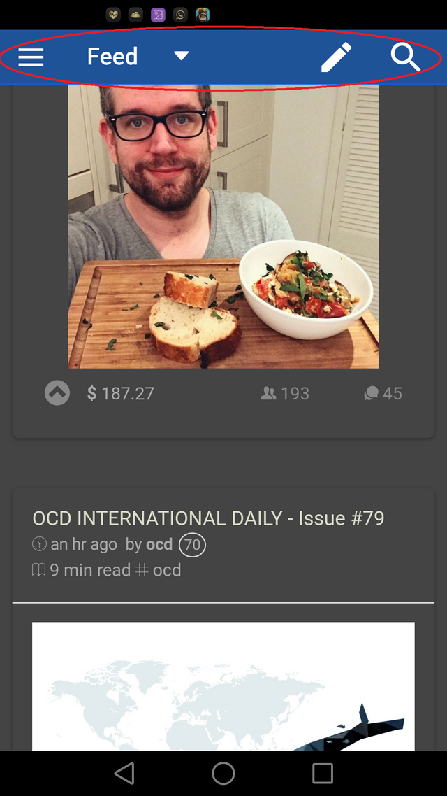
I've been using the Esteem app ever since I signed up on Steem, and I think that it's great, but I feel that it also has the potential to go from great to amazing. The one thing that has always annoyed me about the app was all the scrolling that you need to do to get to the menu, when you're on your own or someone else's profile page.
No access to the menu from here.
Proposal
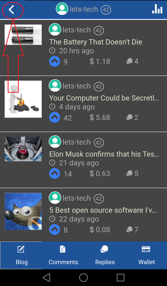
My suggestion is that the app should have a header view that follows you wherever you scroll to, allowing you easy access to the main menu, just like the app has on it's other pages.
Mockups / Examples
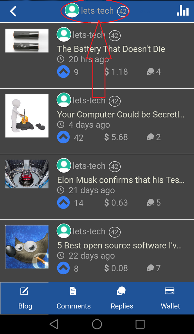
This is how, I think, the profile page should look.
Clicking on the username, could automatically scroll you up to the top.
The menu should be part of this view, as it is a vital component to browse easily.
Benefits
This would make the app a lot more user-friendly, and make it a lot easier to maneuver from the profile page to the rest of the app. People find it really frustrating to scroll down furiously when looking for a specific post, comment, reply or transaction only to have to scroll furiously all the way back up. I imagine that this change would be a great help.
What do you guys think?
Thanks for reading!
Posted on Utopian.io - Rewarding Open Source Contributors


@originalworks
The @OriginalWorks bot has determined this post by @lets-tech to be original material and upvoted it!
To call @OriginalWorks, simply reply to any post with @originalworks or !originalworks in your message!
Thank you for the contribution. It has been approved.
You can contact us on Discord.
[utopian-moderator]
Thanks!
Hey @lets-tech I am @utopian-io. I have just upvoted you!
Achievements
Suggestions
Get Noticed!
Community-Driven Witness!
I am the first and only Steem Community-Driven Witness. Participate on Discord. Lets GROW TOGETHER!
Up-vote this comment to grow my power and help Open Source contributions like this one. Want to chat? Join me on Discord https://discord.gg/Pc8HG9x