KURE Community Curation App Update - Hiding Resteems, Flag/Downvote Posts, Follow/Unfollow on Posts and Blogs, and Searching Follows
A greatly significant but often disliked feature has finally been implemented on KURE, the infamous flag, otherwise known as the downvote now on Steemit.com. I personally don't like the flag, but I understand it's crucial important in a blockchain where money rules and people try anything to exploit the system to get more money. A flag is unfortunately the only way to beat back scammer and spammer. Though, it is often used in abusive ways to target individuals simply for not liking a post or the person.
If a flag was done in error, or the flagger wants to remove the flag, this can also be done and return the rewards back to the user. Sometimes flags are done in anger, and after some time a user can remove the flag and let the rewards go back to the post. This is an important feature to have.
Another new feature with high value for user experience is the hiding of resteems that can often be direly needed when looking at some blog pages. Sometimes you want to see only the blog author's own posts, but they have resteems all over the place and finding their own content can be hard. Some users never even posted themselves, and hiding resteems can show that. This can help you find what the author writes about and decide if you want to follow them, or get bombarded with resteems often if you like that.
The ability to follow and unfollow anyone has been spread toa ll relevant pages, which are the Blog page for a user, and the individual post pages. This way you can follow people as you come across their content which enhances the user experience greatly.
The follow pages (followers, following) has a new feature which I haven't seen on Steemit or Busy: searching for users. This bring greater user experience value to KURE by enabling people to find users by letter when they want to prune their lists, or see if someone is following someone else for other people's lists.
Other changes include some bug fixes with comment dates, and busy.org uploaded images showing broken links. The SEO was also improved on many fronts with the description of posts being fixed, as well as SEO HTML head data being added for all other pages.
Any feedback or criticism is welcome and appreciated. I am looking to improve the app and your experience using it.
What do you want to see next?

Repository
Site
Index
- What is KURE?
- What's new?
2.1 Added follow/unfollow to Pages
2.2 Added searching for followed/follwing users
2.3 Added searching for follows by letter
2.4 Added menu link to steemitwallet
2.5 Added HTML head SEO data for all pages
2.6 Added hiding resteems on blog pages
2.7 Added flagging/downvoting for posts
2.8 Added removing a flag/downvote - Bugs, Tweaks and Other Changes
3.1 Fixed bug with uploaded images from busy being broken
3.2 Fixed posts missing SEO description in HTML head
3.3 Fixed Comment Display Date Being Ahead by 4h
3.4 Changes site width to get rid of extra padding that wasted screen space - Pull Request / Latest Commits
- Roadmap
- Contact
1. What is KURE?
Kindred United to Reward Everyone.
A Community Platform and Curation Network Remedy for Steem
Do you want to find content that other people really value, based on topics that interest you? How?
Upvotes don't do it, because so many upvotes come from autovoting, autobots, or curation trails. You don't know if a vote for content is done by a real person, or some automation. The content isn't being evaluated when it's automated.
Plus, you can upvote so many things, which can be unrelated.
Imagine a curation network where people are interacting through community groups to share and value content, and you can really see what they value globally through various communities that people organize and collaborate together to build.
KURE provides a network hub for people to create their own community groups for evaluating content to curate. It will also develop into communities to create posts within.
Create your own communities and have others join to contribute. Make up your own criteria. Manage who can add curation links to your community group. Anyone else can follow your community and engage.
My goal is to make content easier for everyone to find by all of us sharing the content we like trough communities. Others can find communities they are interested in and see what is being curated within that community to also support it with upvotes, resteems and comments.
Maybe you want to share what you value, and get others to see it or support it, but don't want to resteem it, or want more people to see it. On KURE, the community you create and those who are involved in it will popularize content you value and allow others to see it. Another way of thinking about it, is it's kind of like having a custom community feed, based on a community that engages in creating it, rather than just one person.
KURE empowers the Steem community to coordinate their curation efforts through building community networks of their own.
2. What's new
Video Demonstration
2.1 Added follow/unfollow to Pages
With the follower and following pages developed along with the ability to follow or unfollow people listed there, it needed to spread throughout the site some more. That's why the Blog page now has the follow and unfollow functionality added to it.
Go to any blog page of a user, and you will see a Follow button to start receiving their posts in your feed.
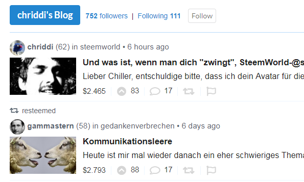
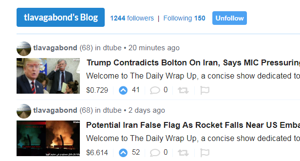
If you visit a blog page where you already are following them, you will see the option to Unfollow.
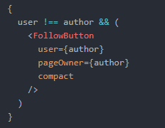
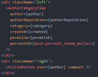
This was done by adding the FollowButton component to the posts component when the current page owner isn't the same as the logged in user.
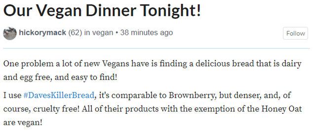
The best place to want to follow someone is when you find content you like. That's when you know you the author/user is putting out content you like and you want to know when more of it is put out in the future. Going to any post will let you either follow or unfollow that author.
When you look at a post, you can see more from that user if you click on the Follow button located at the top near the title.
If you're already following someone, maybe you don't want to see any more of their posts for whatever reason. You can simply click on the Unfollow button and you will have one less person's posts showing up in your feed.
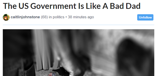
The FollowButton component does all the work. It's added to the PostDetails component alongside the component that shows the author name, category tag and time posted as a left floated element.
2.2 Added searching for followed/follwing users
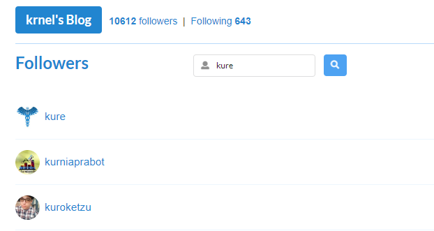
KURE now has a feature I haven't seen elsewhere, at least not on Steemit.com or Busy.org. You can search your follower and following list, and anyone else's. This might be especailly useful for pruning one's own following list. I recall someone suggesting this, or complaining that steemit doesn't have the ability to search for follows. So now KURE does!
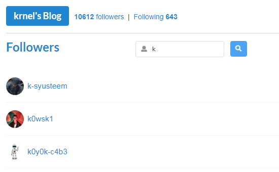
You can search for any user in Follower section, or in the Following section. Just put in the name, or letter to start at a letter. If the name doesn't exist, it finds the closest alphabetical match to show result from, and goes up the alphabet from there.
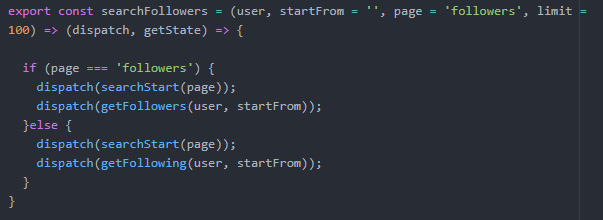
A form takes the values and stores it into the local state on every change. Then when the search is initiated, the type of follow (either followers or following) is sent to a function which then grabs the search value from the local state.
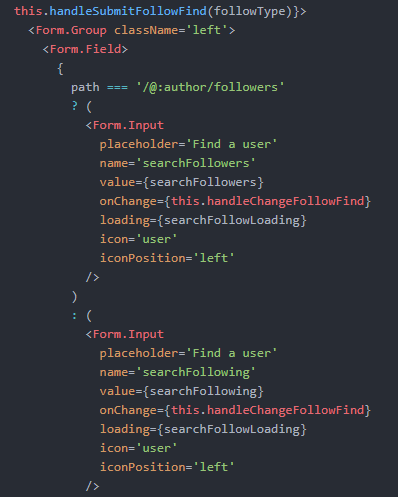
These are both passed to Redux actions to get either the follower or following list to match the search value. The user to get followers for is required, and the search value to start from is optional, as is the page type and limit of results to return.
2.3 Added searching for follows by letter
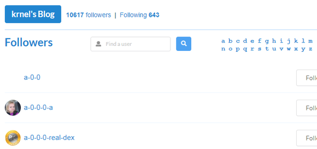
To make it more intuitive that you can search by a single letter to find users that start with that letter, there is an alphabet menu to choose from on the follow pages (followers and following).
When going to the Follower or Following pages, you have the default search that shows the user list alphabetically from the letter 'a'. You can search for any letter if you want.
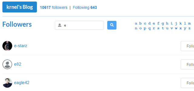
Rather than type in the letter, you can just click on it and get the users that start with that letter and any users that come after that letter will show after. Whatever letter is clicked on, it will show up in the search field.
A string of letters is split into an array and then mapped out to HTML elements for display on the page as links to execute searches.
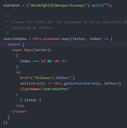
Before sending the request to Redux to perform the search, the type needs to be extracted from the React path of the page.

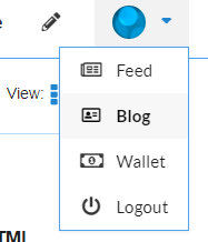
2.4 Added menu link to steemitwallet
Since there is no wallet on KURE developed yet, I still wanted to have a wallet easily accessible. The steemit wallet site has been added to the menu link for now to allow anyone to claim rewards or do other wallet things.
2.5 Added HTML head SEO data for all pages
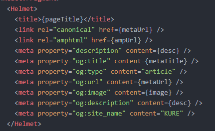
When viewing a page in a browser, the text displayed comes from the HTML head title tag. KURE had a default set for pages statically from the root of the app. I previously only had the title dynamically set for the individual post pages. This meant switching between pages resulted in the same title and tab text, and when switching from a post page, the next page kept the title of the post even though it wasn't the post page anymore.
All the pages have the same basic HTML head data added via Helmet. The page title and the description would be the most important. Now pages have seprate titles and their own description for SEO search results.
2.6 Added hiding resteems on blog pages
Sometimes resteems can clutter a blog page. Whether it's your own page, or someone else's, being able to filter them out is a valuable feature to have. Hiding resteems was introduced on Steem many months after resteeming was made available. KURE has this feature available in much quicker time.
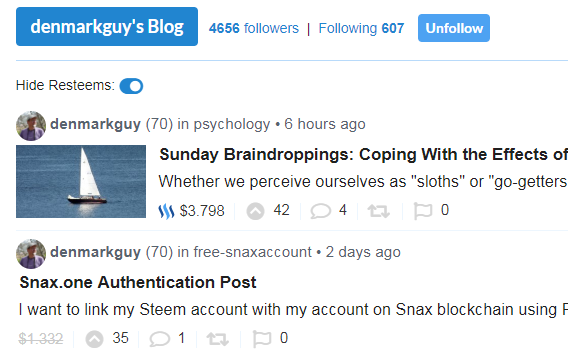
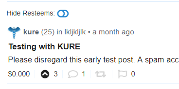
If you want to look at only a user's own posts on their page, you can toggle the Hide Resteems icon.
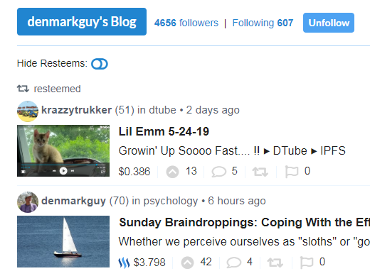
When clicking on the icon, all resteems will disappear from the current view and future scrolls to fetch more data for the blog page.
The toggle icon is set based on the local state showResteems being true or false. It only shows for blog pages.
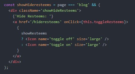
When the icon is clicked it will toggle the state to the opposite of what it currently is.

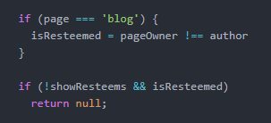
To show or hide the post, the post in question needs to be a resteem which is determined by the post author not bein the same as the blog page owner. If the showResteems is toggled to false, then the post is skipped from rendering on the page.
2.7 Added flagging/downvoting for posts
A crucial feature to combat misbehavior on the blockchain ins the flag or downvote feature. After some time avoiding implementing it, I finally got around to bringing this significant feature to KURE. Flags or downvotes are often abused by those who simply downvote what they don't like. With an imperfect system that allows people to buy votes for trash, flagging has gained more popularity as well to reduce rewards for those who do so.
To flag a post, you need to click on the gray flag icon at the right of the main post actions. Hovering over it will turn red.
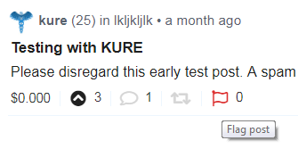
Once clicked, the flag vote slider will appear where you can choose the amount of vote weight to apply to flag a post. To make sure a user knows that a flag isn't simply a downvote to convey dislike, I put the message Flagging will remove rewards. When the vote weight has been chosen, the flag is applied after the green flag icon is clicked.
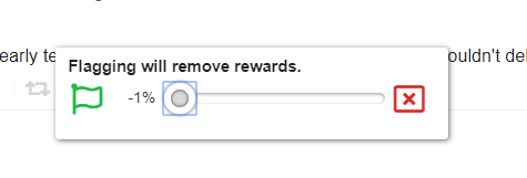
The slider will be gone, and the flag icon will start to spin around, insicatin that the flag is being processed.
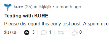
After about 3 seconds, the flag should be applied and you will see a solid red flag icon instead of a gray or red outlined flag icon when no flag was applied. For everyone else that sees the post, they will know it's been flagged due to the red flag icon at the far left.
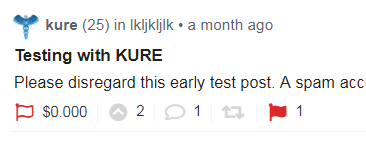
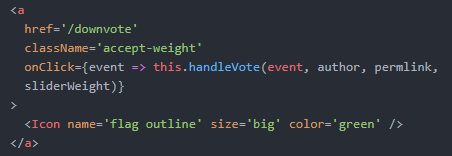
The flag code starts off with the link to flag. A first call is made to the flag function.

The flag function will check if the user is logged before proceeding. If they are, then the vote weight is loaded from the localStorage, if the flag slider was previously used before. If not, the default of 100% is used.
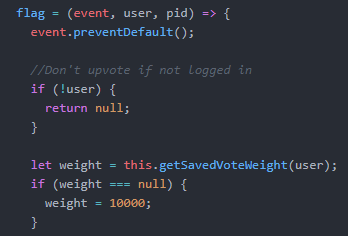
Then the local state slider value is set and the slider will display on the next render.

The slider link to apply the vote is the green flag, and it will call the real flagging vote function once clicked.
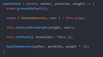
handleVote is the place the flag actually send to Redux to be applied to the Steem blockchain. The vote weight is saved into the localStorage for future use, the slide ris hidden, and the vote is sent as a negative vote.
2.8 Added removing a flag/downvote
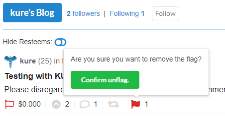
To remove a flag, click on the solid red flag icon, and confirm the removal of the flag.
Afterwards, the flag icon will turn to a gray outline and spin while processing the request.
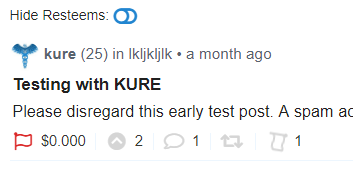
After the flag is removed, the flag will no longer spin and won't be solid red anymore. The flag indicator on the far left will also be gone, and the upvote button will turn black to indicate a vote has previously beeen made on the post, i.e. the flag.
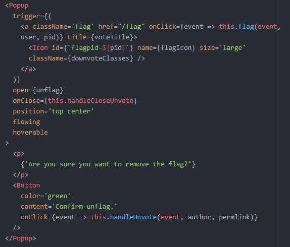
The confirmation to remove the flag is done via a popup. When the confirmation is clicked, the handleUnvote function is called. The unflag popup is only seen when the local state var unflag is set to true. Otherwise, the default behavior is to send a flag via the flag function.
3. Bugs, Tweaks and Other Changes
3.1 Fixed bug with uploaded images from busy being broken
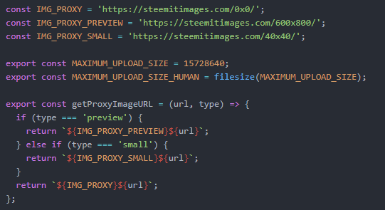
A bug crept up with the images from posts uploaded to busy. The IPFS hosted files weren't displaying. What you would see was a broken image link instead. What was odd was that the post summary showed a working image, but inside the post the image wasn't even loading. Adding steemitimages as a proxy to the URL fixed the issue.
I used a file from busy.org for adding images to posts. In that file, image URLs were being checked to see if they were either from https://ipfs.busy.org or https://gateway.ipfs.io. If so, they wouldn't add a steemitimages proxy. All other images had https://steemitimages.com/ added before them.
To fix the issue, I removed the check for the ipfs URLs and that made those ipfs images get the steemitimages proxy URL added. Images uploaded to busy.org were now rendering.
3.2 Fixed posts missing SEO description in HTML head
I did a search for a post through google to see the result from KURE, and the description was missing. I had set the description in the Helmet customized head component. But the description was empty due the desc key being empty while I thought it had data. This makes for bad SEO.
Now each post has the description added to it. This makes for improved SEO.

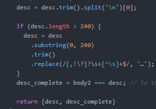
The variable desc now has data grabbed from extracting the post data. The extract was used in the post summary pages, which added desc to the post object. In the post details, no extract was done, so it was empty. Now I do an extract just to get the description.

Sending in the post body, the function will take out the HTML tags and return the first 240 characters as a description for the HTML head data.
3.3 Fixed Comment Display Date Being Ahead by 4h
I noticed some comment timestamps where off one day. A recent comment was made, but instead of showing it was done " a few seconds ago" or "x minuts ago", it was showing as "4 hours from now". That was not what was supposed to be shown.
I had previously fixed this error in the post summary pages and individual post pages. But didn't apply the fix to the comments data. The comment.created data needed a 'Z' on the date to be known as UTC time, otherwise it was taken as local time and 4 hours ahead of actual post time.

The reason this Z is required is for components to know the time is UTC. Otherwise, they assume it's a local time. At least, the moment package works this way.
3.4 Changes site width to get rid of extra padding that wasted screen space
When I was afk for a few hourson Saturday, I used my phone to view the site. I saw that the container for the site has some padding that was ok on desktop, but made for a cramped site on mobile. This container padding has been removed, giving more view width on mobiles.
4. Pull Request / Latest Commits
PR 25
5. Roadmap
I think the wallet and site performance inprovements are a good things to tackle next.
Working on:
- Improved UI/UX, landing page, code splitting, PRPL
- Liking Kurated post submissions in communities
- Rating Kurated post submissions in communities
- Tweak comments (limit to 20, show more option, max nested depth)
- Implement PRPL Pattern for better performance
- Viewing comments in their own page view
- Adding sort functions to the Home, Communities and Kurated pages
- About page
- Dark skin for the site
- Selecting posts to vote at a later time
- Improve Blog page, with rep, description and location
- Add a settings page
- Add nsfw filtering
- Add progressive image loading
- Wallet features
6. Contact
If you want to contact me, you can reach me on Discord at https://discord.gg/ApUp4jJ, or email at [email protected]. I'm not really on steem.chat, but I think I get emails if you send me a message.
- Discord
- Email:
[email protected] - Site: thekure.net
Contributions can be submitted as pull requests to https://github.com/KrNel/kure
Thank you for your time, attention and support. I appreciate it.
Peace.
Posted from KURE
Zfor the UTC time.toa ll. ;-)Your contribution has been evaluated according to Utopian policies and guidelines, as well as a predefined set of questions pertaining to the category.
To view those questions and the relevant answers related to your post, click here.
Need help? Chat with us on Discord.
[utopian-moderator]
LOL :P
Thanks for the review :)
Thank you for your review, @helo! Keep up the good work!
Hi @krnel!
Your post was upvoted by @steem-ua, new Steem dApp, using UserAuthority for algorithmic post curation!
Your post is eligible for our upvote, thanks to our collaboration with @utopian-io!
Feel free to join our @steem-ua Discord server
Thanks for the support
Hey, @krnel!
Thanks for contributing on Utopian.
We’re already looking forward to your next contribution!
Get higher incentives and support Utopian.io!
Simply set @utopian.pay as a 5% (or higher) payout beneficiary on your contribution post (via SteemPlus or Steeditor).
Want to chat? Join us on Discord https://discord.gg/h52nFrV.
Vote for Utopian Witness!
Thanks for the support
This project is being supported by @Fundition the next-generation, decentralized, peer-to-peer crowdfunding and collaboration platform, built on the Steem blockchain.
Read the full details of Fundition Fund program
Learn more about Fundition by reading our purplepaper
Join a community with heart based giving at its core
Fundition is a non profit project, by supporting it with delegation you are supporting 200+ projects.
50SP100SP200SP500SP1000SP2000SP5000SP10000SP
Thanks for the support