使用hcharts创建标题居中环形图/How to use hcharts to make a ring chart(part 2,the title in the middle)
Summary:
Javascript has a lot of open source chart Libraries,Hcharts.js is one of them,today i will show you how to create a ring chart(label is in the middle) by Hcharts.
Javascript 有很多开源图表库,Hcharts.js就是其中之一,今天教程将教大家如何使用Hcharts.js去绘制一张标题居中的环形图。
- 兼容浏览器:IE, Chrome,Firefox等等
您能从本教程学到什么?
- 代码整体结构
- 怎么调用hcharts.js
- 怎么设置图表画布大小
- 怎么配置chart参数
- 怎么设置图表主标题(环形图中间初始标题)
- 怎么设置提示框
- 怎么设置通用配置(饼图样式以及鼠标动作函数)
- 怎么设置数据列
需要的准备条件
- 你需要一个代码编辑器,比如atom,EmEditor等等,当然因为是文本编辑,可以直接通过浏览器打开,typora这类文本编辑器也可以进行代码编辑。
- 你需要下载hcharts.js(如果不下载到本地,也可以在线调用,参考要点2.)
本教程难度
相对来说比较简单,只需要对固定代码格式有些简单了解,就可以绘制标题居中的环形图。
- 认识简单代码
- 认识简单英文
教程内容
下面请先看一个简单例子:
教程要点1:代码整体结构
<html>
<head>
<meta charset="utf-8">
<title>title</title>
<script src="https://img.hcharts.cn/jquery/jquery-1.8.3.min.js"></script>
<script src="https://img.hcharts.cn/highcharts/highcharts.js"></script>
<script src="https://img.hcharts.cn/highcharts/highcharts-more.js"></script>
<script src="https://img.hcharts.cn/highcharts/modules/exporting.js"></script>
<script src="https://img.hcharts.cn/highcharts-plugins/highcharts-zh_CN.js">
//以上调用的是hcarts所需要的资源
</script>
</head>
<body>
<div id="container" style="min-width: 310px; height: 400px; margin: 0 auto"></div>
//定义容器大小
<script>
//这里是hchats代码区域
</script>
</body>
</html>
上述是整个html结构,完整代码另存为.html文件,用浏览器打开即可。本教程是使用javascript库生成图表,所以本例子关键代码为 html结构中body区域中 < script>和< /script>之间的部分,下面将详细讲解关键代码。
教程要点2:怎么调用hcharts.js
<script src="https://img.hcharts.cn/jquery/jquery-1.8.3.min.js"></script>
<script src="https://img.hcharts.cn/highcharts/highcharts.js"></script>
<script src="https://img.hcharts.cn/highcharts/highcharts-more.js"></script>
<script src="https://img.hcharts.cn/highcharts/modules/exporting.js"></script>
<script src="https://img.hcharts.cn/highcharts-plugins/highcharts-zh_CN.js"></script>
如果本地没有hcharts.js库,可以使用其在线js资源,同时需要加载jquery.min.js。直接在head区域引用就可以了。
教程要点3:怎么设置图表画布大小
<div id="container" style="min-width:400px;height:400px"></div>
在body区域,编辑chartjs代码之前,需要先定义下图表的大小。上面代码定义,最小宽度为400px,高为400px。
教程要点4:怎么配置chart参数
   chart: {
            plotBackgroundColor: null,
            plotBorderWidth: null,
            plotShadow: false,
            spacing : [100, 0 , 40, 0]
        },
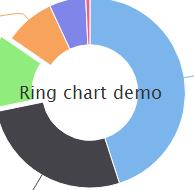
plotBackgroundColor 主图表区背景色,即X轴与Y轴围成的区域的背景色
plotBorderWidth 主图表区边框的宽度
plotShadow 主图标区域是否启用阴影效果,实例如下:
spacing 主图表区域周围空白
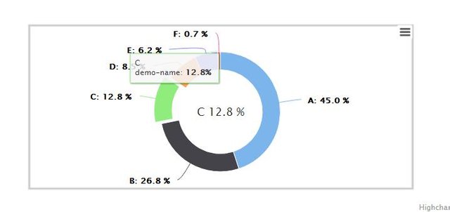
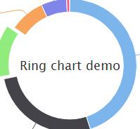
教程要点5:怎么设置图表主标题(环形图中间初始标题)
       title: {
            floating:true,
            text: 'Ring chart demo'
        },
title 标题
floating 固定位置
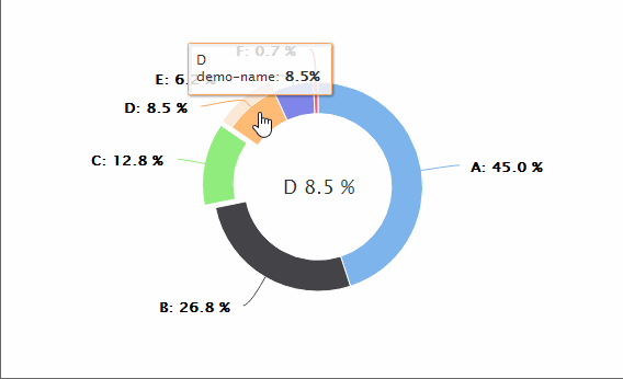
text 此处输入标题文本。 本实例中 此处实则为初始标题,在鼠标移动到各个数据时候,标题会显示成数据标签,实例如下:
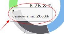
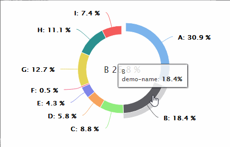
教程要点6:怎么设置提示框
tooltip: {
            pointFormat: '{series.name}: <b>{point.percentage:.1f}%</b>'
        },
pointFormat 数据点显示样式,支持html标签,实例如下:
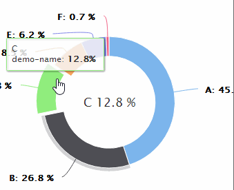
教程要点7:怎么设置通用配置(饼图样式以及鼠标动作函数)
 pie: {
                allowPointSelect: true,
                cursor: 'pointer',
                dataLabels: {
                    enabled: true,
                    format: '<b>{point.name}</b>: {point.percentage:.1f} %',
                    style: {
                        color: (Highcharts.theme && Highcharts.theme.contrastTextColor) || 'black'
                    }
饼图样式设置:
allowPointSelect 是否允许数据点的点击
cursor 光标
dataLabels 数据标签
point: {
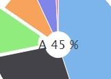
events: {
mouseOver: function(e) {
chart.setTitle({
text: e.target.name+ '\t'+ e.target.y + ' %'
});
}
}
},
mouseOver 鼠标动作函数
chart.setTitle({
                                text: e.target.name+ '\t'+ e.target.y + ' %'
                            });
鼠标滑过时动态更新标题
教程要点8:怎么设置数据列
series: [{
            type: 'pie',
            innerSize: '70%',
            name: 'demo-name',
            data: [
                {name:'A',   y: 45.0, url : 'http://xx.xx.xx'},
                ['B',       26.8],
                {
                    name: 'C',
                    y: 12.8,
                    sliced: true,
                    selected: true,
                    url: 'http://xx.xx.xx'
                },
                ['D',    8.5],
                ['E',     6.2],
                ['F',   0.7]
            ]
        }]
type: 图表类型, pie是饼图。
innersize 内圆大小设置,示例如下:
-20%
- 50%
- 80%
name:数据名称
data 数据,格式:data:[{name:'name-demo1',y:'data1'},['name-demo2',dat2,……]
可以看出可以对单个数据进行定义样式等操作,也可以缺省参数,直接录入数据。
完整实例如下:
完整代码如下:
<html>
<head>
<meta charset="utf-8">
<title>title</title>
<script src="https://img.hcharts.cn/jquery/jquery-1.8.3.min.js"></script>
<script src="https://img.hcharts.cn/highcharts/highcharts.js"></script>
<script src="https://img.hcharts.cn/highcharts/highcharts-more.js"></script>
<script src="https://img.hcharts.cn/highcharts/modules/exporting.js"></script>
<script src="https://img.hcharts.cn/highcharts-plugins/highcharts-zh_CN.js"></script>
</head>
<body>
<div id="container" style="min-width: 310px; height: 400px; margin: 0 auto"></div>
<script>
var chart = null;
$(function () {
    $('#container').highcharts({
        chart: {
            plotBackgroundColor: null,
            plotBorderWidth: null,
            plotShadow: false,
            spacing : [100, 110 , 40, 110]
        },
        title: {
            floating:true,
            text: 'Ring chart demo'
        },
        tooltip: {
            pointFormat: '{series.name}: <b>{point.percentage:.1f}%</b>'
        },
        plotOptions: {
            pie: {
                allowPointSelect: true,
                cursor: 'pointer',
                dataLabels: {
                    enabled: true,
                    format: '<b>{point.name}</b>: {point.percentage:.1f} %',
                    style: {
                        color: (Highcharts.theme && Highcharts.theme.contrastTextColor) || 'black'
                    }
                },
                point: {
                    events: {
                        mouseOver: function(e) {  // 鼠标滑过时动态更新标题
                            // 标题更新函数,API 地址:https://api.hcharts.cn/highcharts#Chart.setTitle
                            chart.setTitle({
                                text: e.target.name+ '\t'+ e.target.y + ' %'
                            });
                        }
                    }
                },
            }
        },
        series: [{
            type: 'pie',
            innerSize: '80%',
            name: 'demo-name',
            data: [
                {name:'A',   y: 45.0, url : 'http://xx.xx.xx'},
                ['B',       26.8],
                {
                    name: 'C',
                    y: 12.8,
                    sliced: true,
                    selected: true,
                    url: 'http://xx.xx.xx'
                },
                ['D',    8.5],
                ['E',     6.2],
                ['F',   0.7],
                ['G',    18.5],
                ['H',     16.2],
                ['I',   10.7],
            ]
        }]
    }, function(c) {
        // 环形图圆心
        var centerY = c.series[0].center[1],
            titleHeight = parseInt(c.title.styles.fontSize);
        c.setTitle({
            y:centerY + titleHeight/3
        });
        chart = c;
    });
});
</script>
</body>
</html>
Posted on Utopian.io - Rewarding Open Source Contributors
Your contribution cannot be approved because it does not follow the Utopian Rules.
You can contact us on Discord.
[utopian-moderator]