使用hcharts创建金字塔图/How to use hcharts to make a pyramidal chart

Summary:
Javascript has a lot of open source chart Libraries,Hcharts.js is one of them,today i will show you how to create a pyramidal chart by Hcharts.
Javascript 有很多开源图表库,Hcharts.js就是其中之一,今天教程将教大家如何使用Hcharts.js去绘制一张金字塔图。
- 兼容浏览器:IE, Chrome,Firefox等等
您能从本教程学到什么?
- 怎么调用hcharts.js
- 怎么设置图表容器大小
- 怎么配置chart
- 怎么设置图表主副标题以及标题位置
- 怎么设置数据点属性
- 怎么设置数据列
需要的准备条件
- 你需要一个代码编辑器,比如atom,EmEditor等等,当然因为是文本编辑,可以直接通过浏览器打开,typora这类文本编辑器也可以进行代码编辑。
- 你需要下载hcharts.js
本教程难度
相对来说比较简单,只需要对固定代码格式有些简单了解,就可以绘制金字塔图。
- 认识简单代码
- 认识简单英文
教程内容
下面请先看一个简单例子:
要点1:怎么调用hcharts.js
<script src="http://apps.bdimg.com/libs/jquery/2.1.4/jquery.min.js"></script>
<script src="http://code.highcharts.com/highcharts.js"></script>
如果本地没有hcharts.js库,可以使用其在线js资源,同时需要加载jquery.min.js。直接在head区域引用就可以了。
要点2:怎么设置图表容器大小
<div id="container" style="max-width:800px;height:400px"></div>
在body区域,编辑chartjs代码之前,需要先定义下图表的大小。上面代码定义,最大宽度为800px,高为400px。
要点3:怎么配置chart
  chart: {
            type: 'pyramid',
            marginRight: 100
        },
type: 描述了图表类型。默认值为 "line"。这里是气泡图,所以设置为pyramid。
marginRight :图表右边距,数值越大,图表越往左边,同时金字塔会被压缩大小,通俗点说,会越来越尖。
marginRight 100:

marginRight 500:

要点4:怎么设置图表主副标题以及标题位置
 title: {
            text: 'HERE IS TITLE',
            x: -48
        },
title:主标题,在text后面输入文本,用单引号括起来。
x: 标题水平位置。数值变化,会导致标题水平位置变化。
 subtitle: {
            text: 'HERE IS SUBTITLE',
            x:-50
        },
subtitle:子标题,在text后面输入文本,用单引号括起来。
x: 标题水平位置。数值变化,会导致标题水平位置变化。
下面演示X值变化,当更改x数值的时候,标题位置就会变化。

要点5:怎么设置数据点属性
 plotOptions: {
            series: {
                dataLabels: {
                    enabled: true,
                    format: '<b>{point.name}</b> <i>({point.y:,.0f})</i>',
                    color: (Highcharts.theme && Highcharts.theme.contrastTextColor) || 'black',
                    softConnector: true
                }
            }
        },
dataLabels 显示各个数据的名称。
enabled,参数有 true和false, 选择true的时候,表示显示名称。
format,显示样式,这里也支持一些html标签。point.name 代表各个数据名称,{point.y:,.0f}即为各个数据。
color,颜色。
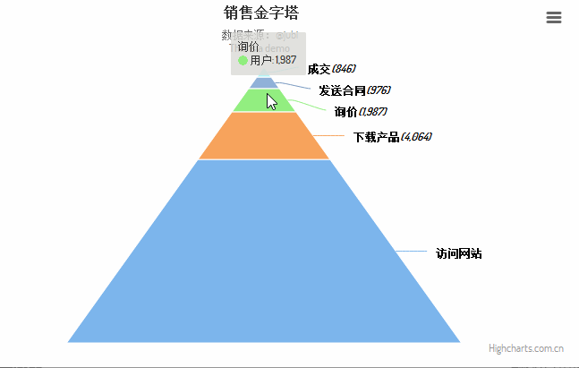
要点6:怎么设置数据列
series: [{
            name: 'USERNAME',
            data: [
                ['DATANAME1',   15654],
                ['DATANAME2',       4064],
                ['DATANAME3', 1987],
                ['DATANAME4',    976],
                ['DATANAME5',    846]
            ]
        }]
name: 数据名称,因为是金字塔图,这个name实际上不显示。
data 具体数据,数据格式为:data:[['name',data1],……],
下面我将用多个数据进行演示:

完整代码如下:
$(function () {
    $('#container').highcharts({
        chart: {
            type: 'pyramid',
            marginRight: 140
        },
        title: {
            text: 'HERE IS TITLE',
            x: -50
        },
        subtitle: {
            text: 'HERE IS SUBTITLE',
            x:-50
        },
        plotOptions: {
            series: {
                dataLabels: {
                    enabled: true,
                    format: '<b>{point.name}</b><br/> ({point.y:,.0f})',
                    color: (Highcharts.theme && Highcharts.theme.contrastTextColor) || 'black',
                    softConnector: true
                }
            }
        },
        legend: {
            enabled: false
        },
        series: [{
            name: 'USERNAME',
            data: [
                ['A',554],
                ['B',464],
                ['C', 1987],
                ['D',976],
                ['E', 846],
                ['F',554],
                ['G',464],
                ['H', 187],
                ['I',976],
                ['J',846]
            ]
        }]
    });
});
系列教程列表
- 使用hcharts创建3D饼图/How to use hcharts to make a 3D Pie chart
- 使用hcharts创建扇形统计图/How to use hcharts to make a fan-shaped chart
- 使用hcharts创建工作进度(甘特)图/How to use hcharts to make a gantt chart
- 使用hcharts创建折线图/How to use hcharts to make a fold line chart
- 使用hcharts创建气泡图/How to use hcharts to make a bubble chart
- 使用hcharts创建堆叠条形图/How to use hcharts to make a stacked bar chart
Posted on Utopian.io - Rewarding Open Source Contributors
不错,学习了。
Thank you for the contribution. It has been approved.
You can contact us on Discord.
[utopian-moderator]
Thank you very much.
Hey @jubi I am @utopian-io. I have just upvoted you!
Achievements
Suggestions
Get Noticed!
Community-Driven Witness!
I am the first and only Steem Community-Driven Witness. Participate on Discord. Lets GROW TOGETHER!
Up-vote this comment to grow my power and help Open Source contributions like this one. Want to chat? Join me on Discord https://discord.gg/Pc8HG9x