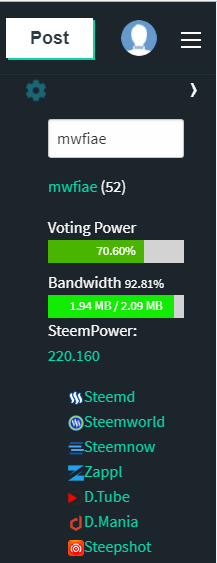
The sidebar looks nice. Only, I feel it would be nicer on the right side just below the drop down by the right nav. That would make the user experience a bit more sleek.
The sidebar looks nice. Only, I feel it would be nicer on the right side just below the drop down by the right nav. That would make the user experience a bit more sleek.
Thank you for your feedback :)
I put it to the left side as navigations are normally on the left. Also steempunk is on the right^^
BUT you are of course not wrong, so I will make it customizable in the future! :)
Greetings,
Martin
Sneak-Preview :D

I'm not happy with the positioning of the buttons yet, so I will have to tinker a little bit more :)
Nice...it looks more natural on this side. Only, more tweaks can be done to the UI.
If you have any more suggestions I would be glad to hear them :)