You are viewing a single comment's thread from:
RE: @utopian-io: Contribution/Score/Moderator/Vote Analysis - 4th - 10th May 2018
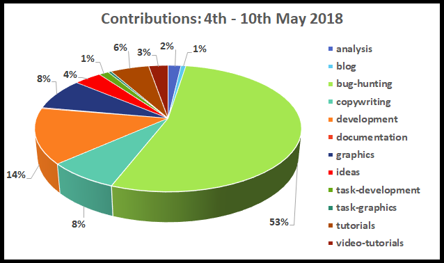
Regarding this image (and other images with color based graphs):

I would personally prefer if you could make it so the colors are assigned in an order that makes similar colors appear next to each other. Red next to orange, light green next to dark green, etc. Just use the color scale.
This makes it much easier to look for the category you want to look for - I was really surprised to see task-development with a 53% chunk ( I was sure it was a mistake )before I realized it's not the only green part of the chart!
Other than that, fantastic as always. I don't review analysis but thanks for setting an example of the category once again!
You know the Devs, they like to get stuck in!
Point taken on the colours, excel is a pain to organise them but I will try to organise them better in future.
Thank you for the kind words, appreciated! :D
Hey @jestemkioskiem
Here's a tip for your valuable feedback! @Utopian-io loves and incentivises informative comments.
Contributing on Utopian
Learn how to contribute on our website.
Want to chat? Join us on Discord https://discord.gg/h52nFrV.
Vote for Utopian Witness!