Using MaterializeCSS to Create a Shop Layout For a Business Website
What Will I Learn
In the last tutorial we covered the steps involved in the creation of a basic homepage layout using materialize css framework by building a simple homepage template.
In this tutorial we will be taking that further, at the end of this tutorial we will have designed a simple SHOP layout for a ecommerce/business website.
The template we will work on will produce minimal text content and will feature the use of icons and digital representations of real life entities.
Among others in this tutorial we will add the following features to our SHOP page.
- Shopping Cart Icon
- Search Form
Additionally, the page will be divided into six sections containing the following
- Navigation bar
- Responsive banner for special offers
- Search form and shopping cart
- Rows of cards to list products
- An extra row for special offers
- Footer
Requirements
- Code Editor
- Latest version of any web browser
Difficulty
- Intermediate
Tutorial Content
For more information on how to get started with Materialize, read this resource.
You can download the full source code for this tutorial in zip format from here.
Section 1. Navigation Bar and Footer
We will not be covering these sections much in detail, the reason being that we will be using the same navbar and footer template we made use of in our last tutorial.
You can read up on how to create this navigation bar and footer with the source code included from here.
At the end of the process just like in the last tutorial you will have an output like these

And for the footer

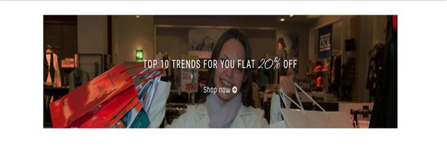
Section 2: Responsive Banner
In this section we will add a responsive banner enclosed in a link that will take to a special offers page.
- HTML code
<section  class="container">

<div  class="row">

<div  class="col l12 m12 s12">

<div  class="row">

<div  class="col l12 m12 s12 img-responsive">

<div  class="banner">

<a  href=""  class="banner-img-link">

<img  class="responsive-img"  src="images/banner1.jpg">

</a>

</div>

</div>

</div>

</div>

</div>

</section>
- CSS code
    div.col.l12.m12.s12.img-responsive {

height: 300px;

}


div.banner {

margin-bottom: 30px;

margin-top: 30px;

margin-left: 80px;

text-align: center;

box-sizing: border-box;

display: block;

height: 275px;

position: static;

z-index: auto;

}


a.banner-img-link {

height: 260px;

}


img.responsive-img {

margin: 0  auto;

display: block;

width:750px;

height: 245px;

box-sizing: border-box;

cursor: pointer;

line-height: 1.42857143;

position: static;

z-index: auto;

float: left;

}
- Output
Analysis
The first line contains a
<section class="container"></section>tag, which signifies the beginning of new section.The
class="container"attribute will collapse the section from having fullscreen width and give it a compact look.The second line we add a
<div class="row"></div>tag, this tag contains aclass="row"attribute which is used to create a new row.After creating the row we add a column using
<div class="col l12 m12 s12"></div>.The
class="col l12 m12 s12of this column signifies that the column should maintain full width on large, medium and small screens using thel12,m12ands12attributes respectively.Inside our new column we create a new row using the
<div class="row"></div>element.Inside the row we create a new column using the following syntax
<div class="col l12 m12 s12 img-responsive"><div>.Inside the new column we create a new
<div>tag withclass="banner"(<div class="banner"></div>). Inside the new<div>we add the code for the image link<a href="" class="banner-img-link"></a>withclass="banner-img-link".Inside the newly created tag we add the tag
<img class="responsive-img" src="images/banner1.jpg">.class="responsive-img"will make contents of the<img>tag responsive to any screen size.
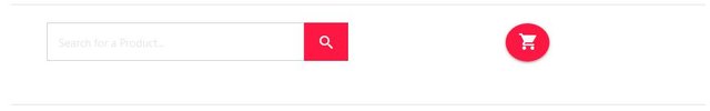
Section 3: Search Form and Shopping Cart
Here we'll be adding a shopping cart icon and a search form where customers can keep track of the items they have chosen to buy and also search for items they are willing to buy respectively.
- HTML code
<div  class="row">

<div  class="col l12 m12 s12 search-box">

<form  class="col l9 m9 s6">

<input  name="Search"  placeholder="Search for a Product..."  required=""  type="search"  class="input-text-box">

<a  class="btn-flat btn-large waves-effect waves-light red accent-3"><i  class="ion-android-search white-text"></i></a>

</form>

<span  class="header-cart">

<a  class="btn-floating btn-large waves-effect waves-light red accent-3">

<i  class="ion-android-cart white-text"></i>

</a>

</span>

</div>

</div>
- CSS code
div.col.l12.m12.s12.search-box {

float: left;

width: 55%;

text-align: center;

margin: 1.6em  5em;

box-sizing: border-box;

display: block;

line-height: 1.42857143;

color: #333;

position: static;

z-index: auto;

}


form.col.l6.m6.s6 {

position: relative;

box-sizing: inherit;

display: inherit;

text-align: inherit;

line-height: 1.42857143;

color: #333;

width: 300px;

}


.input-text-box {

width: 100%;

padding: 1em  5em  1em  1em;

font-size: 1em;

color: #999;

outline: none;

border: 1px  solid  #cccccc;

background: none;

margin: 0;

margin-left: -97px;

text-align: start;

text-transform: none;

word-spacing: normal;

letter-spacing: normal;

cursor: text;

text-indent: 0;

box-sizing: inherit;

display: inline;

float: none;

line-height: 20px;

position: static;

z-index: auto;

}


a.btn-flat.btn-large.waves-effect.waves-light {

border: none;

position: absolute;

width: 60px;

height: 52px;

outline: none;

box-shadow: none;

background: #ff1744;

padding: 0;

border-radius: inherit;

transition: .5s  all;

color: #333;

display: inline-block;

line-height: 1.42857143;

text-align: center;

white-space: nowrap;

vertical-align: middle;

touch-action: manipulation;

cursor: pointer;

overflow: visible;

box-sizing: border-box;

text-indent: 0;

padding-block-start: 0px;

padding-inline-end: 8px;

padding-block-end: 0px;

padding-inline-start: 8px;

padding-top: 15px;

}


span.header-cart {

float: right;

margin: 1px  -150px  1px  1px;

box-sizing: border-box;

display: block;

font-size: 14px;

line-height: 1.42857143;

}


a.btn-floating.btn-large.waves-effect.waves-light.red.accent-3 {

box-sizing: border-box;

display: block;

line-height: 1.42857143;

width: 60px;

height: 52px;

position: static;

z-index: auto;

}


.ion-android-cart.white-text {

border-radius: 50%;

display: inline-block;

box-sizing: border-box;

text-align: center;

cursor: pointer;

white-space: inherit;

text-indent: 0;

text-shadow: none;

font-size: 28px;

position: static;

z-index: auto;

margin-top: 10px;

}
- Output
Analysis
We start the section by creating a row using
<div class="row"></div>.Inside the new row we create a fullwidth column using
<div class="col l12 m12 s12 search-box"></div>.Inside the column we add a new line of code
<form class="col l9 m9 s6"></form>signifying the creation of a new form.Inside the form we add a text-box and a search icon button by the side using the following code
<input  name="Search"  placeholder="Search for a Product..."  required=""  type="search"  class="input-text-box">


<a  class="btn-flat btn-large waves-effect waves-light red accent-3"><i  class="ion-android-search white-text"></i></a>
The element <i class="ion-android-search white-text"></i> was used to create the search button icon.
Using the above element to create icons was made possible by the ionicons css library. Ionicons is a free CSS library that can be used to create icons just like the one we just created.
To use ionicons simply download the files from their website, you can also clone the github repository .
After downloading the files locate ionicons.css file from the collection and copy/paste in the folder for your project.
You can then reference the files from the source code of your project to make it ready for use.
- Below the code handling the search form we add a new block of code in order to create the shopping cart icon.
 <span  class="header-cart">

    <a  class="btn-floating btn-large waves-effect waves-light red accent-3">

    <i  class="ion-android-cart white-text"></i>

    </a>

    </span>
First we of create a
<span class="header-cart"></span>tag to enclose the section and assign some general style to the section as a whole.Inside the tag we create a new button/link using the
<a class="btn-floating btn-large waves-effect waves-light red accent-3"></a>We then place the icon inside the link using the following code
<i class="ion-android-cart white-text"></i>."ion-android-cart"is the attribute value responsible for creating the outline for the cart icon while"white-text"will add the color white to the outline.
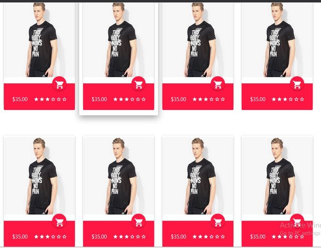
Section 4: Product Listing
This section features a listing of eight products using cards separated into two rows with four appearing on each row.
- HTML code
<div  class="col l3 m6 s12 hoverable">

<div  class="card shop-products">

<div  class="card-image">

<img  src="images/shop-img-1.png"  class="shop-product-img">

<span><p><a  class="btn-floating halfway-fab waves-effect waves-light red accent-3">

<i  class="ion-android-cart white-text"></i></a></p></span>

</div>

<div  class="card-action red accent-3 white-text">

<p>

<span>$35.00<span>

<span  class="right">

<i  class="ion-android-star"></i>

<i  class="ion-android-star"></i>

<i  class="ion-android-star"></i>

<i  class="ion-android-star-outline"></i>

<i  class="ion-android-star-outline"></i>

<i  class="ion-android-star-outline"></i>

</span>

</p>

</div>

</div>

</div>
The code above represents the template used on every column in this row all you have to do is paste the code into a <div class="row"></div> tag.
Paste the code multiple times until you get to your desired amount of columns.
The source code comes with eight columns initially but you can add more at your discretion.
- CSS code
div.card.shop-products {

height: 300px;

margin-bottom: 30px;

}


img.shop-product-img {

height: 75%;

}


div.card-action.red.accent-3.white-text {

height: 25%;

}


a.btn-floating.halfway-fab.waves-effect.waves-light.red.accent-3 {

position: absolute;

right: 24px;

bottom: -35px;

}
- Output
Analysis
All the codes for this section is enclosed in a
<div class ="row"></div>tag to crate a new rowInside the tag we create a new column using the following code
<div class="col l3 m6 s12 hoverable"></div>We then go ahead to create three new
<div>tags withclass="card shop-products",class="card-image"andclass="card-action red accent-3 white-textrespectively.
 <div  class="card shop-products">
 <div  class="card-image"></div>
 <div  class="card-action red accent-3 white-text"></div>
 </div>
The
class="card shop-products"tag will create a new card section.Inside the
<div class="card shop-products"></div>element, the first<div>tag withclass="card-image"will contain the image section for the product listing card.Beneath
<div class="card-image></div>we create a new tag<div class="card-action red accent-3 white-text"></div>to contain the price for the product and a star-rating section for each product.
Section 5: Extra Special Offers
This section is represented by a row containing three columns with each column featuring the special offer and a link to direct the user to a landing page for the offer.
- HTML code
<div  class="container">

<div  class="row">

<div  class= "col l4 m4 s12 hoverable">

<div  class="card">

<div  class="card-content white-text">

<span  class="card-title red-text accent-3">20% Cashback</span>

<p  class="black-text">Shop Using Gift Cards Get 20% Cashback</p>

</div>

<div  class="card-action">

<a  href="#"  class="red-text accent-3">Shop Now <i  class="ion-android-arrow-forward"></i></a>

</div>

</div>

</div>

</div>

</div>
- Output

Analysis
The section is enclosed in a
<div class="container"></div>tag.Inside the first
<div>tag we create a new row using the<div class="row"></div>.Each column in a row contains 4 grid sections on large and medium screens (three in a row), while on small screens each column becomes full-width.
The HTML code responsible for creating each column
<div class= "col l4 m4 s12 hoverable"></div>.Inside each column we create a new
<div class="card-content white-text"></div>to hold the content of the card.We create a title for each card section using
<span class="card-title red-text accent-3"></span>.Beneath the card title section we create a new paragraph to hold the details of the special offer using
<p class="black-text"></p>Outside the
class="card-content white-text"tag we create a new<div class="card-action"></div>tag which contains the link that will redirect the users to the page featuring the special offer.
Curriculum
Posted on Utopian.io - Rewarding Open Source Contributors
Thank you for the contribution. It has been approved.
You can contact us on Discord.
[utopian-moderator]
Hey @gotgame I am @utopian-io. I have just upvoted you!
Achievements
Community-Driven Witness!
I am the first and only Steem Community-Driven Witness. Participate on Discord. Lets GROW TOGETHER!
Up-vote this comment to grow my power and help Open Source contributions like this one. Want to chat? Join me on Discord https://discord.gg/Pc8HG9x
Thanks for your contribution, I did a training on e commerce a while ago, but I got information on colors, tests, not the codes
You're welcome