Building a Landing Page with MaterializeCSS - 1
What Will I Learn?
In this tutorial we will learn how to build a landing page using several MaterializeCSS components and some JQuery.
At the end of this tutorial we will have completed the first part in the series on designing a simple landing page.
Requirements
- Code Editor
- Latest version of any web browser
- Ionicons Library For Icons
- JQuery Library
- MaterializeCSS Framework
- You can download the full source code for this tutorial on Github
Difficulty
- Intermediate
Tutorial Contents
To start with we need to get MaterializeCSS and JQuery files from their respective webpages.
The link to both can be found in the requirements list above.
Download both frameworks and reference them in your source code like so
 <!DOCTYPE html>
  <html>
    <head>
      (html comment removed: Import Google Icon Font)
      <link href="https://fonts.googleapis.com/icon?family=Material+Icons" rel="stylesheet">
      (html comment removed: Import materialize.css)
      <link type="text/css" rel="stylesheet" href="css/materialize.min.css"  media="screen,projection"/>

      (html comment removed: Let browser know website is optimized for mobile)
      <meta name="viewport" content="width=device-width, initial-scale=1.0"/>
    </head>

    <body>

      (html comment removed: JavaScript at end of body for optimized loading)
      <script type="text/javascript" src="js/jquery.js"></script>
      <script type="text/javascript" src="js/materialize.min.js"></script>
    </body>
  </html>
To read more on how to setup the materializecss framework using other alternative you can check the official documentation.
Take note that while referencing your JavaScript files in your HTML jquery.js has to come first before materialize.js.
As soon as we have all requirements installed we are good to go.
The following is the entire CSS code for this tutorial. Save it somewhere preferably a style.css file in the CSS folder.
body {

background-attachment: fixed;

}


.logo-area {

margin-left: 20px;

}


.nav-container {

margin-right: 20px;

}


.header-two {

background-image: url(../images/business-woman.jpg);

background-attachment: fixed;

background-size: cover;

height: 630px;

padding: 100px;

}


.partner-area {

background-image: url(../images/rocky-background.jpg);

background-size: cover;

background-attachment: fixed;

height: 200px;

padding: 50px;

}


.about-info {

margin-top: 100px;

margin-bottom: 100px;

}


.serve-icon {

margin: 50px  100px;

height: 250px;

}


.home-icon-1 {

width: 100px;

height: 100px;

border-radius: 50%;

margin: auto;

}


.actual-home-icon {

font-size: 36px;

padding-top: 25px;

}


.service-col {

margin: 40px;

}


.outer {

background-image: url(../images/startup.jpg);

background-size: cover;

background-attachment: fixed;

height: 700px;

}


.inner {

height: 500px;

padding: 200px  100px;

}


.price-card {

z-index: 4;

border-radius: 2%;

margin-top: 50px;

height: 500px  !important;

}


.price-area {

height: 600px;

}


.team-area {

margin: 50px;

}


.sub-form {

width: 450px  !important;

}


.sub-area {

height: 500px;

padding-top: 150px;

}


.sub-area-content {

margin: 10px;

}


.contact-form {

border: #000  solid  1px  !important;

width: 434.5px  !important;

}


.contact-form:focus {

border-color: #1a237e  !important;

border-style: solid;

border-width: 2px;

}


.contact-form-area {

border: #000  solid  1px  !important;

width: 914px;

margin-top: -9px;

}


.contact-form-area:focus {

border-color: #1a237e  !important;

border-style: solid;

border-width: 2px;

}


.form-area {

padding: 100px  0px;

height: 600px;

}


.form-area-header {

margin-top: 20px;

margin-bottom: 10px;

}


.submit-button {

margin-top: 20px;

}


.footer-copyright {

z-index: 4;

}


.menu, .main-body-content {

position: relative;

}


.menu {

z-index: 150;

box-shadow: 0  2px  3px  rgba(0,0,0,.4);

}


.menu, .menu-scrolled {

position: fixed;

width: 100%;

top: 0;

}
After saving the CSS files we can then start to work on our layout and components.
1. Navigation
The first thing we'll be tacking is the navigation bar.
We are going to add a layout for our navbar.
We'll also use jquery to make it sticky such that when users scroll the navbar will be fixed to the top of the page at every point in time.
HTML
(html comment removed: Navigation Bar)

<nav  class="indigo darken-4 menu">

<div  class="nav-wrapper nav-container">

<a  href="#"  class="brand-logo logo-area">LANDR</a>

<ul  id="nav-mobile"  class="right hide-on-med-and-down">

<li><a  href="#slider">HOME</a></li>

<li><a  href="#overview">OVERVIEW</a></li>

<li><a  href="#features">FEATURES</a></li>

<li><a  href="#pricing">PRICING</a></li>

<li><a  href="#team">TEAM</a></li>

<li><a  href="#subscribe">CONTACT</a></li>

<li><a  href="#contact">JOIN US</a></li>

</ul>

</div>

</nav>
Analysis
The section was opened with a
<nav class="indigo darken-4 menu"></nav>tag.The classes
indigo darken-4andmenuwill set the background to indigo colors while darkening it 2 shades deep andmenuis responsible for the specific CSS styles specified in thestyle.cssfile.Inside the
<nav>tag we create a new tag<div class="nav-wrapper nav-container"></div>.The class
nav-wrapperwill create a wrapper around the navbar whilenav-containerwill set themargin-rightfor the navbar.Inside our newly created
<div>we add a new link<a href="#" class="brand-logo logo-area">LANDR</a>which will serve as the logo.The class
brand-logowill specify the content of this area as the website logo whilelogo-areawill set themargin-leftfor the website logo.Directly below the logo link we create a new unordered list using the following code
<ul id="nav-mobile" class="right hide-on-med-and-down"></ul>This list will hold all navigation contents with each contained in a list component i.e
<li>tag.For the
<ul>tag the classrightwill align the entire list to the right side of the navigation bar.hide-on-med-and-downwill hide the navigation list once the page is ascertained to be appearing on tablet(medium) and mobile(small) screensInside the
<ul>tag we create a number of<li>tags to hold our navigation links.Each
<li>tag will contain an<a>tag with eachhrefattribute set to theidof the section of the page the link is targeting.
To make our navbar sticky we add the following code in a script tag or include it directly in our .js file
var  newNavClass  =  "menu-scrolled"

$('.main-body-content').scroll(function() {

$('.menu').addClass(newNavClass);

});
In this block of code we add a new variable
newNavClassand give a valuemenu-scrolled.On to the next line we reference the element with the class
main-body-contentand bind theJQueryfunctionscroll()to it .The
scroll()function will execute the containing code once the element it is binded to starts scrollingscroll()further contains a reference to a element with classmenubinded to theaddClass()function which will add the value of the variablenewNavClassas a new class to the element referenced.The CSS styles
menuandmenu-scrolledare set in the CSS code shared earlier.menuhandles the styles before scroll whilemenu-scrolledhandles the styles during scroll.
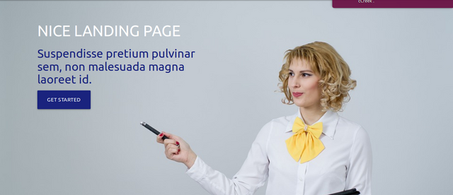
Snapshot of the Navbar

2. Header
In this section we will build the header area for the page.
In here we'll add a fixed background image and also add the header content including a button.
HTML
(html comment removed: Page Header Area)

<section  class="header-two">

<header  id="slider"  class="row">

<div  class=" col l6 m6 s6 home-header">

<h3  class="white-text">NICE LANDING PAGE</h3>

<h4  class="indigo-text text-darken-4"> Suspendisse pretium pulvinar sem, non malesuada magna laoreet id.</h4>

<a  class="waves-effect waves-light btn-large indigo darken-4">GET STARTED</a>

</div>

</header>

</section>
Analysis
We start with a
<section class="header-two"></section>tag.The class
header-twowill set thebackground,heightandpaddingfor this section.Inside the
<section>tag we add a new<header id="slider" class="row"></header>tag where theid="slider"is responsible for connecting the navbar link with nav elementhref="#slider"to this section andclass="row"will create a new row for this section.We then go on to create a new column inside our row using
<div class=" col l6 m6 s6"></div>col l6 m6 s6will create a new column and set it's width to 50% of the row width.Inside the column we add a header text using the
<h3 class="white-text"></h3>.class="white-text"will make the text contents of this tag appear white.Next we add another header tag
<h4 class="indigo-text text-darken-4"></h4>indigo-text text-darken-4will make the text in the element appear with an indigo color 4 shades darkBelow, we then add a new button
<a class="waves-effect waves-light btn-large indigo darken-4"></a>waves-effect and waves-lightwill add a CSS wave effect once the button is clickedbtn-largewill make the button size largeindigo darken-4will give indigo background 4 shades dark to the button
Snapshot of the Header Area
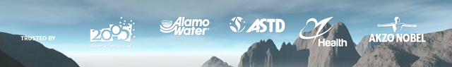
3. Partner Area
Next up is the partner section.
In here we'll be adding a row divided into six columns each column will contain the logo of a partner company.
We'll also set another fixed background for this section.
HTML
(html comment removed: List of Trusted Partners)

<section  class="partner-area">

<div  class ="row">

<div  class="col l2 m4 s12"  style="margin-top: 40px;">

<h6  class="white-text"><b>TRUSTED BY</b></h6>

</div>

<div  class="col l2 m4 s12">

<img  src="images/partner2.png">

</div>

<div  class="col l2 m4 s12">

<img  src="images/partner3.png">

</div>

<div  class="col l2 m4 s12">

<img  src="images/partner4.png">

</div>

<div  class="col l2 m4 s12">

<img  src="images/partner5.png">

</div>

<div  class="col l2 m4 s12">

<img  src="images/partner1.png">

</div>

</div>

</section>
Analysis
Starting with a
<section class="partner-area"></section>tag.The
class="partner-area"will set the background, height and padding for the entire section.Inside the
<section>tag we create a new row using<div class="row"></div>tag.We then go on to create 6 new columns using the tag
<div class="col l2 m4 s12></div>"for each column.Inside each column we have
<img src="">tag wheresrc=""contains the link to the image we want to display for that section.
Snapshot of the Partner Area
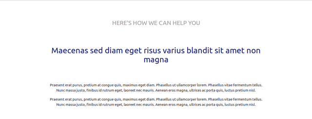
4. About And General Information
In this section we will add a layout that will hold the general information about the page.
HTML
<section id="overview" class="about-info">
<div class="container">
<div class="row">
<div class="col l12 m12 s12 center">
<h5 class="center-align grey-text lighten-2">HERE'S HOW WE CAN HELP YOU</h5>
</div>
<div class="col l12 m12 s12 center" style="margin-top: 50px;">
<h4 class="center-align indigo-text text-darken-4">Maecenas sed diam eget risus varius blandit sit amet non magna</h4>
</div>
<div class="col l12 m12 s12 center" style="margin-top: 50px;">
<p>Praesent erat purus, pretium at congue quis, maximus eget diam. Phasellus ut ullamcorper lorem. Phasellus vitae fermentum tellus. Nunc massa justo, finibus id rutrum eget, laoreet nec mauris. Aenean eros magna, ultrices ac porta quis, luctus pretium nisl.</p>
<p>Praesent erat purus, pretium at congue quis, maximus eget diam. Phasellus ut ullamcorper lorem. Phasellus vitae fermentum tellus. Nunc massa justo, finibus id rutrum eget, laoreet nec mauris. Aenean eros magna, ultrices ac porta quis, luctus pretium nisl.</p>
</div>
</div>
</div>
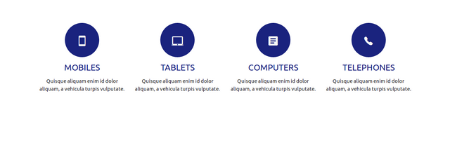
<div class="row serve-icon">
<div class="col l3 m6 s12">
<div class="home-icon-1 indigo darken-4 center">
<div class="ion-android-phone-portrait center grey-text text-lighten-4 actual-home-icon"></div>
</div>
<h5 class="indigo-text text-darken-4 center">MOBILES</h5>
<p class="center">Quisque aliquam enim id dolor aliquam, a vehicula turpis vulputate.</p>
</div>
<div class="col l3 m6 s12">
<div class="home-icon-1 indigo darken-4 center">
<div class="ion-android-laptop center grey-text text-lighten-4 actual-home-icon"></div>
</div>
<h5 class="indigo-text text-darken-4 center">TABLETS</h5>
<p class="center">Quisque aliquam enim id dolor aliquam, a vehicula turpis vulputate.</p>
</div>
<div class="col l3 m6 s12">
<div class="home-icon-1 indigo darken-4 center">
<div class="ion-android-list center grey-text text-lighten-4 actual-home-icon"></div>
</div>
<h5 class="indigo-text text-darken-4 center">COMPUTERS</h5>
<p class="center">Quisque aliquam enim id dolor aliquam, a vehicula turpis vulputate.</p>
</div>
<div class="col l3 m6 s12">
<div class="home-icon-1 indigo darken-4 center">
<div class="ion-ios-telephone center grey-text text-lighten-4 actual-home-icon"></div>
</div>
<h5 class="indigo-text text-darken-4 center">TELEPHONES</h5>
<p class="center">Quisque aliquam enim id dolor aliquam, a vehicula turpis vulputate.</p>
</div>
</div>
</section>
Analysis
The opening tag
<section id="overview" class="about-info"></section>will create a new sectionThe new section has a
id="overview"which connect this section with the navbar link withhref="#overview"andclass="about-info"which sets themargin-topandmargin-bottomfor this sectionWe give the elements of the section a more compact look by adding a
<div class="container"></div>tag.class="container"will cause the section width to shrink and make the section content more closely packed and organized.We then create a new row by adding a new
<div class="row"></div>tagInside our row we create three separate columns using the
<div class="col l12 m12 s12 center"></div>for each column.class="col l12 m12 s12 center"will create a full-width column matching the width of the row and also have the contents ofthe column aligned to the centerIn the first column we have
<h5 class="center-align grey-text lighten-2"></h5>making the contents of that section appear as a headercenter-alignwill align the text content for that section to the center whilegrey-text lighten-2will give the text a color of grey and lighten it 2 shades bright.The second column contains a header
<h4 class="center-align indigo-text text-darken-4"></h4>center-alignwill align the text-content of the element to the center andindigo-text text-darken-4will set the text content color toindigo.The third column contains two
<p></p>tags creating new paragraphs which will hold some filler texts.We move on to create a new row with
<div class="row serve-icon"></div>serve-iconis responsible for setting the margin and height of the row.The new row contains four columns and each column is created using
<div class="col l3 m6 s12"></div>tag.Each column holds a
<div class="home-icon-1 indigo darken-4 center"></div>tag to hold the icon content for the column.home-icon-1sets thewidth,height,border-radiusandmarginof each area.
Snapshot
In the next tutorial we will continue with our landing page design and we'll be learning how to add the following in our page
Fullwidth Carousel
Preloader
Pricing Card
For other MaterializeCSS tutorial
Posted on Utopian.io - Rewarding Open Source Contributors
Thank you for the contribution It has been approved.
Need help? Write a ticket on https://support.utopian.io.
Chat with us on Discord.
[utopian-moderator]
Hey @portugalcoin, I just gave you a tip for your hard work on moderation. Upvote this comment to support the utopian moderators and increase your future rewards!
Hey @gotgame! Thank you for the great work you've done!
We're already looking forward to your next contribution!
Fully Decentralized Rewards
We hope you will take the time to share your expertise and knowledge by rating contributions made by others on Utopian.io to help us reward the best contributions together.
Utopian Witness!
Vote for Utopian Witness! We are made of developers, system administrators, entrepreneurs, artists, content creators, thinkers. We embrace every nationality, mindset and belief.
Want to chat? Join us on Discord https://discord.me/utopian-io
Wow this is educative. I don't know design work is interesting like this. Along the way it looks a bit complex. But I later got it.
Please help me check this out
https://steemit.com/blockchain/@nice2you/cool-cousin-a-decentralized-ecosystem-revealing-informations-about-different-destinations
I will really appreciate