New Logo Proposal for App Shopping List
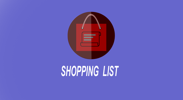
Details
Hi There,
Today I want to contribute a logo for google play open source application. The application is Shopping List. Full Desciption Here
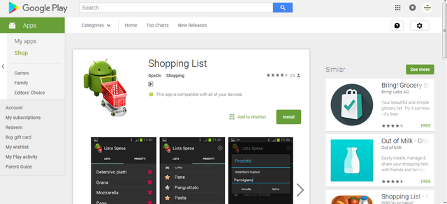
Original Logo
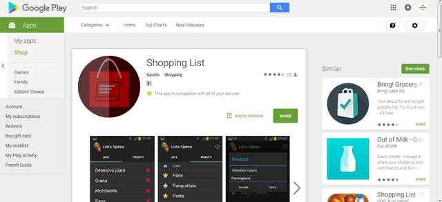
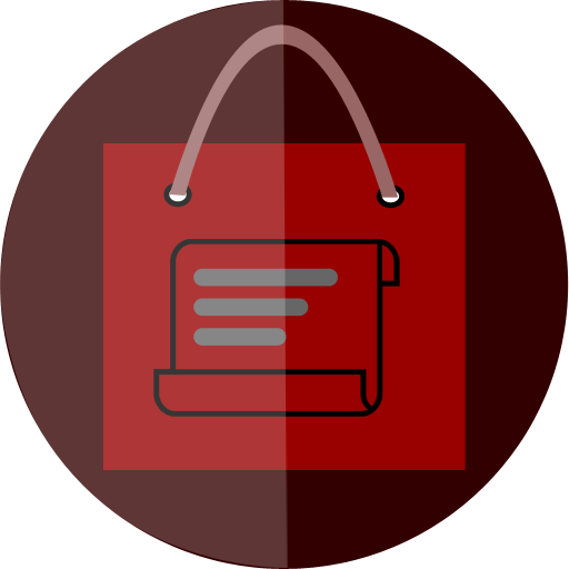
Contribution Logo
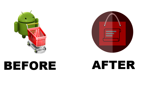
Comparison Original and Contribution Logo
Logo Variations
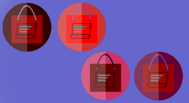
Code Color
330000,990000,996666,666666
cc3333,ff0000,993399,666666
cc3366,660000,330033,666666
660033,990000,663399,666666
Monochrome Version
Logotypes



Sizes
144 Pxl
256 Pxl
512 Pxl
Font
Arial, download here
Benefits / Improvements
Benefits of my latest design is the image shopping and list in the Shopping List application, application users can know the function of the Shopping List application just by looking at the application logo.I made this logo red with light and dark sides with a modified shopping cart symbol for the main icon which means Shopping, I also make a paper-like logo with a stripe and with a flat design makes it simple but elegant. I fixed the logo of the original logo by changing the shopping cart into a shopping bag and I put the red color to look like the original logo. I'm sure this logo can make PlayStore Costumer interest to use this app because this logo is simple and easy. . graceful.
Tools
In this contribution I use Adobe Phothoshop CS3 for designing which I only need rectangle tool, Polygon Tool and pen tool to make the vector. The editable *.PSD file can open and Edit in higher phothoshop version and Adobe Illustrator CS6(tested by me).
Step to Create The Logo
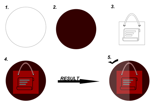
GITHUB
Original files
All editable files can download here (GDRIVE)
Posted on Utopian.io - Rewarding Open Source Contributors

Your contribution cannot be approved because it does not follow the Utopian Rules.
Hard rules broken:
Suggestion:
You can contact us on Discord.
[utopian-moderator]
Hey @baranpirincal, I just gave you a tip for your hard work on moderation. Upvote this comment to support the utopian moderators and increase your future rewards!