The real process of a Logo design. [Modify RULES]

In order to get whatever thing done there's need of following a process. The better the process the better the result. You can't decorate a cake that hasn't been baked, you can't turn on a car that doesn't have any gas, etc. And designing a logo is not the exception to have an specific process that ensures a hard work was made to get a better result.
My suggestion, which I am 100% sure every professional designer will agree with and also every beginner should agree too, is to make the rules for Logo design submissions more strict.
To explain that clearer to moderators, admins, contributors, curators and sponsors I will show you the process to make a logo.
1. Brief
To make a good logo there's need to know the brand or project you will work for/with.
- Who are they?
- What do they do?
- Who is their market?
- What do they want to communicate with their branding?
Those are just a few questions that must be answered before starting. To get a perfect idea of what we can design for them, instead of just making shapes or drawings that look cool. Because a Logo is the face of the project and being accepted or rejected by a potential client could depend 100% on it.
After getting the questions answered, you can pick the main concepts to reflect in the logo.
2. Pencil Sketch
Sketching is a very important part of designing a logo. Here the ideas flow and get into paper to see how they look, what can be improved, what works, what doesn't work. They are modified and analyzed; and there's need to do so many in order to get the best of them.
Here is an example with Trail hispano sketches:

In this sketches the idea was to make something that reflects:
- Cooperation / Team work
- Upvotes / Support
- Community
- Help
3. Digital version
After the pencil sketch phase, there's need to make a digital version of the best ones. Sometimes it is very clear and making just one digital is ok; other times there's need to make more. But whatever the case, there's always need to make options of it.
To make this point clearer I will show you the options with one sketch pencil chosen by the client:

He picked his favorite from the pencil sketches and I worked with it to give him options of how it could look. After analyzing them together we picked the best one:

4. Color
Sometimes designers jump to color since the beginning, but that is not a good idea. That should be definitely the last part of the logo itself. Because first you need to be sure the shape is perfect before adding color to it.
There is need to experiment according to the brief to select the best color choice. For this there's also need of psicology of the color knowledge.
- What does blue mean?
- What does red make feel?
- What is complementary color of green?
If you can answer these questions you are able to work with color to make the best for a logo. Some logos are more flexible by nature as you will see here:

But for other kind of logos there's specific need of color combinations to make them work. The right color to look professional/experienced, the one to look young, the one to look serious, etc.
5. Final result with detailed explanation and variations for different uses
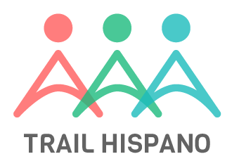
This is the final logo for Trail hispano.
There is need to explain the logo with the most details as possible.
Example:
The shapes of the logo are mean to be people helping each other, holding hands.
The body of each person is also the shape of an upvote.
There is variety of colors because the members of the group belong to different countries.
The colors are semitransparent in the area of hands to show them merging, meaning the collaboration.
The name Trail hispano appears in a subtle gray to combine perfectly with the colors above, so nothing fights each other in importance, but matching in harmony.
The font in the name is one that looks modern but serious at same time. Giving it a professional look.
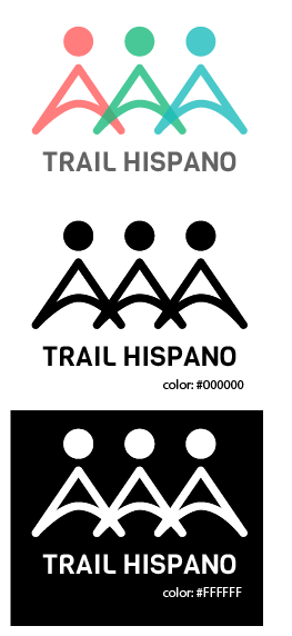
Variations
High contrast are the most minimum needed variations. I mean, the logo should be safe to reproduce in total white (with black background) and total black (with white background). Showing it like this we make sure we have a logo that works in most of the cases that can occur. In case it's needed a little adjustment can be made.
Example:
Conclusion
This 5 steps are the minimal needed to get a good logo, if a step is missing the result is mostly to be a bad one.
Making a long post with process is not about detailing just the digital version of a logo. There could be a long post saying:
I made a line, I made another line, I colored the line, I changed the line...
But that is not actually what makes sure it is a good contribution.
By adding this steps to be an obligation on every logo contribution for a project in utopian everyone could be sure of this:
- The designer followed a process to make sure to make the best logo.
- So this is not about moderators accepting what they like or not; it is about accepting what fits the rules. Rules that also fit the professional model to get an AWESOME LOGO contribution here.
With this you can see making a logo is not just about opening a software and start designing the first thing that comes to your mind. It's about following a real professional process.
But still there's a chance the final logo is bad, so the moderators can still decide if the contribution gets approved or not.
I am a professional graphic designer | You can find me here {  |
|  |
|  }
}
Posted on Utopian.io - Rewarding Open Source Contributors
wow nice to see this one
a simple but meaningful design XD
Thank you!
Thank you for the contribution. It has been approved.
You can contact us on Discord.
[utopian-moderator]
Thank you!
Wo yeah. Tbis is awesome to get up.
Thanks! Time to get real things done!
its nice...great information for all..
thank you!=)
I could not agree more. It's visual cummunication and there for you need to know what message your transmitting. A baby can make lot's of sounds, but can it speak? It needs to learn first how to put this sounds together to communicate more complex things! The same applies for design. Nice post! Very well explained and showcased!
EXACTLY!!!!
Are you a designer?? Will you post more design work?:D
Yes, I'm a designer XD and more posts coming soon :)
Peeerfect!!
Excellent article. Very well detailed, and thanks for your logo for @trailhispano!
Keep on doing all of those excellent logos!
I put my life on it!!XD thanks for the appreciation mois!:) Working with you is always awesome ;D
You get excellently better in each post.
Thank you!
Hey @fabiyamada I am @utopian-io. I have just upvoted you at 4% Power!
Achievements
Suggestions
Human Curation
Community-Driven Witness!
I am the first and only Steem Community-Driven Witness. Participate on Discord. Lets GROW TOGETHER!
Up-vote this comment to grow my power and help Open Source contributions like this one. Want to chat? Join me on Discord https://discord.gg/Pc8HG9x
wow..this is good artcles for me..thanks again @fabiyamada
You're welcome!:)
This is great. But it's not for everyone though. I make logos but I don't follow these steps. Especially pencil sketches. I straight up do it digital. It doesn't mean I do less work. I don't do color study, I just pick the colors and change them as needed that's why we have editable files. This is a good suggested template for people to use but again it's not for everyone.
Some steps can be skipped if the client specifies.