Your idea is nice :) I just would like to help you a little with this ;D
Your logo needs consistency, with shapes sizes and proportions to make it look better.
I will try to explain with graphics.
You have very round with square corners combined:

Super huge elements with small elements:
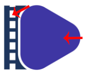
I see you tried to make a video tape and the play button, remember to first think: how many squares do I need to resemble a video tape?
Here is an example of consistency:
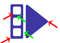
Red: Same round for corners .
Green: Same space between shapes.
N.B. Don't take this as example for good logo, is just to explain consistency, ok?=)
I invite to make a bunch of pencil sketches before jumping into illustrator, that is going to help you a lot :D
I hope my comment doesn't bother you and helps you a little to do better next time n_n
I am not utopian moderator, take my advice if you want. I am a graphic designer graduated in 2009; founder of @wearecodex team.
tried little pencil sketches in the past.actually my hand art is too bad to look so i never try to to do that now.but i should try to pencil sketches from now cause you explain whats good for me.thank you so much
yeah it helps a lot get many ideas and when you see them you can think more and more ideas, modify them, play, etc =) Is not necessary to add them to the post if you think they don't look good, but that will help you get a better concept :)
Greetings!!