Design for website - SPAMPIG (wearecodex gamehub)
Repository: https://github.com/wearecodexx/crypto-gamehub
Link to task request: does not apply. I am project owner.
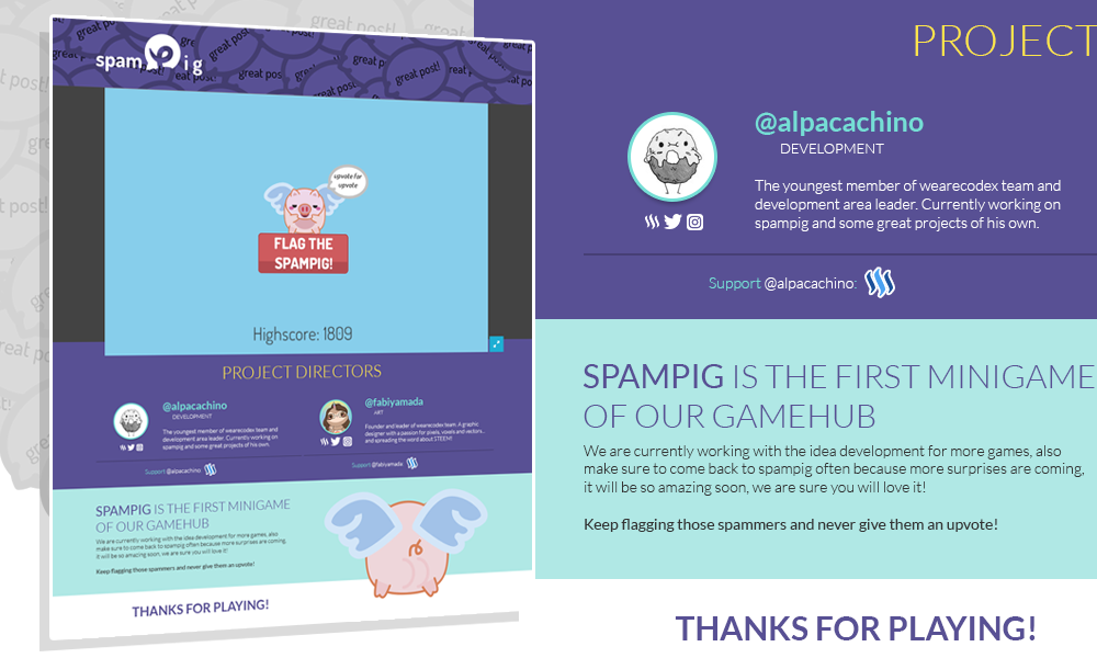
SPAMPIG is the first minigame created by @wearecodex team as part of the GameHUB. This game approach is to fight spammers by flagging them in a fun way.
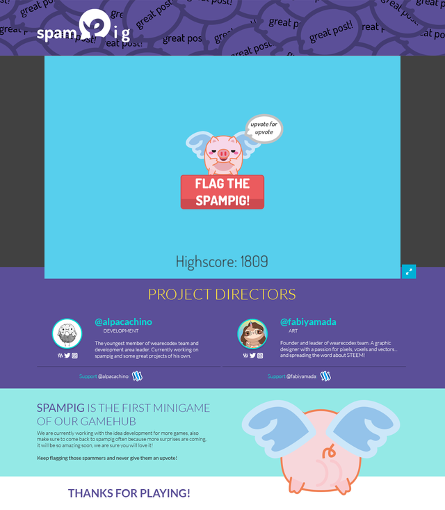
Final result, complete page:
Important details:
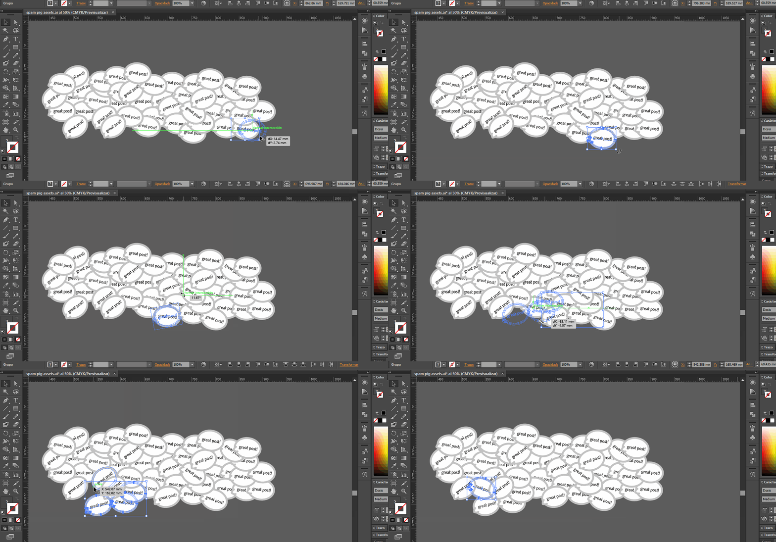
The first mistake spammers do is to leave short insignificant comments like: great post! That is why the top banner is filled with a buble with that text, as you can see below.
Directors section:
We want to make sure the people who took the main responsabilities of the game are well credited, so there is a section with details to find them in other social media (if they have profiles there), a little description, and of course, their avatars and a link to support them they way they want.
Final section:
A bit information about the game and an invitatation to stay connected because much more is to come.
Benefits / improvements
Now the website for spampig is completely formal and looks more professional, also it adds information to credit authors and to keep the gamers more engaged.
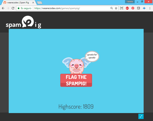
Old web design
It only had gray divisions and the logo, as well as the favicon based in the logo icon.
Proof of authorship
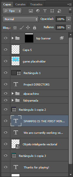
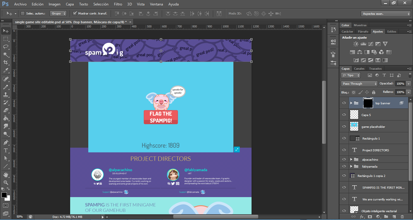
Layers:
Tools
I used Adobe Photoshop CS6.
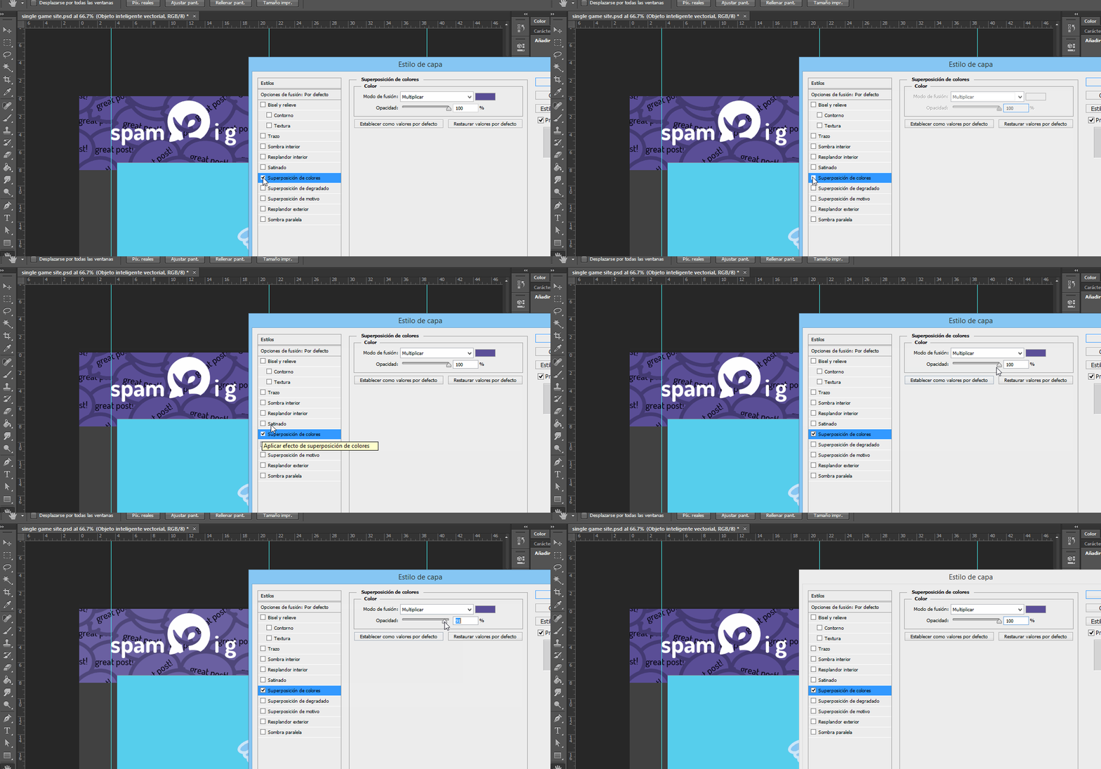
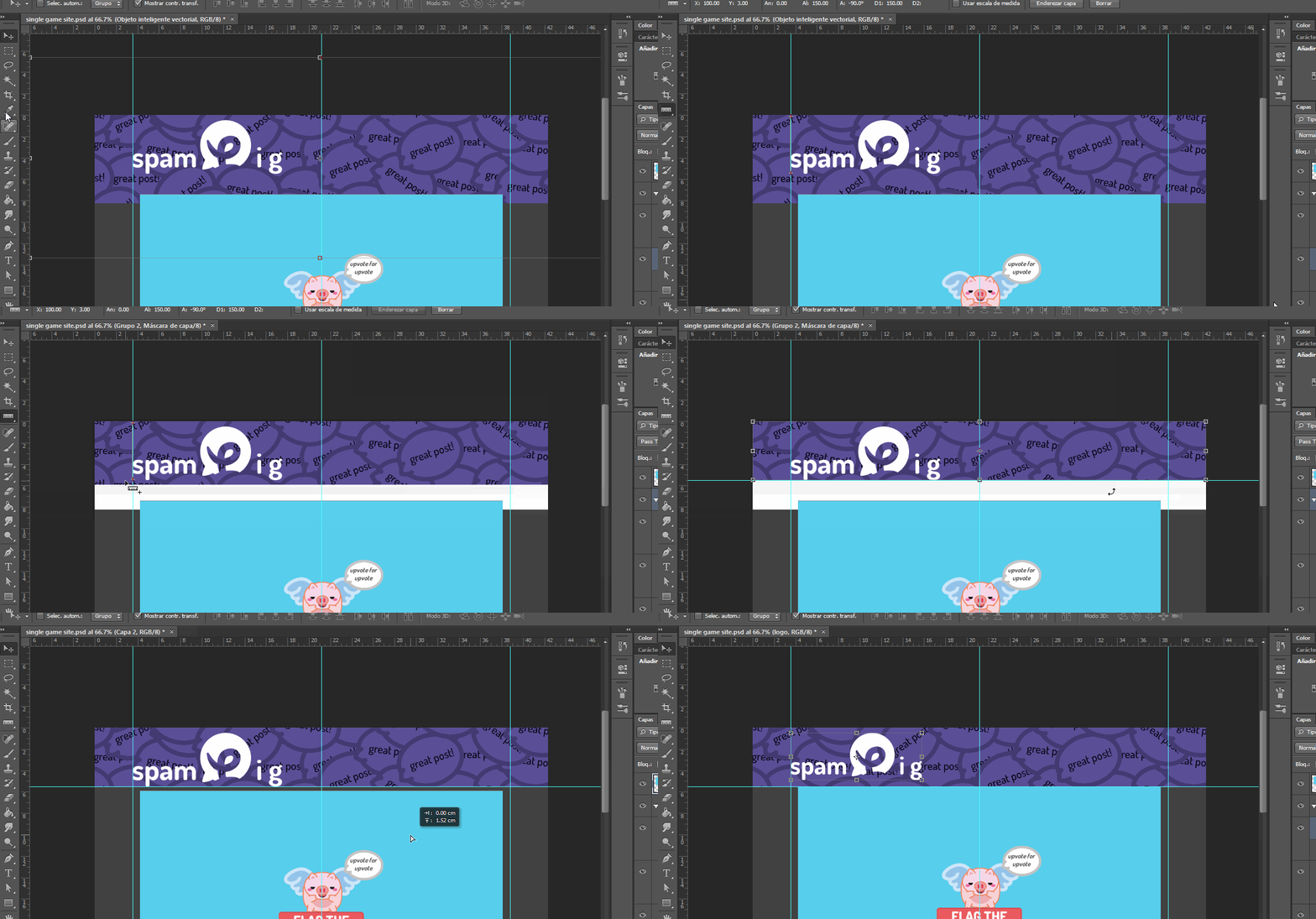
Workspace:
Original files:
GOOGLE DRIVE FOLDER Find PSD, PDF, and image files.
Images for immediate use:
Logo:
Top background:
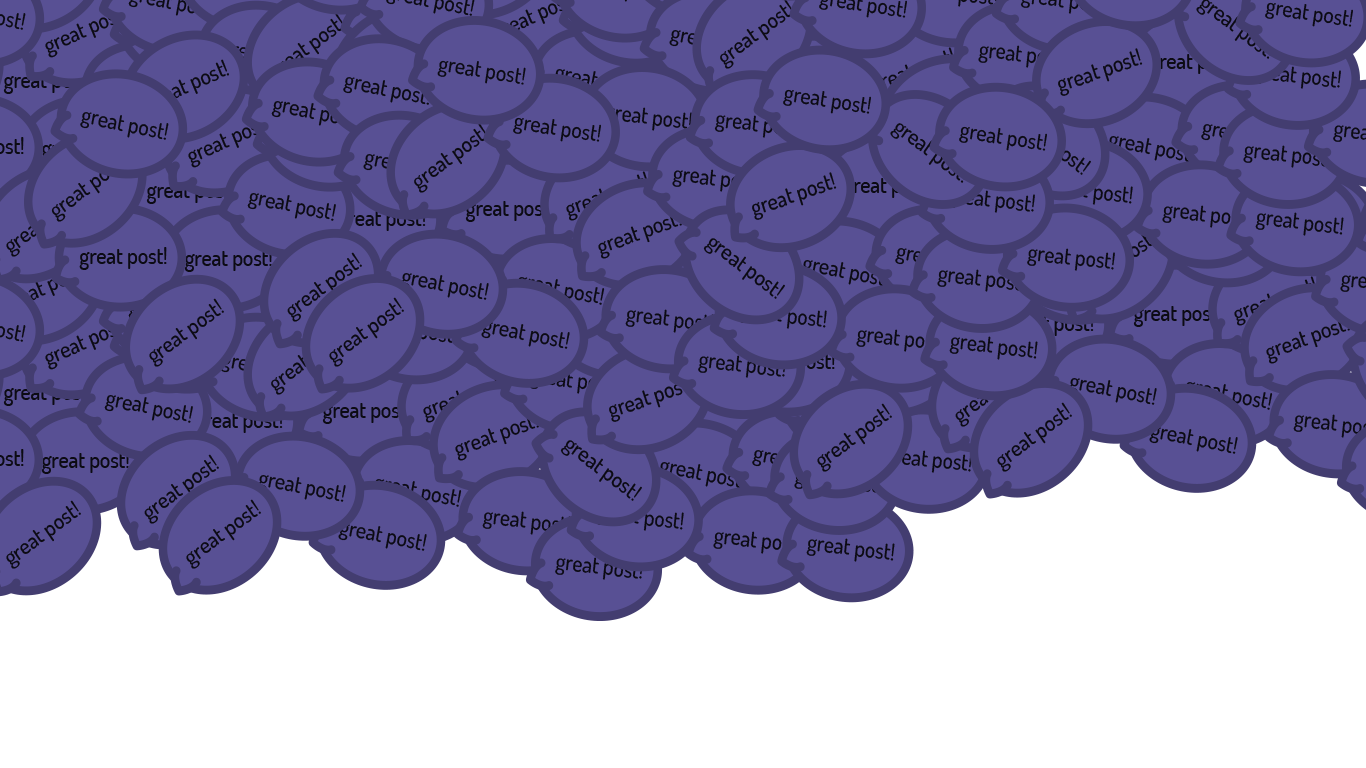
Note: It HAS to be like this, not cropped to fit the exact area, because in the CSS it needs to be background-attachment: fixedand background-size: coverto get the effect showed in the gif above. So, for immediate use it MUST be like shown here.
Avatars:
![]()
![]()
Note: The images are squared also because they are rounded by CSS using: border-radius:50%; ; in this way, in case the developer wants to make them square again or just a bit rounded corners it is way easier to modify than having a rounded image.
Support logo:
If you can't see some images just turn on "night mode".
Proof of Work Done
https://github.com/fabiyamada
https://github.com/wearecodexx/crypto-gamehub/issues/10
PLAY THE GAME
- There you can verify the web design has been implemented, note that I am project owner of this game and leader of @wearecodex team.
Licensed under a [Creative Commons Attribution-NonCommercial 4.0 International](http://creativecommons.org/licenses/by-nc/4.0/).




You could link the issue here web design · Issue #10 · wearecodexx/crypto-gamehub · GitHub as the request
As I’ve suggested here Design of Cover image for Steem-Plus API — Steemit, you can focus on projects looking for a logo. We are not going to accept simple iterations on banners etc…
I can already see another issue here. https://github.com/wearecodexx/crypto-gamehub/issues/11
You did a great job gathering talented designers and developers under wearecodex team. Please use your power and talent for good of Open Source community.
Need help? Write a ticket on https://support.utopian.io.
Chat with us on Discord.
[utopian-moderator]
Well, I linked the issue in the part of proof of work done because there asked for Github account. But I think that is not very important right now, is it?
A web design is not a simple iteration, this was made from scratch, there was no previous version with similarities, also a web design is very important for a project that consists on games to be played on a browser.
Also web design is more difficult than logo design, I know many more designers that can create logos than designers who create web. That is why web designers get better payment than logo designers in 'real world'.
I hope you reconsider.
Hmm, I never saw these digits in 'real world' UI jobs. http://bfy.tw/I5fV
This is your point of view, it's related to designers' specialties.
I saw web designers (as of myself) just import a UI framework and c/p the required components. It's about the effort designers choose to put in.
This is graphics section and I only evaluate the graphical part of the process, I didn't check the code part. If you think it's better suited for a web design process you should have tried development section instead.
I've just checked your 3 Pull Requests and it doesn't look like it started from zero, either. Even just by looking at the titles of pull requests.
This is a very good layout!
well done!!!! @alpachino @fabiyamada ... :) autenthics machines
I didn't touch any of this XD
Hahaha thanks grandson!
Beautifull desighn dear I like it I think you are designer
yes, I am... XD
Hey @fabiyamada
Thanks for contributing on Utopian.
We're already looking forward to your next contribution!
Contributing on Utopian
Learn how to contribute on our website or by watching this tutorial on Youtube.
Want to chat? Join us on Discord https://discord.gg/h52nFrV.
Vote for Utopian Witness!