New Icon Design for Calendar Notification Plus
Hi guys this is my proposed new icon design for Calendar Notification Plus.

DESCRIPTION:
This app would replace calendar event notifications, providing snooze functionality and notifications persistence.
For this app to work it must be opened at least once after installation. Please don't forget to grant required calendar access permissions.
Source
DESIGN CONCEPT:
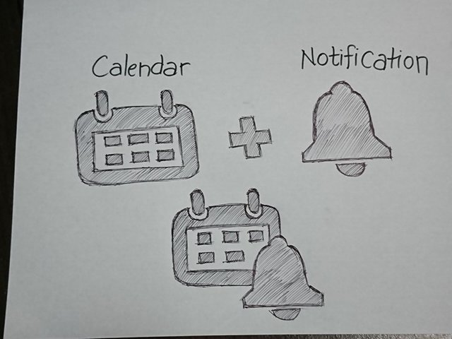
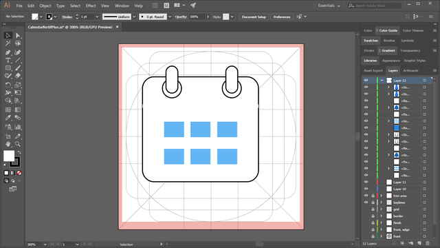
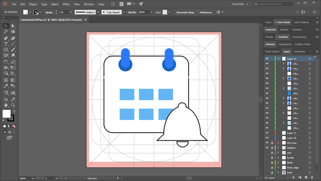
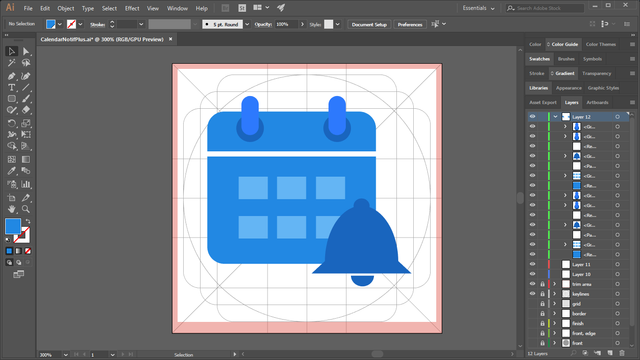
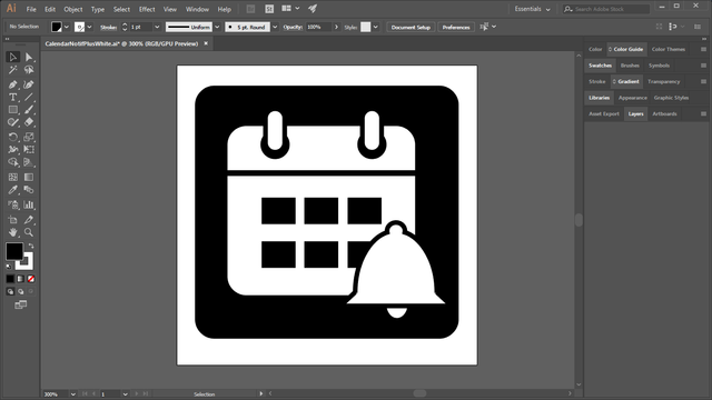
I used a simple calendar icon and then add a bell like icon to represent the notification.
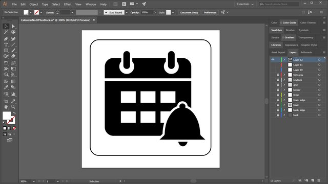
BLACK ON WHITE AND WHITE ON BLACK LOGO VERSION

COLOR VARIATIONS

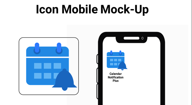
Source of photo : Phone
ICON SIZES
-192px

-144px

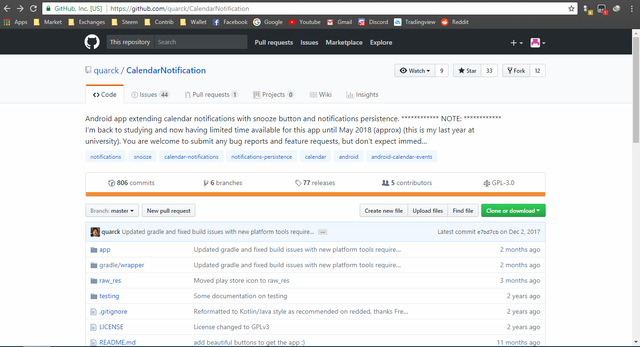
GITHUB REPOSITORY
Link
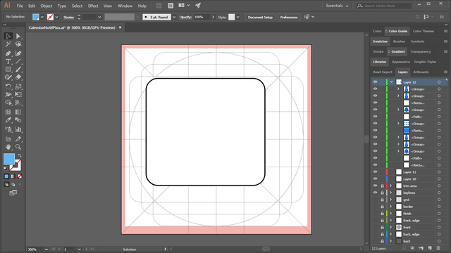
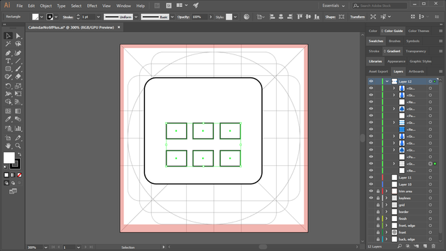
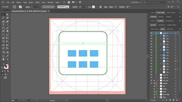
PROOF OF WORK
BENEFITS/IMPROVEMENT
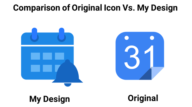
I think my new icon design make the original icon better because it shows the app’s concept. This new icon will help users to easily determine what's the use of the app. The bell icon I add and the simple calendar icon shows that this is a calendar notification app.
TOOLS
I used Adobe Illustrator CC 2017 in designing this new proposed icon and Microsoft PowerPoint for the presentation.
ORIGINAL FILES
You can download all the files i used in the link below.
Original Files
Posted on Utopian.io - Rewarding Open Source Contributors
squares are misaligned, "clips" on the top are not same and it would be better if they had perfectly rounded corners, gaps in one-color version are too small - make them at least 3x bigger.
With these fixes, it can be approved.
Thanks for your consideration sir. I appreciate it. I will edit it now and improve my work. Thank you for your advice sir.
I already made the changes sir. Thank you for your help. :)
Thank you for the contribution. It has been approved.
You can contact us on Discord.
[utopian-moderator]
Thank you sir. :)