Steemit - The Footer Box
Did there came a time that you saw your self having the need to travel through 5 miles of footer images and graphics before reaching the area where the site buttons are (Upvote, Resteem, Share, etc) and the comments part? I have, and that will be my own post, lol.

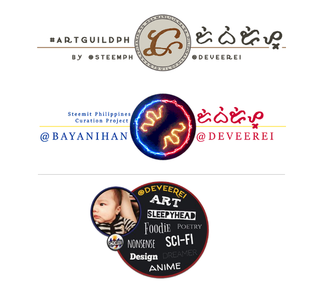
Usually those footers are graphics that Steemians add at the end of their posts to recognize or showcase the affiliation that they have in a certain community or group.
It can also be personal information about them like their linksto their websites or social media accounts, or it could also be badges that they've collected along the way by journeying through Steemit.
Sometimes though it can be a clutter because we don't really have any assigned standard format for having footers. Unlike the standards we have on our Profile Photos and Cover Images who stick to the sizes assigned by the website codes of Steemit.
There are indeed lots of pros for having the freedom to play with your footer but I must admit that there are cons as well that needs to be addressed.
So, why not compromise? Give them limits but give them options as well.
Here's the plan:
Let's provide an area for the footer, i think the best ratio can either be 16:9 or 4:3, and must be in landscape only. Having things in portrait will consume lots of real estate space on the screen and will took long to get pass to.
Then we add pages to it, like the sample I made up above.

Let's add dots for the "page's" navigation, it will be best to keep them minimal.
Give the users customization for the dot's color or even appearance.
We can also add arrows to both corners of the footer area - left and right arrow - for navigating among the "multi-footer".

Let's start calling it Multi-footer!
We may also give them customization for the arrows like how you did with the dots.
Make sure to restrict their customization options for the arrows based on their chosen settings on the dot, and vice versa - so that they won't destroy themselves by using christmas-themed dots with bones shaped like arrows, or other nasty combination of the two.

Add filters over the footers used. There are lots of websites and apps that offer filters, I bet there's something we can do to incorporate one into this. it would look nice if all those footers will be of the same theme and color. Filters would help in making them look almost the same.
Make sure to leave an option for opting out of the "multi-footer" feature. That's what freedom is about. Anyway if there are tons of people using it and most think it's cool and innovative then majority will follow and do the same thing. Let the trend take over.
Open Source Contribution posted via Utopian.io

Pretty ingenious. Is this something you thought up yourself, see something similar elsewhere and had a revelation or did you see the whole thing somewhere else?
Just thought it would look nice here with multiple footers - I typically see these effect/layout on online shop's banners.
I like it. I wish I knew how to do it.
The sample I made is simply a GIF. But what I envision is an interactive one for everyone to use - if only Steemit would implement it. Well this is an official contribution and it will be sent to their Github once approved, so we never know. Thank you for liking my work good sir!
ang gaganda sa mata! you guys have been blessed with such talents when it comes to designing. kainggit!! 😫😂
Thank you so much! Okay lang yan :D ikaw naman ay maganda din sa mata haha :D Maraming salamat sa papuri sa mga gawa ko! :))))
Astig yung alibata, ano meaning? :P
Yung name ko yun - lahat ng #artguildph footers and makikita mong alibata ay yung username ng may-ari.
Ang galing ng concept na to pre. :) dami mo ng contributions haha
Thanks. Oo, sipag pag may time haha.
Thank you for the contribution. It has been approved. Remove the steemdev tag please.
You can contact us on Discord.
[utopian-moderator]
Thank you. I have removed it thanks.
gusto kong gumawa nito but you know, tamad ako. maganda sya talaga dev. sakto sa mata
Thanks Gail! :)))
We are waiting for the artguildph footer. Yehey. Too much excitement.
Hehe, sorry sa delay dami ko inaasikaso ngayon e. Di ko pa maharap - unahin ko muna Guild Moderators ng #artguildph. For the meantime if you see someone making art na Pinoy just encourage them to use the tag para we can feature them. Thanks!
Will do. Thank you =)
dev, ang ganda gusto ko yong kay bayanihan nakita ko, parang may Christmas lights kaka goodvibes sya!
talented mo tlaga pogi!
Hehe, thanks! Yung may electricity or something? Di ako gumawa nun e - si @ninjace.
ay sya ba ang gleng astig nyo ah! rock n roll!
Yes, in-edit ko lang into the footer that we have sa @bayanihan.
astig to master haha
Thanks master @rye05!
Hey @deveerei I am @utopian-io. I have just super-voted you at 19% Power!
Suggestions https://utopian.io/rules
-Utopian has detected 2 bot votes. I am the only bot you should love!!
Achievements
-Good amount of information. Thank you!
-Much more informative than others in this category. Good job!
-Votes on this contribution are going well. Nice!
-You are having more votes than average for this category. Nice!
-You are generating more rewards than average for this category. Super!
-Seems like you contribute quite often. AMAZING!
-You have a good amount of votes on your contributions. Good job!
-In total you have more votes than average for this category. Bravo!
-You have just unlocked 8 achievements. Yeah!
Up-vote this comment to grow my power and help Open Source contributions like this one.