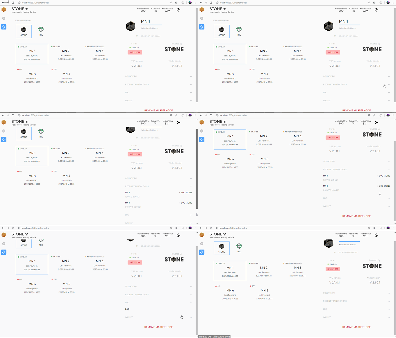
STONEm Front-end Development Update: Masternodes Manager Screen.
Repository
https://github.com/stonecoinproject/stonem-frontend
Pull Request
https://github.com/stonecoinproject/stonem-frontend/pull/42
Continuing with the development of the masternodes manager client, our previous update added the wallets screen alongside some base primitive elements.
Changes / New Features.
- Implement wallet funding screen.
- Leverage React render props design patterns to create a consumable & abstract
<ToggleProvider />component.
Details.
This screen has been pretty challenging compared to the previous screens. The masternodes manager is accessible on the route /masternodes. In keeping with the core philosophy when building this client, the goal is not to build extremely rapidly but to build with an eye for the future while minimizing technical debt.
In keeping in line with this philosophy, every line of code must be adjudged to be meeting the project goals. For this reason, we try to keep code as reusable as possible. One such excellent use-case for code re-usability is the simple act of toggling.
Toggling stuff is a staple for most applications be it a music player or a spaceship administration manager. With this in mind and understanding that we'll probably need to toggle stuff multiple times, the goal was to ensure we have just one component that does all our toggling. This component should have no opinions about styling, cosmetics and appearance.
I decided to launch a research into the most optimal way to do this and I narrowed down the solution to two design patterns:
- The higher order components (H.O.C) pattern.
- The render props pattern (alias the provider pattern).
Higher order components receive a React component and then sprinkles an extra layer of magic before returning the component to the consumer. The connect function of the Redux framework is probably the most popular H.O.C in all of React land. However, higher order components were not the way to go for this problem as that meant recomposing multiple components and littering withToggleProps everywhere.
The render props pattern (also called the provider pattern) is a pattern that allows you to pass a function either
- as a child element (accessible through the children prop) or
- as a method to the component's render function.
This means no annoying composing just straight down to business.
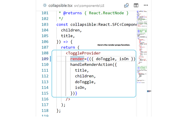
Usage of the render props pattern is seen in the implementation of the <Collapsible /> component that shows/hides content. The <Collapsible /> component simply delegates its own render function to the parent context's render function accessing the provided arguments.
/**
 * Creates a component that can be collapsed and expanded to show/hide content.
 *
 * @param { React.ReactNode } children  - Child elements to render within the collapsible component.
 * @param { React.ReactNode } title     - Title of the collapsible component.
 *
 * @returns { React.ReactNode }
 */
const collapsible:React.SFC<ComponentProps> = ({
  children,
  title,
}) => {
  return (
    <ToggleProvider
      render={({ doToggle, isOn }) =>
      handleRenderAction({
        title,
        children,
        doToggle,
        isOn,
      })}
    />
  );
};
Here's the implementation of the <ToggleProvider /> component.
/**
 * A render props pattern using component that can be used to create multiple
 * independent toggle functions.
 */
class ToggleProvider extends React.Component<StatefulToggleProps, StatefulToggleState> {
  readonly state:StatefulToggleState = {
    isOn: false,
  };

  constructor (props: StatefulToggleProps) {
    super(props);

    // Bind the method name to the class object to set context.
    this.doToggle = this.doToggle.bind(this);
  }

  /**
   * Toggles the `isOn` state property.
   */
  doToggle = () =>
    this.setState(({ isOn }) => {
      return { isOn: !isOn };
    })

  render () {
    /** Delegates actual rendering to the child render prop. */
    return this.props.render({
      isOn: this.state.isOn,
      doToggle: this.doToggle,
    });
  }
}
The cool thing about this pattern is we never have to worry about creating logic for things that switch off and on. The <ToggleProvider /> component can be used for our upcoming masternodes switch buttons as well as collapsible information panels. Sweet!
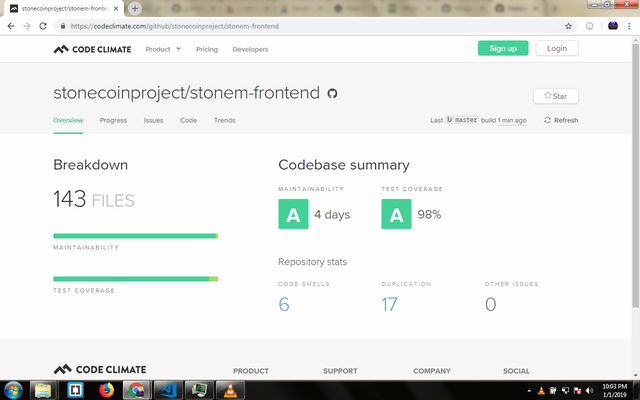
Pictured below is the code health analysis from Code Climate. Possible next approach is a refactor to take care of code smells and duplication.
What's Next?
- Provide in-depth code documentation for existing components.
- Refactor existing code for improved code health ratings.
- Add wallet manager screen.


Thank you for your contribution. A great update and a very nicely explained. The code is of very high quality.
Your contribution has been evaluated according to Utopian policies and guidelines, as well as a predefined set of questions pertaining to the category.
To view those questions and the relevant answers related to your post, click here.
Need help? Write a ticket on https://support.utopian.io/.
Chat with us on Discord.
[utopian-moderator]
Thank you for your review, @codingdefined! Keep up the good work!
Hi @creatrixity!
Your post was upvoted by @steem-ua, new Steem dApp, using UserAuthority for algorithmic post curation!
Your post is eligible for our upvote, thanks to our collaboration with @utopian-io!
Feel free to join our @steem-ua Discord server
Hey, @creatrixity!
Thanks for contributing on Utopian.
We’re already looking forward to your next contribution!
Get higher incentives and support Utopian.io!
Simply set @utopian.pay as a 5% (or higher) payout beneficiary on your contribution post (via SteemPlus or Steeditor).
Want to chat? Join us on Discord https://discord.gg/h52nFrV.
Vote for Utopian Witness!
Nice work. Glad to see development ongoing.