Part 2: Build a CSS-in-JS React App with Styled Components and Priceline Design System
Repository
Last time on this series, we explored the CSS-in-JS paradigm and code splitting with Webpack. We also built a minimal app interface that uses styled components for displaying notable lines from hip hop verses.
Today, we'll do some more development. We'll learn how to lazy-load on-demand route based code (i.e code specific to a certain route). We'll also explore more Priceline components and create some of our own components that leverage preexisting Priceline components.
Difficulty
- Advanced
What Will I Learn?
At the end of this tutorial, we should be fully up to speed on the following concepts:
- Lazy Loading Route Specific Code.
- Creating Custom Styled Components Leveraging Preexisting Styled Components.
- Designing an Accessible API for our Custom Styled Components.
Requirements
- Node.js 8.0 or greater.
- NPM 3.0 or greater.
- Yarn package manager
- Git
- Previous code on this series
- An intermediate level of ReactJS knowledge.
- Keen interest and patience.
Introduction
On our previous tutorial in this series, we got to understand the benefits we can obtain by using CSS-in-JS as our styling system. We also built the initial interface of a CSS-in-JS React app we called FireLiners.
Let's dive right in to this tutorial! As a refresher, it's important to remember that we currently maintain the below application structure:
fire-liners/
- config/
- jest/
- env.js
- polyfills.js
- webpack.config.dev.js
- webpack.config.prod.js
- webpackDevServer.config.js
- node_modules/
- public/
- favicon.ico
- index.html
- manifest.json
- scripts/
- build.js
- start.js
- test.js
- src/
- components/
- Header/
- index.js
- logo.svg
- Header/
- containers/
- App/
- App.test.js
- index.js
- registerServiceWorker.js
- components/
- package.json
- config/
Previously, we took a look at code splitting as a performance tool. Today, we'll be gaining an understanding lazy loading as a tool to further optimize load times.
What is Lazy Loading?
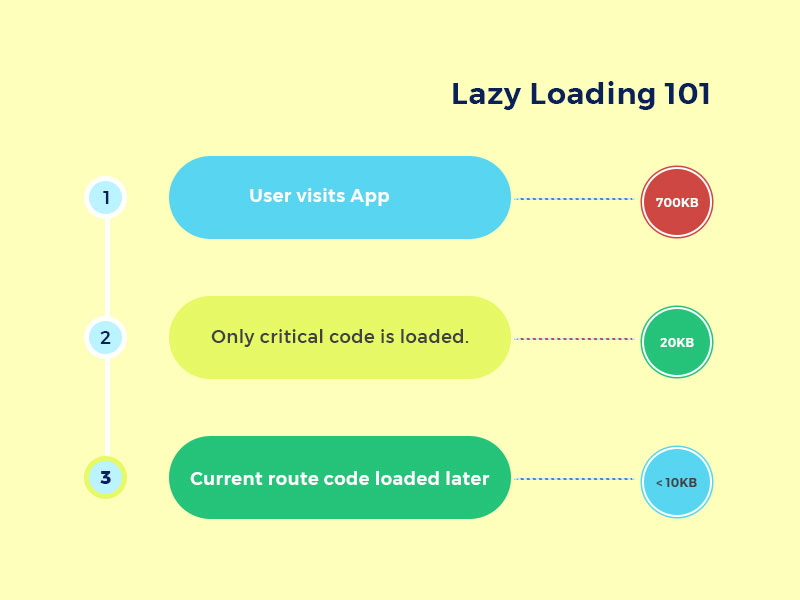
Lazy loading is the retrieval of a resource or resources only when they are needed. Lazy loading can help us speed up our application as we are only going to load some components when we need them as opposed to allowing them lump up our initial bundling.
We can use lazy loading techniques to great effect in multiple cases. For instance, let's assume we had a modal in our application that shows information about a particular user when you click on the users name. We don't need the modal component until we click the users name. Lazy loading the modal component is our best option for performance as this will help us reduce the code weight of the initial code needed to run our application.
Getting Started with Lazy Loading
There are multiple techniques for implementing lazy loading in React, but we'll be keeping the scope narrow by focusing on one solution. We'll be using the React Loadable package to implement lazy loading. Let's install it by running.
npm install react-loadable
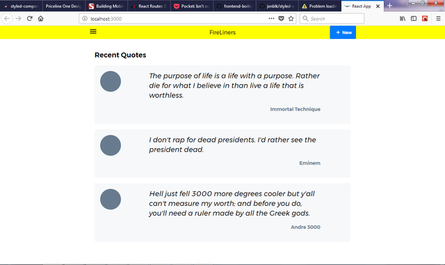
Our application looks like this at the moment.
From the view we see at the moment, our app could really benefit from being able to create a new quote. Let's add a route to the app that displays a short form that allows us to create a new quote. To do this, we'd need to setup routing for our app. We can do this by installing the react-router-dom package.
npm install react-router-dom
Once our installation is completed, it's time to refactor our code to take advantage of the router. We can do that by first rearranging our project structure. We'll be aiming for the below project structure. The changes to the project structure are indicated in bold and italicized text.
fire-liners/
- config/...
- node_modules/...
- public/...
- scripts/...
- src/
components/
- Header/
- index.js
- logo.svg
- Header/
containers/
- App/
- App.test.js
- index.js
- App/
screens/
- Home /
- index.js
- Loading /
- index.js
- Home /
registerServiceWorker.js
- package.json
As you can see, we added the screens directory to house our screens. Screens contain the components that our routes map to. We also added the Home and Loading screens.
Next, we'll refactor our src/containers/App. We'll be adding our routes here. We'll also be using react-loadable to lazy load our routes. We first start by importing our dependencies. We import the Router and Route. We also import the loading screen we'll be working on soon.
import React from 'react';
import Loadable from 'react-loadable';
import {
    BrowserRouter as Router,
    Route
} from 'react-router-dom';
import { ThemeProvider, Flex } from 'pcln-design-system'
import Header from '../../components/Header';
import AppLoadingScreen from '../../screens/Loading';
We now have to import the Home screen and make a lazy loaded component out of it as that's the first screen our users get to see. We'll be using two React components that we're yet to create (HomeScreen and AppLoadingScreen). We'll also be setting a maximum delay of 200 miliseconds on the request within which a user may retry the request.
const LoadableHomeScreen = Loadable({
    loader: () => import('../../screens/Home'),
    loading: AppLoadingScreen,
    delay: 200
})
Then we update our App class. We make sure to use a flex container that covers the whole screen. In our Router component, we pass LoadableHomeScreen to respond to requests to the / route.
class App extends React.Component {
  render() {
    return (
        <ThemeProvider>
            <Flex flexDirection="column" className="App" style={{ minHeight: '100vh' }}>
                <Header/>
                <Router>
                    <Route exact path="/" component={LoadableHomeScreen} />
                </Router>
            </Flex>
        </ThemeProvider>
    );
  }
}
We'll move some of our previous code to the home screen component. Edit src/screens/Home/index.js and add these dependencies.
import React, {Component} from "react"
import styled from 'styled-components'
import {
    Box,
    Flex,
    Link,
    Text
} from 'pcln-design-system'

const Circle = styled(Box)`
    border-radius: 100%;
    width: 60px;
    height: 60px;
    display: inline-block;
`;
We then simply move our old code that used to live in the App component to the render method.
class Home extends Component {
    render() {
        return (
            <Flex justify="center" alignItems="center">

              <Box width={[ 0.9, 0.8, 0.6 ]} p={3}>
                  <Text fontSize={3} mb={3} bold>Recent Quotes</Text>
                  {
                      liners.map(liner => (
                          <Box key={liner.id}>
                              <Flex bg="lightGray" style={{borderRadius: '4px'}} p={3} mb={3}>
                                  <Flex width={[0.5, 0.7, 0.2]}>
                                      <Circle bg="gray" mr={5}></Circle>
                                  </Flex>
                                  <Flex flexDirection="column" width={[0.5, 0.7, 0.7]}>
                                      <Text mb={3} width={1} italic fontSize={[1, 2, 3]}>
                                          {liner.body}
                                      </Text>
                                      <Link href={'/authors/' + liner.author}>
                                          <Text fontSize={1} mb={3} color="gray" align="right" bold>{liner.author}</Text>
                                      </Link>
                                  </Flex>

                              </Flex>
                          </Box>
                      ))
                  }

               </Box>
            </Flex>
        )
    }
}

export default Home;
Let's create a loading screen that we'll be reusing through out the app. Edit src/screens/Loading/index.js and add some code. We'll be displaying a simple message on a light yellow background. In the future we could have something more elaborate.
import React from 'react';
import { Flex, Text } from 'pcln-design-system'

const AppLoadingScreen = props => (
    <Flex style={{ height: "100vh", position: "fixed", top: 0, bottom: 0, width: "100%" }} bg="lightYellow" flexDirection="column" align="center" justify="center">
        <Text bold>Whipping up Awesomeness...</Text>
    </Flex>
)

export default AppLoadingScreen
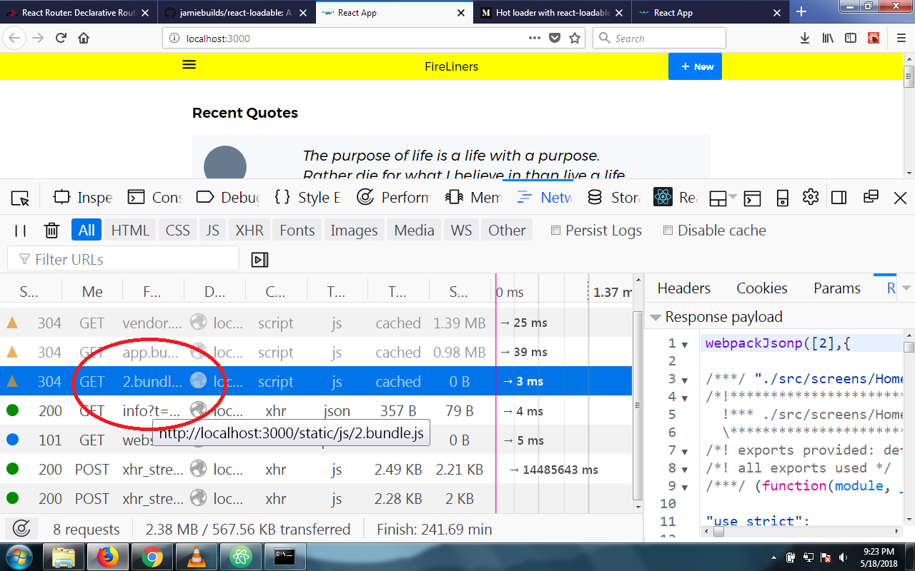
If we save and refresh our browser, we get a loading screen before our app comes up, so we know we've successfully lazy loaded our Home component. Let's hop over to the developer panel in the Chrome browser by pressing F12 on your keyboard and we'll switch to the network tab. We should see the below screen indicating that we made three requests for JS resources (app.bundle.js, vendor.bundle.js and 2.js). Inspecting 2.js closely, we see that it contains the home component separated from the other code.
Let's apply what we learnt to the AddLineScreen we'll be creating soon. Create src/screens/AddLine/index.js and we'll add some code to it. We're leveraging the idea of responsive sizes for our Flex element. We're displaying a simple form with an input field and a text area. Our Textarea component doesn't exist yet, we'll create it as a custom component soon.
import React, { Component } from 'react';
import { Box, Flex, Input, Label, RedButton, Text } from 'pcln-design-system';
import Textarea from '../../components/Form/Textarea';

class AddLine extends Component {
    render () {
        return (
            <Flex mt={4} justify="center" alignItems="center">
                <Flex flexDirection="column" width={[ 0.8, 0.8, 0.5 ]}>
                    <Text bold mb={3} fontSize={3}>Add. The Dopest Lines. Ever.</Text>
                    <Box mb={3}>
                        <Flex flexDirection="column" mb={3}>
                            <Label mb={2}>Author</Label>
                            <Input id="author" placeholder="Which cat dropped this line?" />
                        </Flex>

                        <Flex flexDirection="column" mb={3}>
                            <Label mb={2}>Lyrics</Label>
                            <Textarea rows={7} placeholder="Spit that line here, dawg..."></Textarea>
                        </Flex>

                    </Box>
                    <RedButton>Save and go back</RedButton>
                </Flex>
            </Flex>
        )
    }
}


export default AddLine;
Since we have more than two routes to deal with now, we better refactor our code or React will scream at us. Open up src/index.js and set it up to wrap our root App component in the React router.
import React from 'react';
import ReactDOM from 'react-dom';
import { BrowserRouter as Router } from 'react-router-dom';
import App from './containers/App';
import registerServiceWorker from './registerServiceWorker';

ReactDOM.render((
    <Router>
        <App />
    </Router>
),
document.getElementById('root'));
Next, we'll add the AddLine component as a lazy loadable component in src/containers/App/index.
const LoadableAddLineScreen = Loadable({
    loader: () => import('../../screens/AddLine'),
    loading: AppLoadingScreen,
    delay: 200
})
In the render method of the App class, we'll register the route
<Route path="/add" component={LoadableAddLineScreen} />
Creating our First Custom Component
In our AddLine class, we imported the Textarea class which we are yet to create. Let's handle that now. Create src/components/Form/Textarea.js and we'll get started. First, we import our dependencies. We are using the space and theme methods from styled system. This will give us access to the default spacings and theme setting that come with styled system.
import React from 'react';
import styled from 'styled-components';
import { space, theme } from 'styled-system'
Next, we do something of great importance, we define a function that returns the styles for the borders that will surround our Text box. This function also accepts the color and theme objects and makes them accessible to us. We also write code that provide defaults in the event that the function received no arguments. We then return an object with our styles intact.
const borders = ({ color, theme }) => {
  const borderColor = color ? theme.colors[color] : theme.colors.borderGray
  const focusColor = color ? borderColor : theme.colors.gray
  return {
    'border-color': borderColor,
    'box-shadow': `0 0 0 1px ${borderColor}`,
    ':focus': {
      outline: 0,
      'border-color': focusColor,
      'box-shadow': `0 0 0 2px ${focusColor}`
    }
  }
}
Next, we define the styles for our Textarea in a new ES6 proposal called 'tagged template literals'. We write regular CSS here except for the theme function calls. Calling the theme method with an argument here will return a value.
const Textarea = styled('textarea')`
    appearance: none;
    display: block;
    width: 100%;
    font-family: inherit;
    color: inherit;
    font-size: ${theme('fontSizes.1')}px;
    background-color: transparent;
    border-radius: ${theme('radius')};
    border-width: 0px;
    border-style: solid;
    border-color: ${theme('colors.borderGray')};

    padding-top: 14px;
    padding-bottom: 14px;
    padding-left: 12px;
    padding-right: 12px;

    margin: 0;

    ::placeholder {
      color: ${theme('colors.gray')};
    }

    ::-ms-clear {
      display: none;
    }

    ${borders} ${space};
`
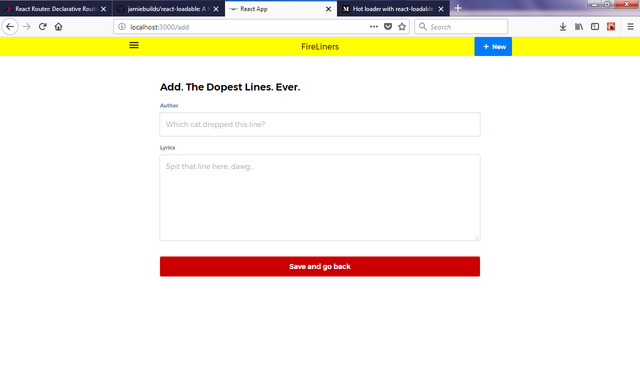
Fire up your browser and head to http://localhost:300/add and you should see a screen like the one below.
Whew, we've covered a lot today. With that done, we are through with this installment.
Conclusion
In this tutorial, we examined lazy loading code as a viable performance technique. We also created custom styled components with an API that accepts configurations.
In our next tutorial, we'll setup a proper state management system and we'll actually use our forms to populate the feed in the index route. Finally, we'll add functionality that allows us to create new entries for our feed of liners. Don't miss the next installment for anything.


Thank you for your contribution.
Keep up the good work.
Looking forward to your upcoming tutorials.
Your contribution has been evaluated according to Utopian rules and guidelines, as well as a predefined set of questions pertaining to the category.
To view those questions and the relevant answers related to your post,Click here
Need help? Write a ticket on https://support.utopian.io/.
Chat with us on Discord.
[utopian-moderator]
You're welcome.
Hey @creatrixity
Thanks for contributing on Utopian.
We’re already looking forward to your next contribution!
Contributing on Utopian
Learn how to contribute on our website or by watching this tutorial on Youtube.
Want to chat? Join us on Discord https://discord.gg/h52nFrV.
Vote for Utopian Witness!