Logo Designs for LibreOffice
Details
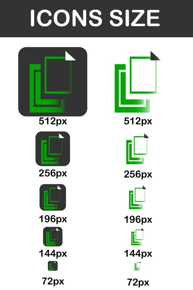
Write here the details of your work. Paste the images of the final result.

Font Download Here
Benefits / Improvements
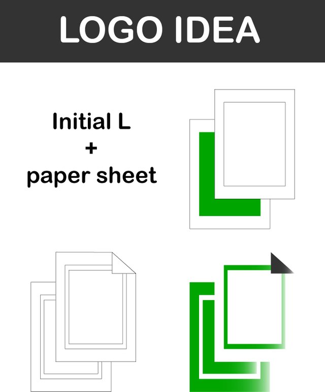
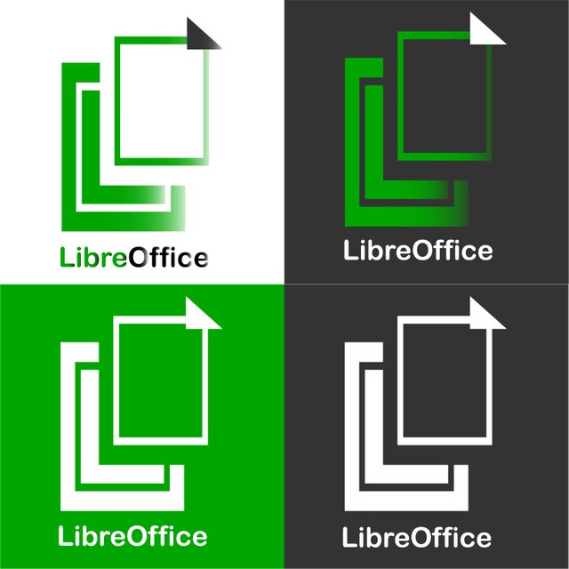
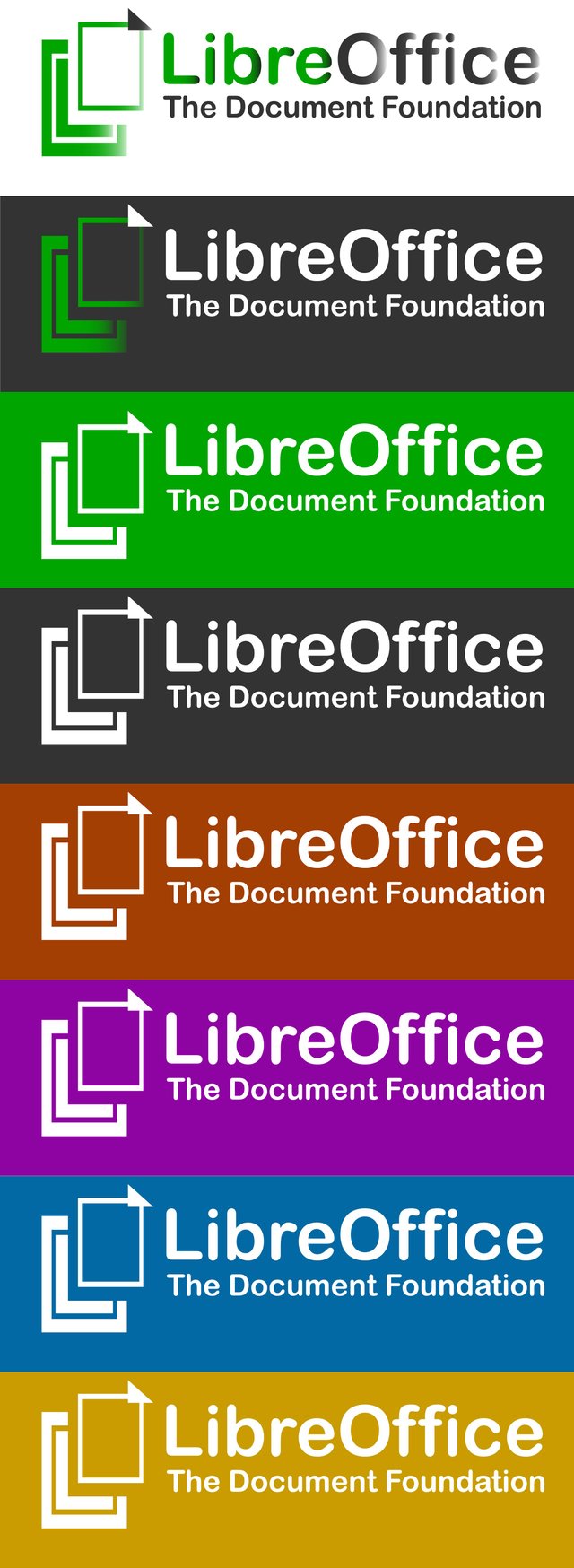
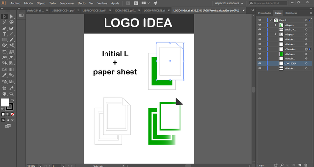
This is a totally original logo. Each one of the parts that compose them has a study of geometry and composition and its set forms a solid logo that brings personality to the brand.
It is modern, simple and clean, which helps its easy recognition and attracts in a friendly way ...
The benefits that it brings are:
1 - Personality
2 - Current identity
3 - Friendly identity
4 - Cleaning
5 - Ability to generate icons and campaigns
6 - Integration in the current graphic environments
Tools
Using Adobe illustrator CC 2018 to made creation logo process. here is screenshoot to proof my work about this logo.
Original files
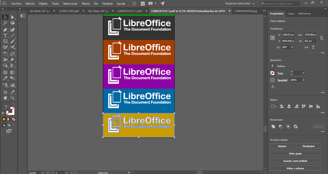
The following is a file about logos that can be used for projects. I enclose the logo in usable PNG, AI and PDF files.
Posted on Utopian.io - Rewarding Open Source Contributors
Your contribution cannot be approved because it does not follow the Utopian Rules.
HARD rules broken:
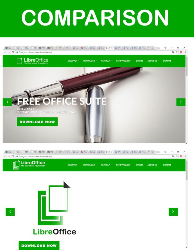
but it doesn't legible in full color version, it's look like a weird triangle that has nothing to do with the logo.

And the gradient and transparancy make the logo not legible in small size.
Suggestions:
You can contact us on Discord.
[utopian-moderator]