SECOND LOGO DESIGN CONTEST FOR STEEMMAKERS
Hello everyone and @steemmakers … it’s yet another amazing day, the week is really going smoothly and I hope we are having an amazing week also. Today, I will be showing the processes I took to create this second logo design for SteemMakers as a contribution.
Below are the steps that were taken to create the logo design.
BRIEF OVERVIEW
Ok guys, Before we start, I will like to quickly give a brief overview about this second logo design. I looked at the previous design that I did and I felt I needed to try out new style for the steemmaker logo. This time, I wanted to create a logo that looks simple but effective, so I started thinking out ideas and concepts, then if decided to jump into photoshop and let my creativity run wild.
LINK TO FILES: Here
PNG FILES Here
TOOLS USED
- Computer (windows PC)
- Adobe illustrator CC 2015
- Adobe Photoshop CC 2014
- Creative thinking
Now to the fun part;
STEP 1
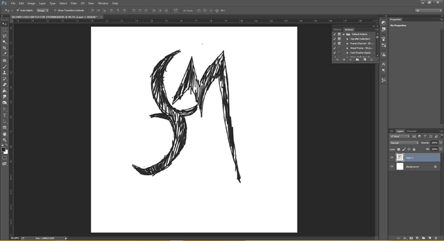
It all started with a sketch on my computer..
STEP 2
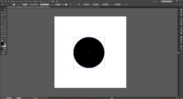
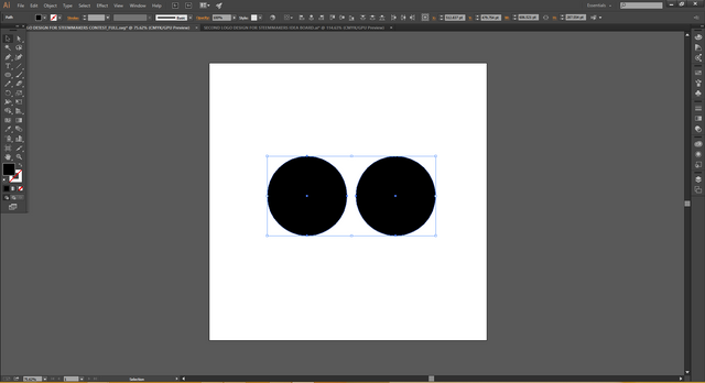
Next I created a circle shape and duplicated it to get two perfectly equal circles
STEP 3
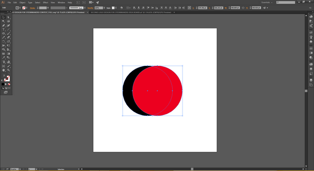
Next, I changed the colour of one circle for visual differentiation and placed it how I wanted it
STEP 4
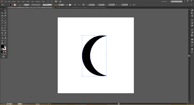
I cut out the shape
STEP 5
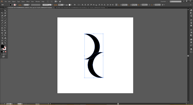
Next, I duplicated the cut out shape and flipped one the other direction and brought them close to form an “S” shape
STEP 6
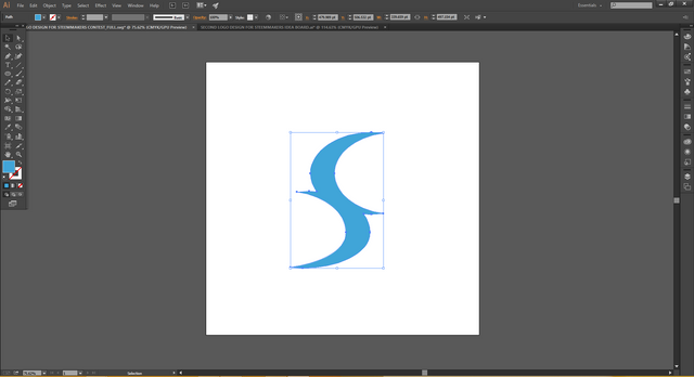
I merged the shapes into one and changed the colour and squeezed it in a little bit
STEP 7
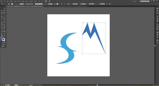
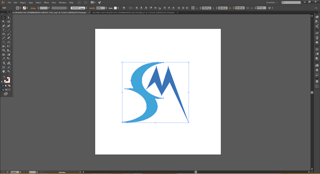
Next, I used the pen tool to create an “M” shape
STEP 8
I then placed the “M” shape where I wanted it
STEP 9
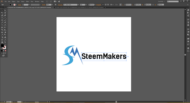
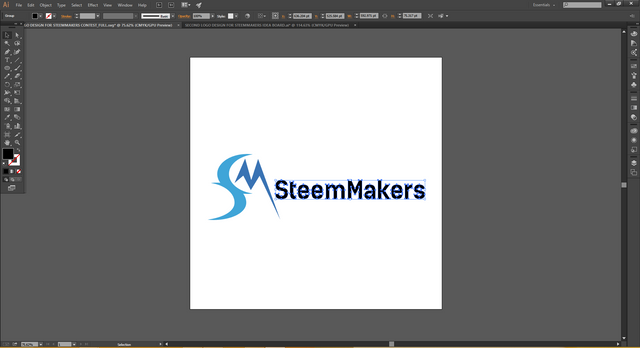
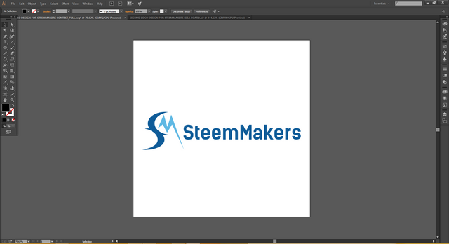
Next, I typed the name “SteemMakers and converted the text to shapes and changed the colour
STEP 10
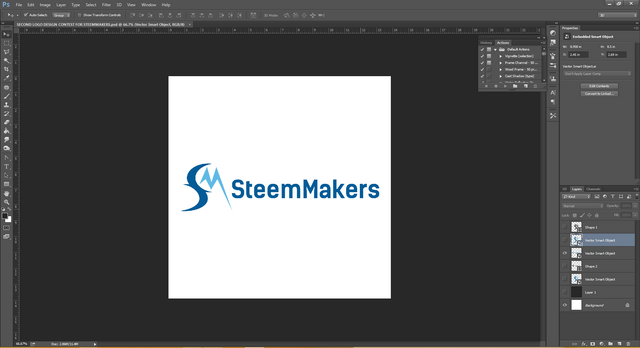
After creating the logo in illustrator, I brought it over to photoshop to create different background variations
STEP 11
Next, I typed the word “SteemMakers and converted the text to shapes and placed it near the logo in the spot I wanted it to be.
STEP 12
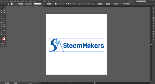
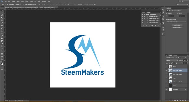
And that is how I created this proposal logo for SteemMakers
OTHER VARIATIONS:
CONCLUSION
This logo design was just pure creativity, there was no rule behind the design, I just wanted to create something that feels clean, elegant and portrays SteemMakers.
Posted on Utopian.io - Rewarding Open Source Contributors




yeey ist very useful thankss :)
Tnx alot
Thank you for the contribution. It has been approved.
You can contact us on Discord.
[utopian-moderator]
Tnx alot @umais
Hey @chimzycash I am @utopian-io. I have just upvoted you!
Achievements
Community-Driven Witness!
I am the first and only Steem Community-Driven Witness. Participate on Discord. Lets GROW TOGETHER!
Up-vote this comment to grow my power and help Open Source contributions like this one. Want to chat? Join me on Discord https://discord.gg/Pc8HG9x
Thank you. I personally think it would look better with a normal S instead of the two c parts combined. Something different, thanks.