LOGO DESIGN PROPOSAL FOR STEEMMAKERS
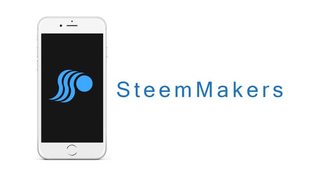
Hello everyone and @steemmakers … it’s another great and beautiful day again, hope we are having a wonderful week ahead. Today, I will be showing the processes I took to create this logo proposal for SteemMakers as a contribution.
Below are the steps that were taken to create the logo design.
BRIEF OVERVIEW
Before we start, I will like to quickly give a brief overview about this design. I got to know about the request for logo and banner design by @steemmakers and it struck me to jump on board. I wanted to create a logo that looks clean and elegant and at the same time portraying SteemMakers. So I started thinking out ideas and concepts, then if decided to jump into photoshop and let my creativity run wild.
The link to the files can be found here
LINK TO FILE: here
TOOLS USED
- Computer (windows PC)
- Adobe illustrator CC 2015
- Adobe Photoshop CC 2014
- Creative thinking
Now to the fun part;
STEP 1
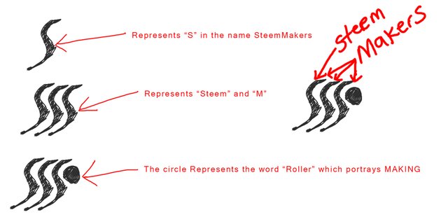
It all started with an idea sketch.
STEP 2
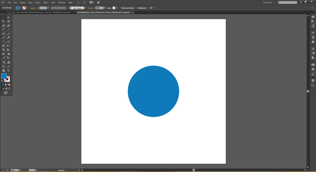
Next I started with a single cirle shape
STEP 3
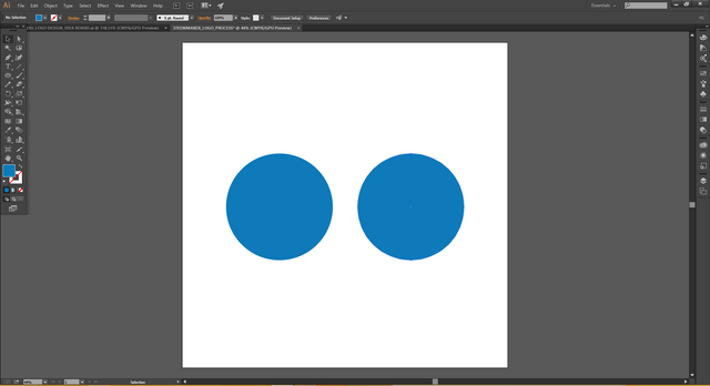
I duplicated the circle shape to have two circle shapes with exact dimensions and size.
STEP 4
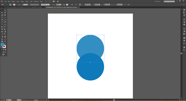
Next, I changed the colour of one circle for visual differentiation only and placed it where I wanted it.
STEP 5
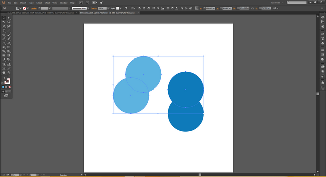
After that, I duplicated the two circles, making it a total of four circles, changing the colours also for visual differentiation only.
STEP 6
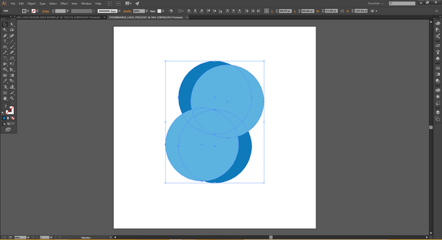
Next I positioned the circles how I wanted them. The positioning of the circles allowed me to get the shapes I had in my sketch.
STEP 7
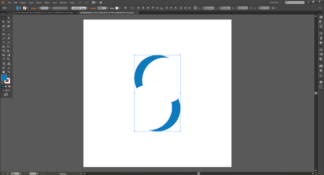
Next, I subtracted the parts of the shape I didn’t need.
STEP 8
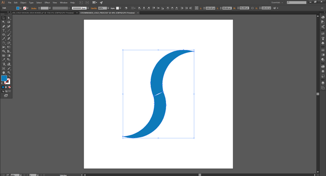
After that, I brought the newly created shapes closed to each other and merged them into a single shape.
STEP 9
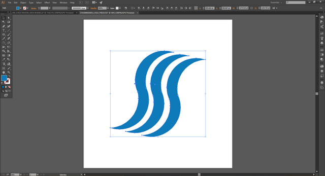
Next, I duplicated the shape three times to get the design I wanted based on my sketch.
STEP 10
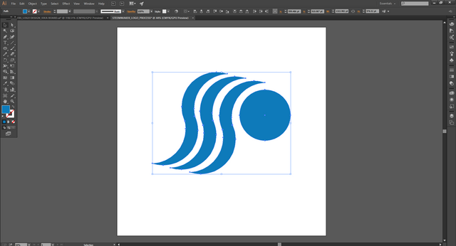
I created a smaller circle shape and placed it in the area I wanted it.
STEP 11
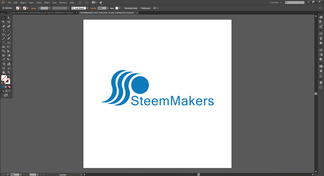
Next, I typed the word “SteemMakers and converted the text to shapes and placed it near the logo in the spot I wanted it to be.
STEP 12
And that is how I created this proposal logo for SteemMakers
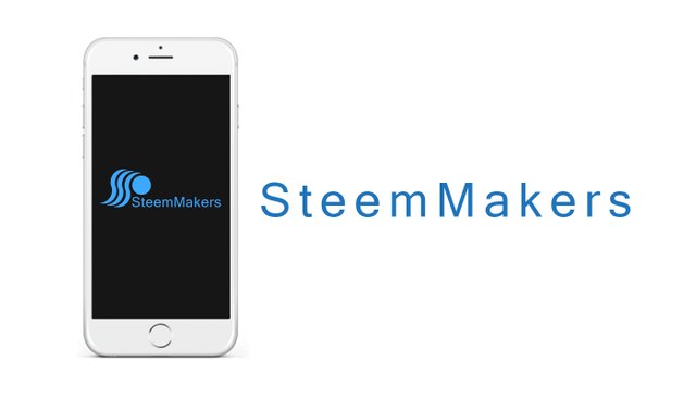
OTHER VARIATIONS
CONCLUSION
This logo design was just pure creativity, there was no rule behind the design, I just wanted to create something that feels clean, elegant and portrays SteemMakers.
Posted on Utopian.io - Rewarding Open Source Contributors



Thank you. I think I would like it better if logo replaced the s in steemmakers, but that would require the ball to go and that again would make it look much like the steem logo.
Nice idea :-D. I'm adding it to the contest overview here.
Tnx alot for checking up... @jefpatat
@jefpatat please reply here if you would like me to accept this one as a contribution.
Why shouldn't you? What do I have to do with your moderation?
Every design made for our project has value for us.
Thank you for the contribution. It has been approved.
You can contact us on Discord.
[utopian-moderator]
tnx alot
Hey @chimzycash I am @utopian-io. I have just upvoted you!
Achievements
Community-Driven Witness!
I am the first and only Steem Community-Driven Witness. Participate on Discord. Lets GROW TOGETHER!
Up-vote this comment to grow my power and help Open Source contributions like this one. Want to chat? Join me on Discord https://discord.gg/Pc8HG9x