Proposal for a New Design for the Roundcube Logo

Details
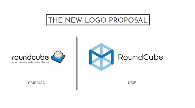
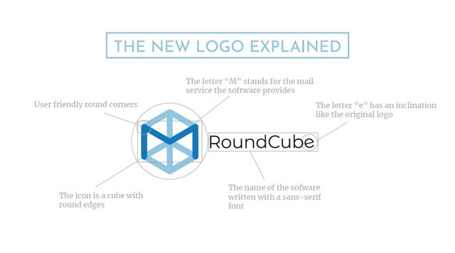
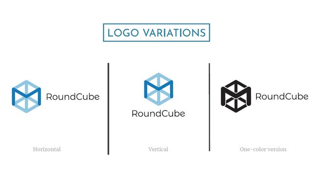
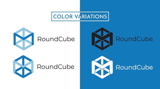
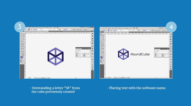
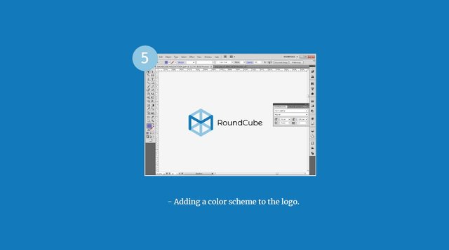
This new logo proposed in this article uses friendly corners in the design, in addition to The letter “M” stands for the mail service the software provides, the letter “e” has an inclination like the original logo and the name of the application was written with a sans-serif font, As we can see below:

Benefits / Improvements
This new Logo represents an innovation, achieving a clean and friendly design that identifies the Application with the use of the letter "M" highlighted in the final design. Integrating each of the elements that characterize it.
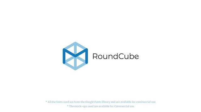
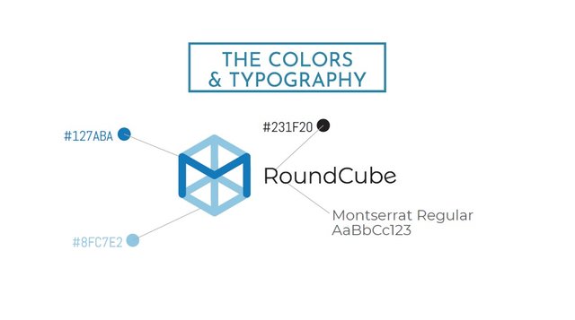
- All the fonts used are from the Google Fonts library and are available for commercial use.
- The mock-ups used are available for Commercial use.
Tools
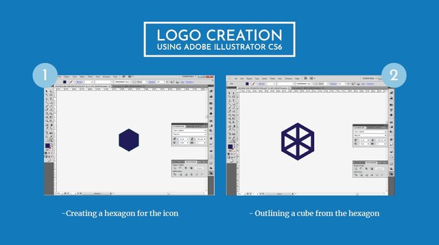
For the creation of this design Adobe Illustrator CC
Original files
Posted on Utopian.io - Rewarding Open Source Contributors
Excelente trabajo @carlos-cabeza el minimalismo es la tendencia.. Suerte
Thank you for the contribution. It has been approved.
You can contact us on Discord.
[utopian-moderator]
Hey @carlos-cabeza I am @utopian-io. I have just upvoted you!
Achievements
Community-Driven Witness!
I am the first and only Steem Community-Driven Witness. Participate on Discord. Lets GROW TOGETHER!
Up-vote this comment to grow my power and help Open Source contributions like this one. Want to chat? Join me on Discord https://discord.gg/Pc8HG9x