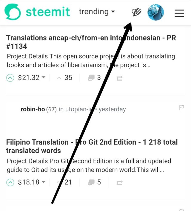
The 'Search' Icon Directly Overlaps The 'Create new post' Icon When Viewing Promoted/Trending post.
Expected behavior
N.B :This bug was noticed while using the mobile interface.
The two icons mentioned are usually separated by a significant gap, hence it is possible to use each of them without the conflict of choosing one when you mean to choose another.
The search option looks like a magnifying glass icon, while the 'creat new post' option is represented by a pen icon.. and post are situated at the top of the pages.
Actual behavior
When viewng trending or promoted post, both icon somehow breach the gap and meet in a way that the search icon overlaps the 'create new post' icon.
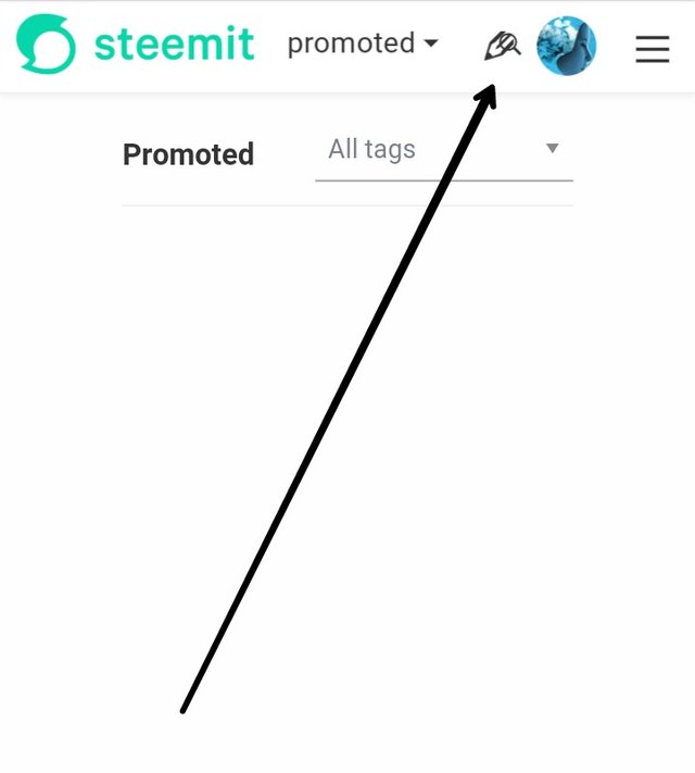
How to reproduce
Visit www.steemit.com
Follow a particular tag and view it's trending or promoted section.
There you will find that the search icon had moved to now overlap the 'create new post' icon
Browser: EKSTAR BROWSER V15.0
Operating system: ANDROID NOUGAT, VERSION 7.0
Recording Of The Bug
........
Posted on Utopian.io - Rewarding Open Source Contributors
Thank you for the contribution. It has been approved. It is happening if the resolution is more than 395px
You can contact us on Discord.
[utopian-moderator]
Hey @bluishjane I am @utopian-io. I have just upvoted you!
Achievements
Suggestions
Get Noticed!
Community-Driven Witness!
I am the first and only Steem Community-Driven Witness. Participate on Discord. Lets GROW TOGETHER!
Up-vote this comment to grow my power and help Open Source contributions like this one. Want to chat? Join me on Discord https://discord.gg/Pc8HG9x