Restructuring the functional buttons menu
Components
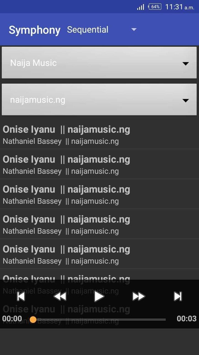
The symphony app is one lovely and nice app that displays all music in device folder and allows users to play them... It is a nice idea, not only displaying songs in a folder, but also allowing her users to know the total numbers of music in a folder.
It has the following buttons : the play,pause,forward,backward,previous and next buttons, which allows users to manage and play their music perfectly
(see image below)
From the image above, you can see that songs are displayed from the selected folder above and the buttons are used properly.
Proposal
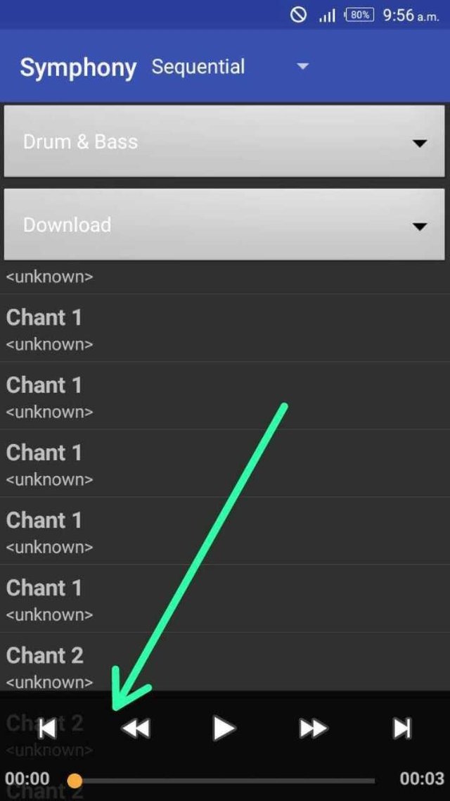
Well I discovered that the main functional button is mixed with the music files when displayed.
So am using this platform to propose that it should be separated and placed at the button of the app, such that it shouldn't have to be together, and thereby causing conflict...
Also in the case of few songs or just a song in a folder, and thereby impossible to select the desired song, should be fixed, adjusting the functional button down, and making the list of the displayed songs, stop at the beginning of the functional button menu.
Mockups / Examples
Whilst I was using the app, I noticed something that look more like a trivial bug, which I think should be amended and fixed.
(see image below)
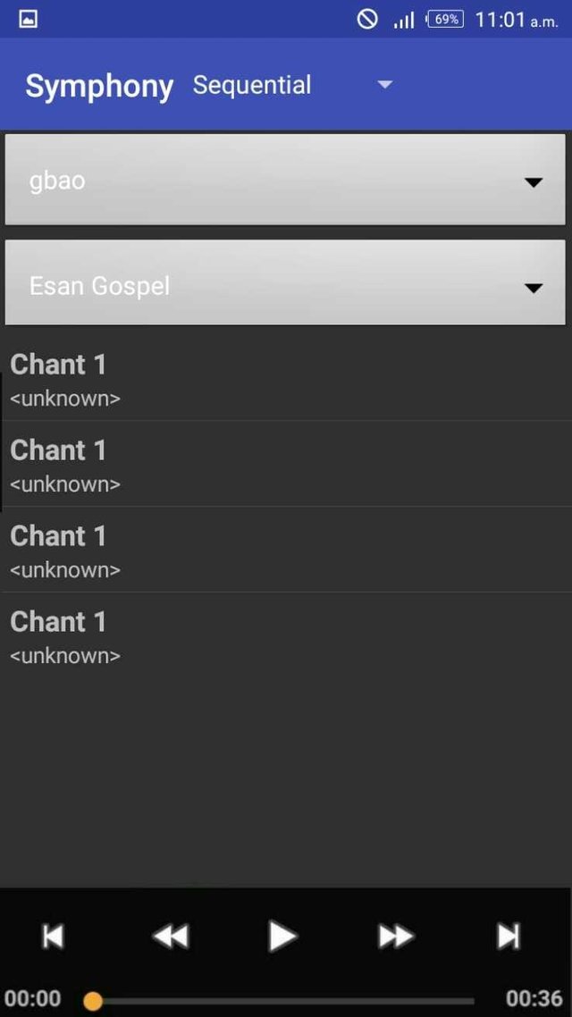
From the image above, you can see that when a folder is selected and songs are displayed for use, any music file that find itself at the bottom, it'll be at the back of the functional buttons, and won't be allowed to be touched.
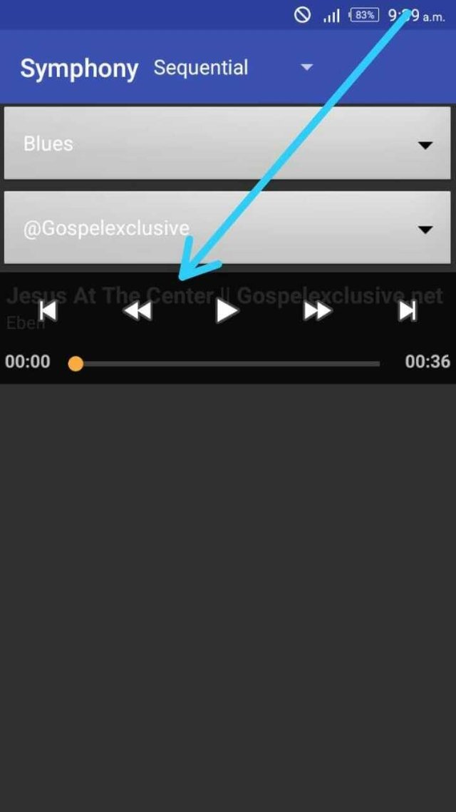
Also, in a case whereby a folder is having just a music file available, such music file can't be played, as it is behind the functional buttons
(see image below)
From the image above, we can see that it's impossible to select such music file for use.
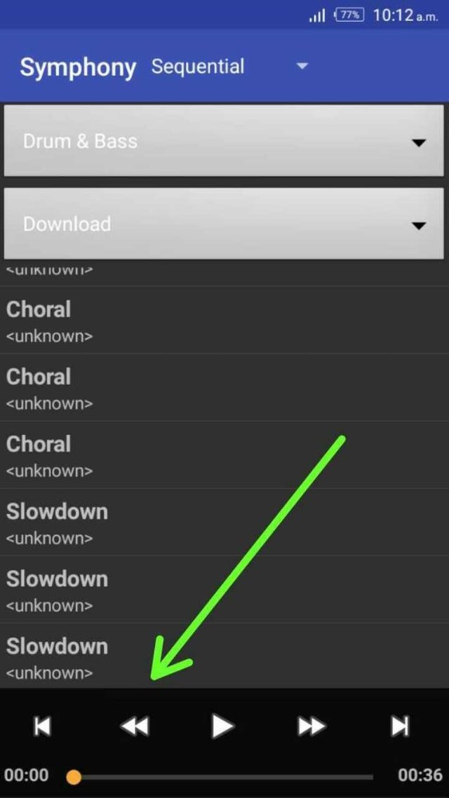
Now here goes my suggestion/idea. The app should be restructured in such a way that it should make all available music files end at the beginning of the functional button, and the button should be at the bottom of the app. I've been able to design a good view of how it should look like, to allow users use it properly
(see images below)
Also,
We can see that music files are displayed properly without having to be displayed behind the functional button. Also in a case of folders having like four songs in a folder, the play button is displayed at the button and isn't mixed with the functional button menu.
Benefits
- If this implemented and fixed, users will be able to select a file properly without any issue
- All files will be displayed correctly
- It'll be user friendly
- Users would have a good user experience as they'll be able to access their folders and music files properly
- The situation whereby users won't be able to select their desired songs, will be fixed and they get to play around with their music files prop
Hello @beckysophie, thank you for sharing this with us. I just downloaded the app to my device and you are right about the music controller overlapping with the list of music displayed. However, this can be avoided simply by pressing the back button.
Looking at the project issue tracker, the PO already made the intention to seperate the controller from the list to avoid overlapping (click here to view PO's comment).
Overall, i would love to see you improve on the kind of idea you share with us.
Things to consider before submitting idea contribution via utopian to ascertain good score
Once you are able to put this into consideration, i am sure your contribution will stand out and become very valuable to the project.
Thank you for using utopian.
Need help? Write a ticket on https://support.utopian.io/.
Chat with us on Discord.
[utopian-moderator]
Going to be worth a read!!