You are viewing a single comment's thread from:
RE: My Logo Contribution to "Plant Monitor"
Hey @tobaloidee ,
Thank you for the contribution.
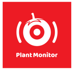
I liked the idea of how you separated leaf and tomato on single color version of the logo design. You can made it on the colored version. So, you can break the low color contrast between the red and green.
Also, the dimension difference between the logo-mark and typeface is too much. You should make the logo-mark smaller or typeface bigger.

Your contribution has been evaluated according to Utopian policies and guidelines, as well as a predefined set of questions pertaining to the category.
To view those questions and the relevant answers related to your post, click here.
Need help? Chat with us on Discord.
well, I liked it more on the colored version. That is not my style. Thanks!
Well, I liked it more
On the colored version. That
Is not my style. Thanks!
- tobaloidee
I'm a bot. I detect haiku.
Thank you for your review, @baranpirincal! Keep up the good work!