You are viewing a single comment's thread from:
RE: Proposal New Logo For NeftyNet
Your contribution cannot be approved because it does not follow the Utopian Rules.
Hard rules broken:
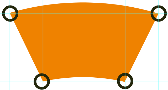
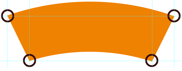
- Your logo design has some geometrical problems. There are mistakes in proportion, so your symbol looks weird. It looks like little details but it affects the whole symbol. Your logo design should be perfect for the project owner.
Suggestion:
- Try to use basic geometry when you construct your logo design, not hand-made paths.
You can contact us on Discord.
i dont think that is a hand made path. you know my work by proof.
But thanks for your advice, ill be try the best later.
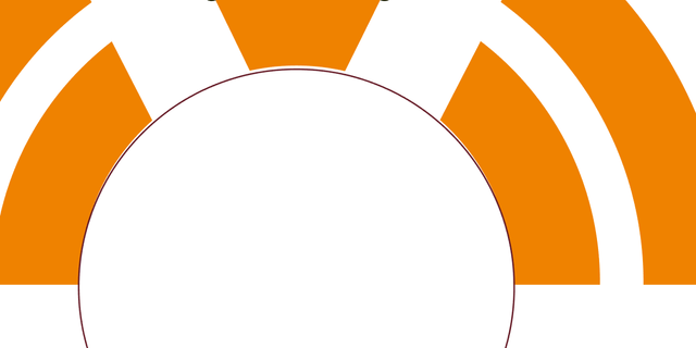
maybe you might have touched and did not realized, because the space in the middle does not sit on the circle as you can see on picture which I sent . you're welcome