Hey dee-y ,
Thank you for the contribution.
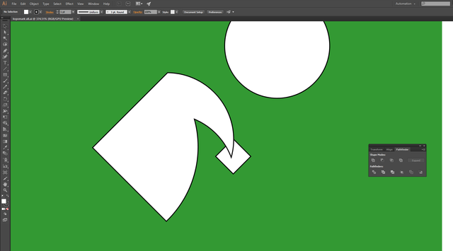
I think this thin stroke is unnecessary. It seems like a mistake.
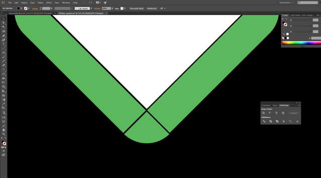
Also, squares are not understandable in small sizes. I think it would be better if you made detail more visible.
Your contribution has been evaluated according to Utopian policies and guidelines, as well as a predefined set of questions pertaining to the category.
To view those questions and the relevant answers related to your post, click here.
Need help? Write a ticket on https://support.utopian.io/.
Chat with us on Discord.
[utopian-moderator]
Thank you for your review, @baranpirincal!
So far this week you've reviewed 9 contributions. Keep up the good work!