RE: Logo Design For nunomaduro.com
Hey @dee-y ,
Thank you for the contribution.
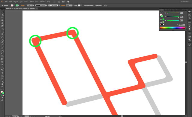
Actually, N and M letters are not recognizable. Because of that, your logo design seems to be some part of Laravel logo design and does not look original. In my opinion, your initial idea might be okay but it's application is not. You could get inspiration from logo design of Laravel but with changing something on design. Shape of logo design, color palette can be change or you can remind 'Laravel' in a different way.
In addition, icon looks weak in the square frame due to the thicknesses of the line. Also, corners of the icon seems not balanced. Spaces of the left corner wider. It looks, it not intentionally made.
Your contribution has been evaluated according to Utopian policies and guidelines, as well as a predefined set of questions pertaining to the category.
To view those questions and the relevant answers related to your post, click here.
Need help? Write a ticket on https://support.utopian.io/.
Chat with us on Discord.
[utopian-moderator]
Thank you for your review, @baranpirincal!
So far this week you've reviewed 9 contributions. Keep up the good work!