Hey @mansyaprime ,
Thank you for the contribution. I appreciate your work.
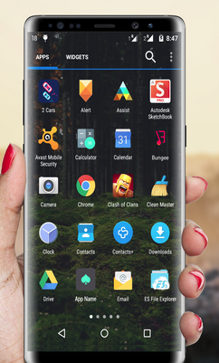
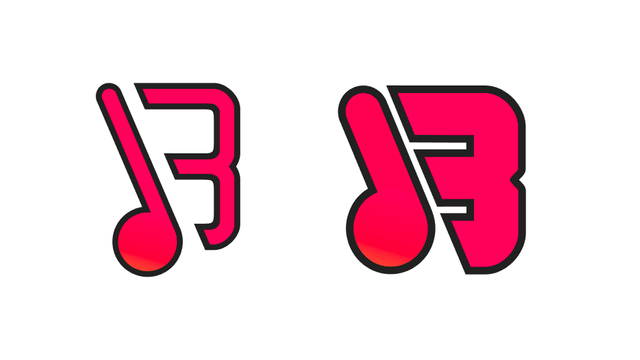
As you can see below, on android interface, the logo design looks weak when we compare with the other logo designs of applications.

In my opinion, first solution is you must resize the logo design according to square format. Making the elements thicker may be another solution method. Because our focal point should be understandability of the logo design in such a project like that.

Your contribution has been evaluated according to Utopian policies and guidelines, as well as a predefined set of questions pertaining to the category.
To view those questions and the relevant answers related to your post, click here.
Need help? Chat with us on Discord.
Thank you for your review, @baranpirincal! Keep up the good work!