Zappl landing page
It is no more a news that Zappl is the first and only microblogging project that pays for microblogging. Its super nice to see that the efforts of developers are really paying off with the all new Zappl beta design (screenshot below). But I believe it could be better with more ideas implementation, as there is always room for more improvement.
I took note that when you visit the zappl web the first page you encounter is this:
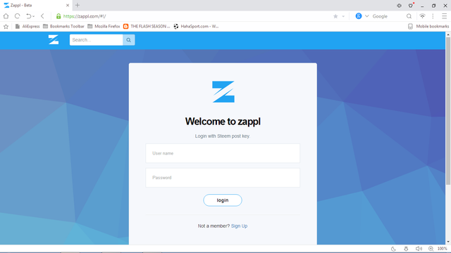
The login page, there is no way for visitors to know what the project is all about.
My suggestion
I suggest there be a landing page for zappl which will tell user more about the project. The landing page should be inviting and full of information enough to influence visitors to use it. I will like to use the all new utopian.io landing page to explain the elements of the suggested zappl landing page found on utopian.io/join;
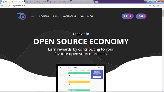
Menu
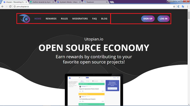
check the red box
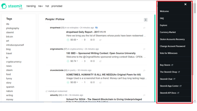
The landing page should contain a menu which would contain links to Login, Steemit Signup, About, Faqs, e.t.c. The menu may be hidden with three bars, not exactly as demonstrated on the Utopian landing page , just like on steemit, check the screenshot below,
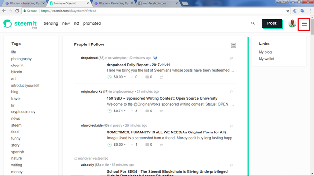
And when the menu is clicked it displays the menus
Name
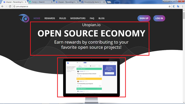
This should be where the name is, and a very short caption of Zappl and a screenshot of the browsing experience of zappl. Something like
Zappl: Get paid to microblog
About
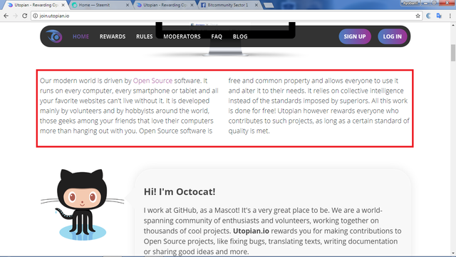
There should be another portion on the landing page that talks about the project, this should contain a short and concise details about zappl inviting enough for visitors:
A quick display or slides of trending posts or news
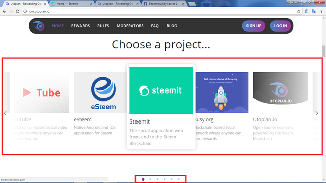
The landing page should contain a quick auto slides of trending posts or news in a card form. Check the screenshot below.
Other information
Other information about zappl should also be on the landing page, information like: about the devs, more notes on the projects, the sponsors e.t.c.
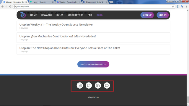
Social media links
It should also contain links to zappl social medias like facebook, twitter, email, e.t.c. for people who will like to speak with the developers.
Benefits
• It makes the site more inviting and interesting to interact with
• It helps referral of visitors
• It will enable people to get more acquainted with the purpose of the project.
There are many more benefits of the landing page, I believe. It will help the visibility of zappl.com
Thank you
I am @ayobami99
Posted on Utopian.io - Rewarding Open Source Contributors
Never heard of zappl before this post.
Thanks.
You are welcome!
I support the idea of zappl new landing page to be attractive.
I support the idea of zappl new landing page to be attractive.
Yes you are right
Thank you for the contribution. It has been approved.
[utopian-moderator]
Thanks
You're welcome!
@ayobami99 Good observation, you really made a point and this will help visitor to know about the website before signing up
Yes sir, thank you
Hey @ayobami99 I am @utopian-io. I have just upvoted you at 5% Power!
Achievements
Suggestions
Did you know?
Up-vote this comment to grow my power and help Open Source contributions like this one. Want to chat? Join me on Discord https://discord.gg/Pc8HG9x