You are viewing a single comment's thread from:
RE: Logo Design Proposal for Shuttle Music Player

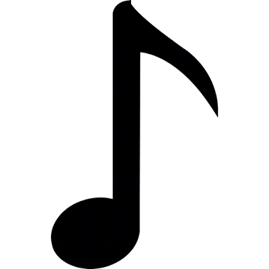
It is representing music note symbol like this. Sharp on the head and round on the bottom

It is representing music note symbol like this. Sharp on the head and round on the bottom
It looks like forgoten... I recommend making them more different or same.
In my humble opinion sir, too sharp on the head,showing no more synchronization between the shape (head and bottom). And hiding the similarities of 'S' element.
I've tried making the head sharper when i creating it, but it's decreasing the aesthetical.
How about it sir?
Keep this one, but add alternative version.
Version 2 - same heads