How to Make Step Progress Component in Vue.js
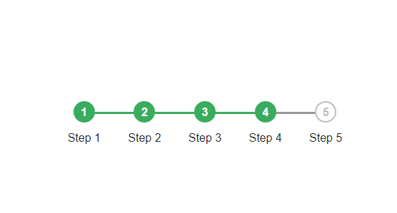
In this tutorial I will make from the beginning of step / progress bar, of course in every website especially in form filling for UI look nice we need to add step in every form we will fill. I will invite you to make it from scratch, I hope you already know the basic css and html, because I will not explain the codes of css and html more deeply. just start we start this tutorial
What Will I Learn?
- Css :after and Css :before
- Step/progress bar
- Add Reusable Components
Requirements
- Install Vue-cli and Install Node.js
- Css intemedite
- Html intermedite
- Javascript es6
Difficulty
- Basic
Make Structure Css and Html
Let's make a hmtl file, I make a simple structure like this
<div class="root">
     <div class="container">
          <ul class="progressbar">
            <li >Step 1</li>
            <li>Step 2</li>
            <li>Step 3</li>
            <li>Step 4</li>
            <li>Step 5</li>
          </ul>
      </div>
  </div>
< div class="container" ></ div > : This the container will make wrapp the element inside.
< ul class="progressbar" > : I will add < ul >< /ul >With class name progressbar.
And I will add some nice css..
.container{
  width: 100%;
  position: absolute;
  z-index: 1;
}
.progressbar li{
  float: left;
  width: 20%;
  position: relative;
  text-align: center;
}
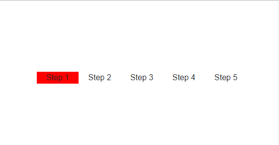
in the .container , I give the width 100% . and position absolute and z-index:1. this for the wrapper . and then i user the class progress bar , but i will add style in that < li >< /li >. I give each width 20% , because the width of .container is 100%, anda i have 5 li, so you can divided it.

We can see the < li >< /li > have width 20% every items. we can see if i give the background red in one of < li >< /li > .
Make Css :after and :before
After We have created structure Html and Css. We will add some css property to make the desired look. I will add element before < li >< /li >,
.progressbar li:before{
  content:"1";
  width: 30px;
  height: 30px;
}
I insert something in: before li, with property content, content:"1";
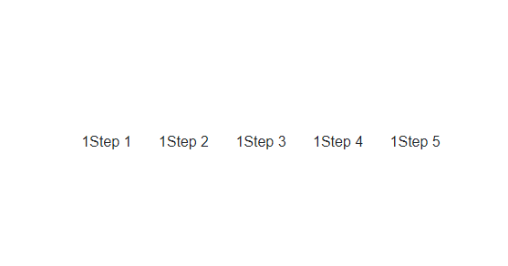
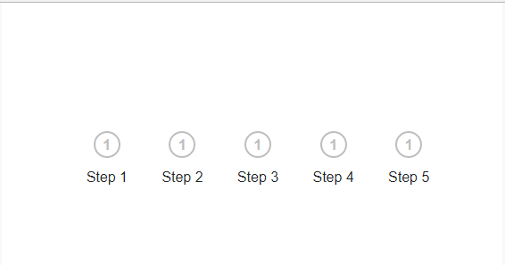
We have add content before < li>< /li> , now we can make it more interesting by creating some additional css properties
.progressbar li:before{
  content:"1";
  width: 30px;
  height: 30px;
  border: 2px solid #bebebe;
  display: block;
  margin: 0 auto 10px auto;
  border-radius: 50%;
  line-height: 27px;
  background: white;
  color: #bebebe;
  text-align: center;
  font-weight: bold;
}
Add Auto Increment bullets Step
Of course we will not make content to 1 in all element of progresbar, I will make auto icrement. so the numbers in the step / progress bar can automatically adjust the amount of < li >< /li >
.progressbar{
  counter-reset: step;
}
.progressbar li:before{
  content:counter(step);
  counter-increment: step;
  width: 30px;
  height: 30px;
  border: 2px solid #bebebe;
  display: block;
  margin: 0 auto 10px auto;
  border-radius: 50%;
  line-height: 27px;
  background: white;
  color: #bebebe;
  text-align: center;
  font-weight: bold;
}
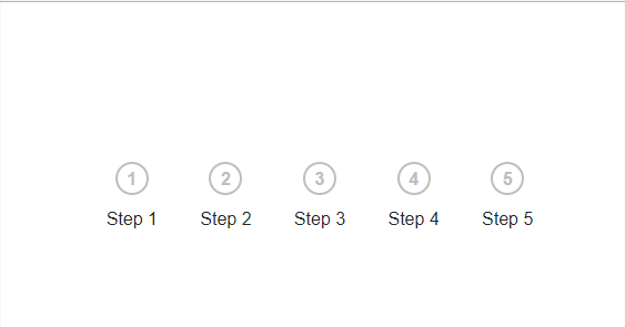
Add Progress Bar
After we add auto increment step , We will create a progress bar in each step.
Before we insert a content before < li >< /li >, then now we will insert contents after < li >< /li >
.progressbar li:after{
  content: '';
  position: absolute;
  width:100%;
  height: 3px;
  background: #979797;
  top: 15px;
  left: -50%;
  z-index: -1;
}
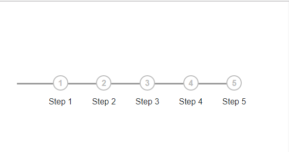
we created a progress bar, but see, we have a bit of a problem, progress bar past the bullet steps limit. but we can fix with remove content in the firstchild of < li >< /li >.
.progressbar li:first-child:after{

content: none;

}
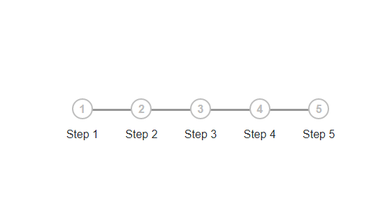
Add Active Step/Progress Bar
Now we will create css style for step / progress bar that is active. there is little trick to do. I will add class "active" in one of element < li >< /li >.
   <div class="container">
          <ul class="progressbar">
            <li class="active">Step 1</li>
            <li>Step 2</li>
            <li>Step 3</li>
            <li>Step 4</li>
            <li>Step 5</li>
          </ul>
      </div>
first I will make the background from step / progress bar to #3aac5d;
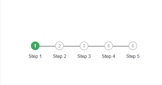
now we can see the background of the bullets change color,
after that i will make progress bar change background, progress bar located : after.
So we can access it by using property : after
.progressbar li.active + li:after{
 background: #3aac5d;
}
.progressbar li.active + li:before{
border-color: #3aac5d;
background: #3aac5d;
color: white
}
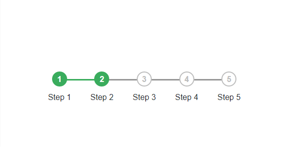
now we can see the results of the step / progress is active,
we can add an "active" class if we want to add step that has been passed.
<div class="container">
          <ul class="progressbar">
            <li class="active">Step 1</li>
            <li class="active">Step 2</li>
            <li class="active">Step 3</li>
            <li>Step 4</li>
            <li>Step 5</li>
          </ul>
      </div>

Make it In A Component
I will make a component for step progress that we make can use repeatedly.
I will create a component home.vue, later I will import the component step silder, which can be used in other component. This is a home.vue component.
<template>
  <div class="root">
    <div class="wrapper-mains">
      <div class="left-align">
        <h2 class="bold center" style="color:#3aac5d;">Make Commponent Step Progress in Vue.js</h2>
        <step-progress :length="5"></step-progress>
      </div>
    </div>
  </div>
</template>
<script>
import stepProgress from './stepProgessSlider'
export default {
  components:{
    stepProgress
  }
}
</script>
(html comment removed:  Add "scoped" attribute to limit CSS to this component only )
<style scoped>
.wrapper-mains{
  width: 561px;
    height: auto;
    background: white;
    text-align: center;
    margin: auto;
    padding: 100px 47px 20px 61px;
}
.textarea{
    display: block;
    width: 100%;
    height: 70px;
    border-radius: 5px;
}
</style>
import stepProgress from './stepProgessSlider' : Import component stepProgessSlider .
components:{stepProgress} : Registered the component in property components
< step-progress :length="5" >< /step-progress > : Use component stepSlider in Home.vue. There is props that I passing into the stepSlider component , that is :length,
the props will be the length of the step that will be rendered in the stepProgressSlider component
And this is a stepProgessSlider.vue
<template>
  <div class="root">
     <div class="container">
          <ul class="progressbar">
            <li class="active" v-for="i in length" :key="i"> </li>
          </ul>
      </div>
  </div>
</template>
<script>
export default {
  props:['length'],
  data () {
    return {
    }
  },
}
</script>

(html comment removed:  Add "scoped" attribute to limit CSS to this component only )
<style scoped>
.container{
     width: 35%;
    position: absolute;
    z-index: 1;
    margin-top: 20px;
}
.progressbar{
  counter-reset: step;
}
.progressbar li{
  float: left;
  width: 14.28%;
  position: relative;
  text-align: center;
}
.progressbar li:before{
  content:counter(step);
  counter-increment: step;
  width: 30px;
  height: 30px;
  border: 2px solid #bebebe;
  display: block;
  margin: 0 auto 10px auto;
  border-radius: 50%;
  line-height: 27px;
  background: white;
  color: #bebebe;
  text-align: center;
  font-weight: bold;
}
.progressbar li:after{
  content: '';
  position: absolute;
  width:100%;
  height: 3px;
  background: #979797;
  top: 15px;
  left: -50%;
  z-index: -1;
}
.progressbar li.active:before{
 border-color: #3aac5d;
 background: #3aac5d;
 color: white
}
.progressbar li.active:after{
 background: #3aac5d;
}
.progressbar li.active - li:after{
 background: #3aac5d;
}
.progressbar li.active - li:before{
border-color: #3aac5d;
background: #3aac5d;
color: white
}
.progressbar li:first-child:after{
 content: none;
}
</style>
props:['length'] : We receive props with the name 'length' .
and we will loop as much of the props in the passing in integer form < li class="active" v-for="i in length" :key="i" > < /li >
Passing data length (3)
< step-progress :length="3" >< /step-progress >

Passing data length (7)
< step-progress :length="7" >< /step-progress >

Now we have finished using step progress, and not just use Css. we have made it into a component that can be used over and over again. just so much of me hopefully this tutorial help you to make step slider, thank you
Posted on Utopian.io - Rewarding Open Source Contributors
Thank you for the contribution. It has been approved.
You can contact us on Discord.
[utopian-moderator]
Hey @alfarisi94 I am @utopian-io. I have just upvoted you!
Achievements
Community-Driven Witness!
I am the first and only Steem Community-Driven Witness. Participate on Discord. Lets GROW TOGETHER!
Up-vote this comment to grow my power and help Open Source contributions like this one. Want to chat? Join me on Discord https://discord.gg/Pc8HG9x
Strike ya bro tangkapan besar :D
Dapet gabus bro :)
Really good. This is great. Thanks.
Thank you @steveblucher
great!