VR menu interfaces need an upgrade…. or a flashback to the past.
One of the problems with Virtual Reality today, is that the technology can do more things than we ever dreamed it could. It often overwhelms new users (first timers) with a terrible introduction to the technology and an overwhelming interface. Often long menus of hundreds of applications and videos, scrolling in a hovering window in front of you.
There is often very little organization, or structure to the categorization of VR app content.
No where to be found is a happy virtual assistant explaining the rules of this new world and what you can do with it.
A paperclip (windows), a Morpheus or a voice in your ear like Scarlett Johanssen in the movie Her. (obviously AI is not there yet, but admit it, it would be cool to have her voice guiding your first VR menu experience.)
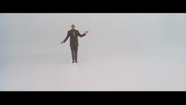
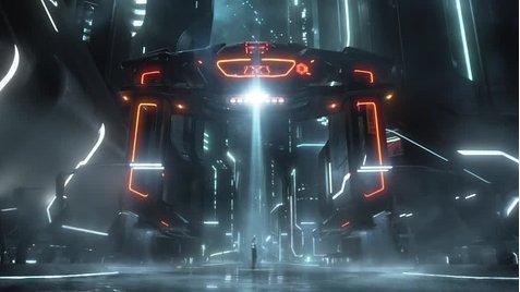
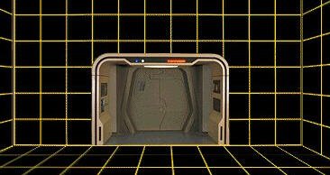
This needs to change, soon, to enable mass adoption, or just because it’s cool.Sci-Fi movies from the last 40 years failed to show what surfing the internet in VR would look like, they had to guess what the UI UX (User Interface, User Experience) would look like. They often used outrageous (yet familiar) digitization like these and many more.
Lawnmower Man
Tron
Star Trek holodeck
The Matrix
For my generation (and older) to really adopt VR in a really big way, I propose that VR developers offer some options on the main menu for VR devices.If you could select one of these vr world view styles Lawnmower, Tron, Holodeck, Matrix etc…. as the starting room, I think for some, the familiarity will help see the potential of what the technology can do, and be more willing to explore and experiment.
When Microsoft launched Windows it revolutionized computer use by reducing code commands to drag and drop visual icons on a desktop. a window view into the program. VR is starting to get saturated by content and waiting for advanced speech recognition and AI seems a little too idealistic.
What we need today is a Redesigned user interface for VR. A landing page that can be customizable. It should blend both the familiar and unique and it should allow for simple sorting and navigation through VR content. (here’s one for 360 videos with GPS tags)
Content navigation is only going to get more complex. Education and Entertainment are slowly merging into one. (EduGaming, Edutainment?) Another merge is occurring between WEBVR enabled websites and 360videos (with clickable links to other 360VR content or “storyboard icons”). Navigating between VR videos, webpages, travel, experiences, games, lessons, therapy, telecom, illusions, metaverses and real life “captured” locations is becoming a more seamless experience, distorting your ability to know which one you are in.
We can simplify this with a refined User Interface for an improved User experience today.
What VR interface would you love to be able to load up?
Who would be your ultimate guide around this brave new digital world?


