03.01 - Spacing - The Foundations of Typgoraphy
Chapter 03 - Arrangement
Lesson 01 - Spacing
First off, welcome to chapter 3 of my series. In this chapter, we'll cover various aspects of arrangement to ensure your composition and tone not only fits your content well, but also elevates and amplifies it. I would love to get your feedback on the series so far, so please feel free to drop any suggestions or comments down below!
Using an appropriate typeface is only one aspect of good typography (and we'll cover this more in a later series). The other is arranging your type well. We’ll break down arrangement into a few posts, starting with spacing.
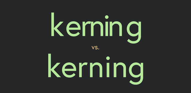
Kerning
Kerning is the adjustment of spacing between two specific letters. The goal of kerning is to create consistent rhythm of space that helps readability. This ties back into our discussion of optical sizing. The kerning should balance optically, as they all have different shapes, angles and sizes. Text sized letters are already created with proper spacing. This is why you should avoid free fonts, because they usually aren’t developed as carefully in terms of their spacing. Display sizes on the other hand often need manual kerning. Kerning mostly takes practice and honing of the typographic eye, however here's a fun little exercise to practice when you're attempting to kern a word. Imagine a balloon holding the same amount of air between each letter. How can you move the letters to allow for that space to be filled with the same amount of "air". You'll also want to try the eye-blur test. If you blur your eyes, you'll get a better sense of the rhythm and it's easy to spot any sections that are too tight are too loose.
Here are some general guidelines:
- The narrowest space will be needed between two round letters (o c)
- The next narrowest would be needed between a straight and curved letter (p l)
- The most space would be needed between two straight letters (l h)
- For angled letters like A, Y, X, etc, pay close attention to the space the other letter creates. For example, an A and a v work quite nicely together and require less space. However, an A and an o would need to be tightened up to accommodate the angle and the curve.
- Work with the most difficult pairing first and then move to the other parts of the word.
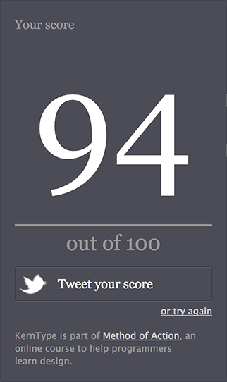
Kerning requires small but critical adjustments, and practice makes perfect. There is a great online resource to test your kerning here. I got a 94, can you beat that?
Post a screenshot of your score below, and I will reward the user with the best score with $5.00 SBD!
Tracking
Tracking is the adjustment of overall spacing between a group of letters. Tracking affects the tonal weight of text as mentioned in a previous lecture, you never really want to space lowercase text more than 5/1000 em, and usually no less than -20/1000 em.
Most design software, such as the Adobe Creative Cloud uses 1/1000 em to measure letter spacing (kerning and tracking). However, in CSS, you can adjust the tracking with the letter-spacing property using ems, pixels, points, and metric units.
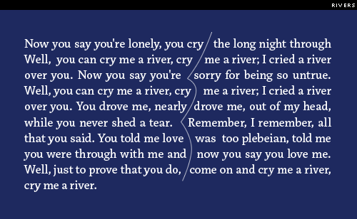
The goal of tracking is to remove clashes in your paragraph's tone and rhythm. The 3 main culprits to watch for are rags, rivers, orphans, and widows.
Rags
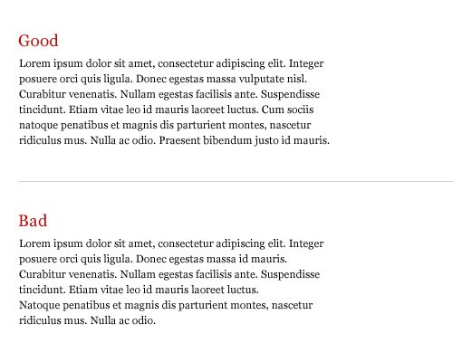
Rags are the irregular or uneven side of the a block of type. Usually it’s the right margin that’s ragged since left-aligned type is the most common, but depending on alignment, either or both margins can be ragged. Rags are not inherently bad. A good rag goes in and out from line to line in small increments. A poor rag creates distracting shapes of white space in the margin, or goes out from line to line in too large of increments. Get in the habit of spotting and correcting poor rags by adjusting tracking, making manual line breaks (shift + return), or by editing your copy.
Rivers
Rivers are spaces that run through multiple lines and create a distracting shape of negative space. These are usually very easily remedied with a little tracking, but once again, don't force it. Edit your copy if need be.
Orphans
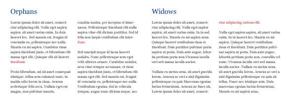
An orphan is a single word or short line left at the end of a paragraph, resulting in excessive white space between paragraphs. Tighten your tracking a little bit to try and remedy these.
Widows
A widow is a single word or short line at the beginning or end of a column, separating it from the rest of the paragraph. This interrupts the reader’s eye and diminishes readability. This can also be remedied by tracking, manual line breaking, or copy editing.
Leading
Leading is the space between lines, measured from baseline to baseline. Leading also affects the tonal weight of text. You typically want to be between 120% and 150% of the font size. The length of the line (or measure, as you'll remember from my post on size) actually impacts your leading optically as well, so for longer lines, you’re going to want to use larger leading. Betterwebtype.com has actually created a cool game to test your knowledge of how these 3 work in tandem. Give it a shot! The Equilateral Triangle of a Perfect Paragraph
One more thing to consider with leading is when using typefaces with strong vertical strokes (such as Bodoni), you’re going to want to increase leading to allow for that extra vertical spacing.
Don't forget to post your a screenshot of score from the kerning test for a chance to win $5.00 in SBD!

Very good educational material mate! Typography is the king of graphic design. :)
Thanks @andrejcibik! I agree ;)
I am a graphic designer myself. Thanks for sharing great content like this!
Awesome! I really want to help grow the design community on steemit. I hope you find these posts as a helpful reminder still!
I definitely do, thanks!