02.06 - Capitalization - The Foundations of Typography

Chapter 02 - Classifying Type
Lesson 06 - Capitalization
The terms uppercase and lowercase come from traditional print shops. Capital letters (also known as Majuscules), were used less frequently, and were stored in a case on a shelf above the lowercase letters (also known as minuscules).
Voices/Personality
When you are choosing type for your project, think about the qualities and characteristics you are trying to convey. Upper and lower case have distinct personalities. So use cases sensibly to ensure you’re giving an appropriate aesthetic that helps communicate your message.
Lowercase
Lowercase type makes up the bulk of text. Sometimes it can be used as title or brand to bring a more playful or passive voice.
All Caps
All caps are harder to read at text size, because the shapes of the lowercase letters create a varied visual contour that helps our brain recognize words.
This doesn’t mean you should never use all caps, just use them judiciously.
They are suitable for headers, footers, captions, and other labels.
NEVER CAPITALIZE AN ENTIRE PARAGRAPH! YOU’LL APPEAR BORDERLINE INSANE. A PARAGRAPH SET IN ALL CAPS IS VERY HARD TO READ. IT REALLY SOUNDS LIKE THE VOICE IN YOUR HEAD IS SHOUTING AT YOU AND IT’S EVEN HARDER TO READ IF IT’S BOLD. AS THE PARAGRAPH WEARS ON, READERS FATIGUE AND LOSE INTEREST. HOW ABOUT YOU? DO YOU ENJOY READING THIS? I DOUBT IT. BUT I REGULARLY SEE CAPITALIZED PARAGRAPHS THAT ARE MUCH LONGER THAN THIS. DO YOUR READERS A FAVOR. STOP CAPITALIZING WHOLE PARAGRAPHS.
As you probably realized after the reading through the paragraph, capitalization can have a massive impact on the way we interpret words and text. The previous example shows how capitalization can affect volume. But it can also change personality. Words in lowercase tend to have a warm, fun, playful feel which is usually more personal and informal. While words set in all caps tend to communicate power, urgency, importance, formality, trustworthiness and authority.
Spacing
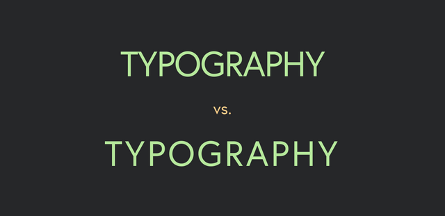
Here is a best kept secret, and it will make a huge impact on your all cap titles. Uppercase letters, due to their more blockish shape, require a little extra space, so if you're using all caps as a header, adjust the letter-spacing (tracking) to help the legibility of these shapes.
All caps can actually exist with really exaggerated letter spacing, and can create a really nice effect in certain situations. Lowercase text however, should never be spaced more than 5/1000 em, but we will get more into that later in the series.


