02.05 - Size - The Foundations of Typography
Chapter 02 - Classifying Type
Lesson 05 - Size
Understanding the sizes of fonts is an important part of typography. There are a few different ways in which we can measure type. The most obvious way, being...height.
Height
All letter height is measured in Points.
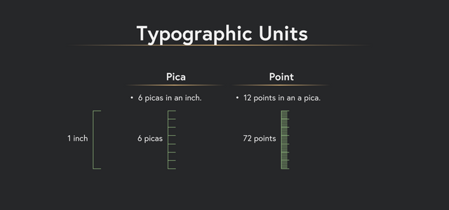
We use ‘pts’ to abbreviate points like ‘8 pts'. OR by placing a ‘p’ before the measurement like 'p8'. A pica is abbreviated with the ‘p’ following the measurement like '6p'. If you want to abbreviate a measurement that was 4 picas and 2 points, it looks like so '4p2'
Line Height
Line height is the distance between the baselines and is commonly referred to as ‘leading’. In print design, line height is typically measured in points, whereas in digital type, it can be measured in a number of formats such as percentage (120%), decimal (1.2), pixels (20px), ems (1.2em), metric (0.4cm), or point (12pt).
A quick way to reference the point size and line spacing of a text is by using a slash between the 2 measurements. First the point size, then the leading size, usually followed by the name of the typeface.
Ex: 10/12 Bodoni
This is mostly used for print, as it's unclear which units you'd be using with web design. However, those of you who are familiar with css will recognize this as the same syntax used in the 'font' shorthand property.
X-Height
X-heights may appear very different among the same size of different typefaces, and similarly, set widths may appear very different among typefaces with the same x-heights.
Width
“Set width” is how we describe the width of a letter. The set width is the width of the body plus a sliver of space that protects it from other letters. As you will learn later in the course, some typefaces are designed with narrow set widths, and some with quite wide set widths.
Measure
The width of a line of text can also be measured in points and picas, and this is called a “measure”. The “measure” of this paragraph is about 35 picas wide. In digital design, it's simpler to refer to the cpl or Characters Per Line or even the containing element's width, depending on what you're looking to calculate.
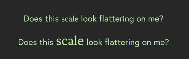
Scale
Scale is the size of the design element (or type in this case) compared to other elements in a layout. It is all relative.
X-heights: As we mentioned earlier, the x-height can vary quite a bit between typefaces. So if you are inserting a new typeface which has a slightly different x-height, it’s generally good to exaggerate it a bit so it doesn’t look “off”.
Take a look at these two examples.
Optical sizes:
Size is not only mathematical in design, it’s optical. If you line up the size of all letters, their different shapes will create an uneven appearance. To make up for this optical discrepancy, designers create “overshoots” which we discussed in the anatomy lesson.
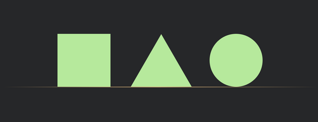
To further understand this, take a look at these three shapes. Which is bigger? The square takes up much more space visually, so to make up for this, we would enlarge the triangle and circle.
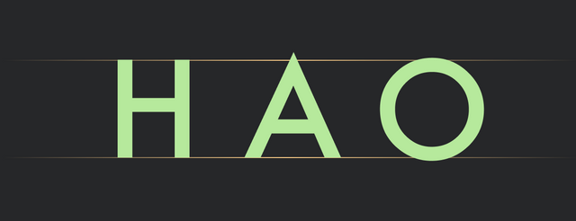
Now, convert these shapes with an H, A and an O. See how adjusting the overshoots creates a subtle optical balance?
This is one of the most overlooked concepts in typography and understanding it will help you immensely. Establishing an optically consistent size is just one puzzle among very many, but understanding the basics of size and measurement, will allow you to focus on the more complex variations and combinations of type.

keep it coming. great stuff
Welcome
Thanks so much! I'm glad you enjoy!
Impressive post @ spencec6
Tanx for dis wonderful piece
Keep the fire burning
Steem on
Kudos...
Well, you are very welcome! Thanks for your support!
Very impressive and detail oriented, i loved it. keep it up the good work. Following you now
So glad to hear it. Thanks a ton!
excellent
Thanks!
Great post dude! So such crap typography out there, gotta educate!
Thanks so much!