02.03 - Display vs Text Type - The Foundation of Typography

Chapter 02 - Classifying Type
Lesson 03 - Display vs Text Type
Text Type

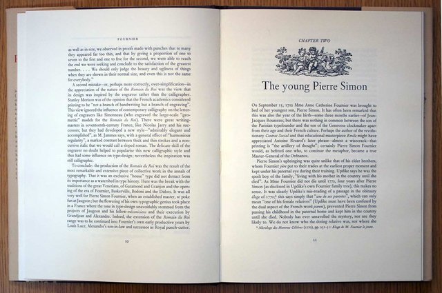
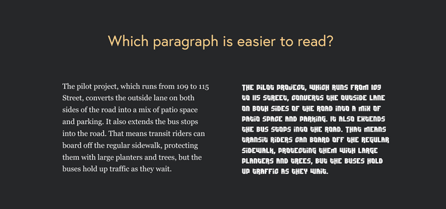
Another important classification is the difference between text type and display type. Text type is type that is designed to be read in large quantities at small sizes (usually between 8pt and 12pt). This goal of text type is to create smooth and easy reading for the reader. Text type actually relies on many tiny cues that help guide our eye through the passages of text in fractions of a second. For example, the bulk of the text in any newspaper, magazine, or book is text type. It's also called body type or body copy.
Display Type

Display type, on the other hand, is used in larger sizes, and it's typically used in small quantities for emphasis and effect. The goal of display type is to announce or amplify certain content such as headers, decks, mastheads or logos. Display type should be used restraint, as it can very easily be overdone. Ideally, display type works the best when it is contrasted with the clean, readability and quietness of text type.
Balancing Act

The key is that display type should always be used with restraint. Text type can function as display type, but very rarely could display type ever work as text type. Think of these two classifications as a cake. The text type is the main portion of the cake, and the decorative icing makes the cake more aesthetically pleasing and adds just the right amount of extra sweetness.